Updating the expression of Norens with colors and texture,thinking of the future of Nihonbashi.
Updating the expression of Norens with colors and texture,thinking of the future of Nihonbashi.
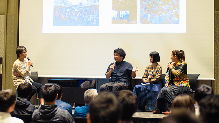
NIHONBASHI MEGURU FES which has been taking place for about 2 months since September 27. Various creators participate in one of these events called “Meguru Noren Exhibition”, to design Noren curtains to express the town of Nihonbashi. We have made a series of short interviews with three young creators who took the challenge to make the Noren for the exhibition starting on Friday, October 11.
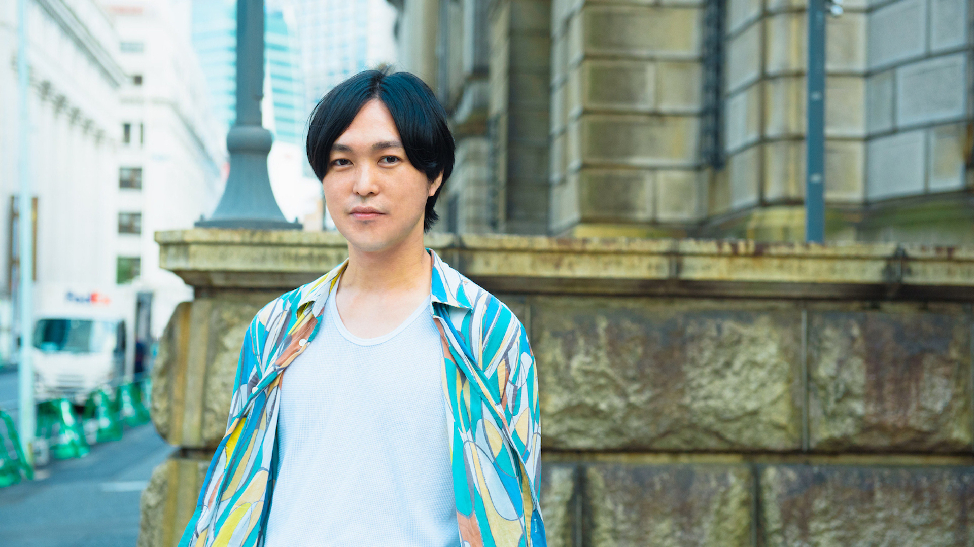
As for the first interview of the series, we have Mr. Naonori Yago from SIX Inc. who has been working as the art director of Laforet Harajuku advertisements for a long period of time. He recently works on business design and projects such as the ZIPAIR and has a personal exhibition titled “Basara (self-indulgence) (temporary title)” planned in February of next year. We interviewed about his thoughts and ways of expression in the current work.
Expressing the regeneration and glamor of the town through colors and pleating.
- First, could you tell us about the intention behind the Noren project which you created?
With the aim to “update Norens,” I thought of ways to express Norens such as the Nawa Noren (curtains often used in restaurants and bars made of rope tied together and dangled down) and Sudare Noren (curtains often used in townhouses in the countryside made by weaving ropes or thin strings with thin cut or split bamboos) in a new genre of Norens that would continue on to the following generations. As the methods and technologies of expression are evolving, I wanted to challenge a new genre of Noren that can be created because we’re in this current age.
I’m always conscious about imagining what would things be in the future, and as an art director, I try to be mindful of coming up with suggestions in which never before seen images work in real-life situations. So I took on this challenge hoping that the future images of Norens would be updated through the new genre of Norens that I propose as a hint.
- Specifically, from what perspectives did you start thinking of the update?
I started by thinking of what could be done if I changed “the colors and shapes of Norens which anyone would normally imagine”. There could be ones that are flamboyant and fun and the shape does not necessarily need to be flat.
Also, comparing to the old days, we have new textures available, and the processing and printing technologies have evolved. Because many things concerning the process of creation are developed, I wanted to make something that can be expressed since we are in this age and connect to the future.
By combining colors and technologies that were not used in the expressions of Norens, I wanted to express the town of Nihonbashi where the old and new harmonize together.
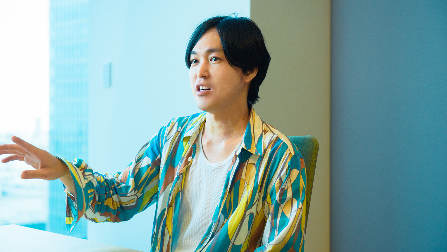
“The role of art direction is to shape the final image. It would be great if everyone can act towards that image.” Recently, Mr. Yabe is also involved with branding and business design projects.
- It is surely a very gorgeous color. - What kind of thoughts are put into the colors?
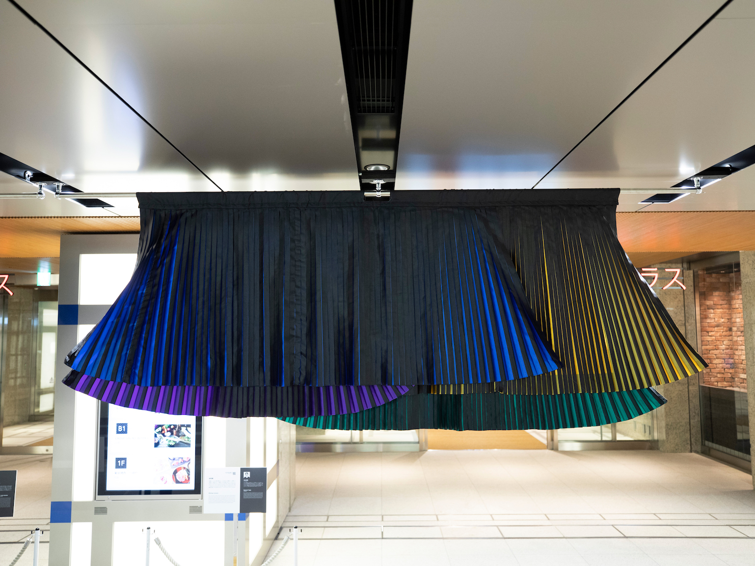
“I had the ambition to change Noren’s existing image of “calm one tone color.” Also, I thought about the ways to express the idea of “regeneration for protecting tradition” which left a great impression when I started working with Nihonbashi. I wanted to apply the unique idea of Nihonbashi that changing together with time connects to protecting traditions into colorful expressions.
I used blue, green, yellow, and purple and the balance of these 4 colors also has a meaning. Since it is an update, it should not be either traditional or pop. For instance, using indigo or 3 colors like the Kabuki curtains would make it too traditional and would not make it an update. However, using red, blue, and yellow would be too far from what exists now and would also not be an update. To aim in between and to combine in a good way possible, I used the 4 colors in the actual work. Also, by hiding the 4 colors in the texture colored all in black, the 4 colors appear to the eyes when the cloth moves with wind or by people’s hands. Like this, I planned it to bring impact to the colors.
- I heard that you also challenged in using new processing technology.
Yes. I incorporated a pleating texture to the Noren. Having pleating texture on Norens itself is a new way of expression, but I have also added meaning to this pleating form. The width of the pleating differs by each of the color blocks. This is to express the glamor of the town of Nihonbashi. I feel like the town and the people of Nihonbashi has something attractive and glamor. There is a book titled, “Structure of Iki,” and if you read that book, the meaning of “glamor” is contained in the word “iki (chic)” that is often used in Nihonbashi. So I wanted to somehow envelop the essence of glamor in the work. By changing the width of the pleating by few millimeters and not creating a fixed width, it actually created a flow and a depth in its looks. By incorporating ideas and aims and by not making it like machine-made, it brought out the glamor in the Noren.
I believe that this Noren realizes colors and shapes that were not available in the conventional ways of creating Norens.
A new style of Noren for people to imagine the future of Nihonbashi
- Were there any difficulties in incorporating new ways of expressing in the traditional format of Noren?
The pleating was a struggle. No matter how many times we tried the pleating, the crease turned out loose and did not become ideal crisp pleating. When the words “give up” came to mind, we decided to leave the pleating on the side and try out the coloring of the cloth. Then it resulted in a break through.
We add heat to the cloth when dying it, and we discovered that the heating played a role in creating a stable pleating texture. Because we were too focused on the pleating itself, we could not get the ideal results even with numerous tries. However, we were able to realize crisp pleating in the whole process including the coloring part. I was very happy when I discovered this. I would not have been able to put my ideas into shape if it were not for the producer Mr. Shin Nakamura (proposed processing technologies for the Noren, supported making the Noren, and connected artisans and creators) and the artisans.
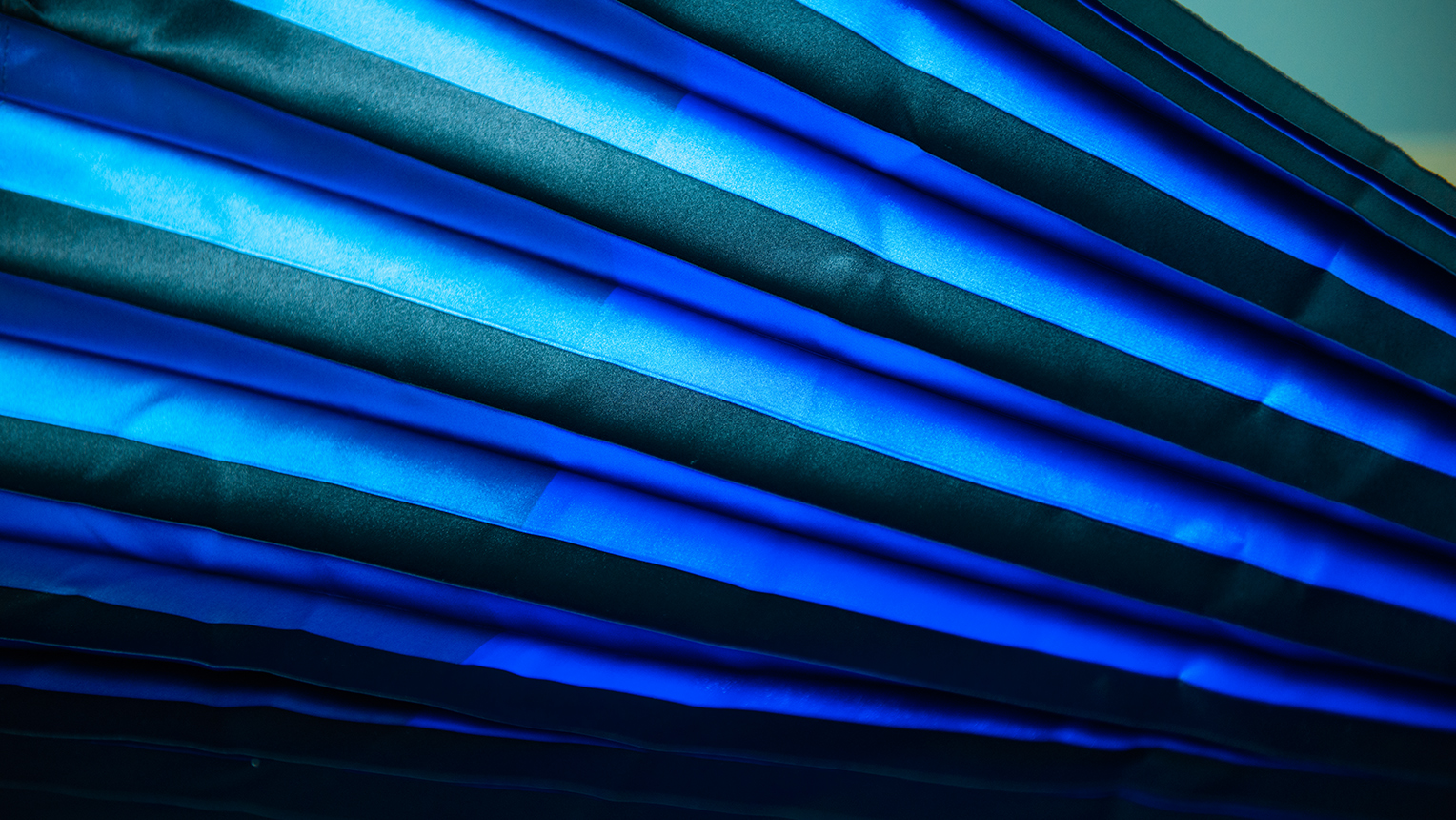
Sample during the making process. The transparency and the look changes with the degree of lights. A new style of Noren that shows different expressions every time you pass under or see it. Many trials and errors were made in creating this ideal edge of the pleating.
- Lastly, please tell us about your thoughts on the town of Nihonbashi.
The more I learned about Nihonbashi, I felt that it is not as high threshold as what people think generally. It is similar to the feeling of going to a bar that’s difficult to visit. It is actually easier than you think once you go in.
For Nihonbashi to further enhance its appeals, I feel that it is one way to purposely express the fun part of Nihonbashi flamboyantly to the people outside of the area and change the image of holding high threshold little by little.
I hope that the update of Norens from the image of plain indigo to colorful pleating would become an opportunity to imagine the future of Nihonbashi.
Interview and Article: Kei Furuta(Konel) Photos: Daisuke Okamura
Naonori Yago
Art director/graphic designer. After graduating from the Department of Visual Communication Design, Musashino Art University, Yago worked at Hakuhodo and currently works at SIX Inc. His works include the art direction of Laforet Harajuku advertisements and the design of the new airline of JAL, “ZIPAIR Tokyo” project. A personal exhibition “Basara (self-indulgence) (temporary title)” is planned to be held in Tokyo on February 2020.
The Future of Cities and Creativity – “β Lounge” Volume 2 Public Talk Report
“New perspectives” born from daily experimentation. Taking a look at the shape of contemporary design that “we+” aspires to.
A meeting of equals made in the darkness; the reason why Dialogue In The Dark Japan values “dialogue”.