The Future of Cities and Creativity – “β Lounge” Volume 2 Public Talk Report
The Future of Cities and Creativity – “β Lounge” Volume 2 Public Talk Report
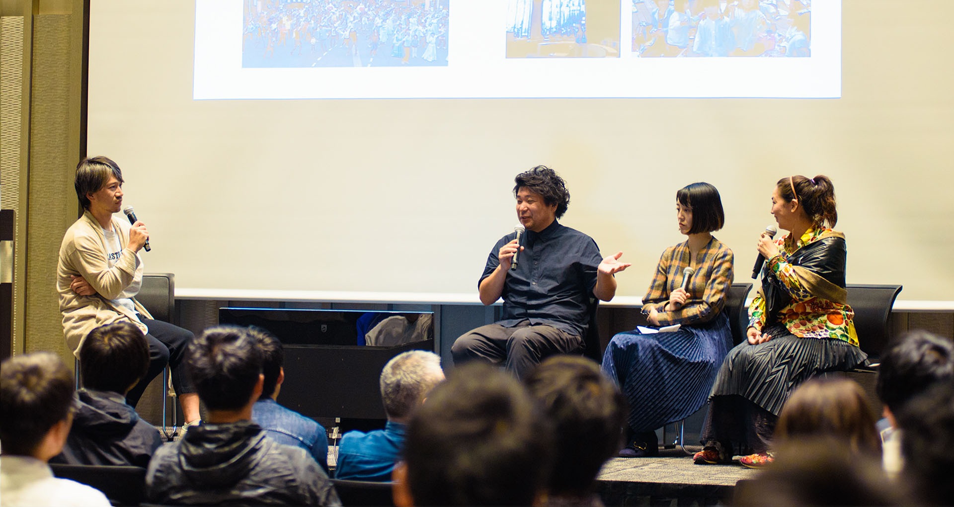
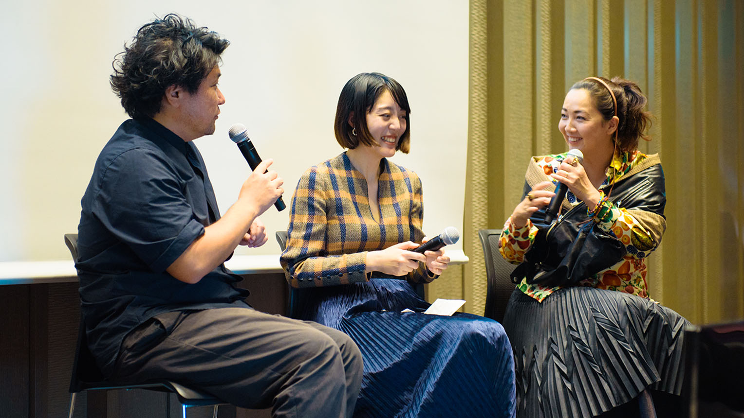
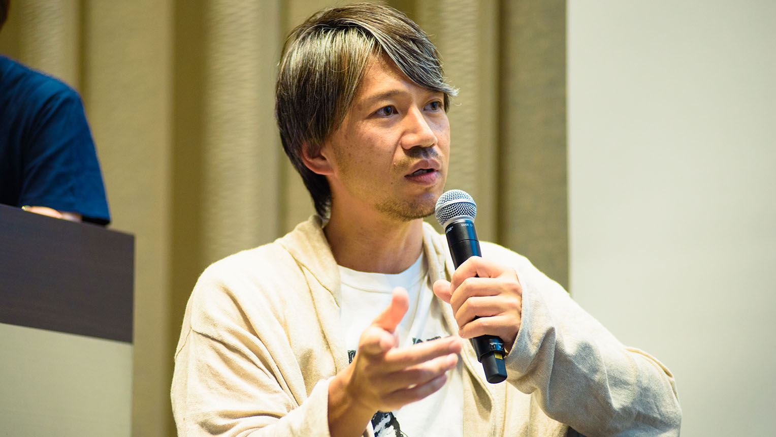
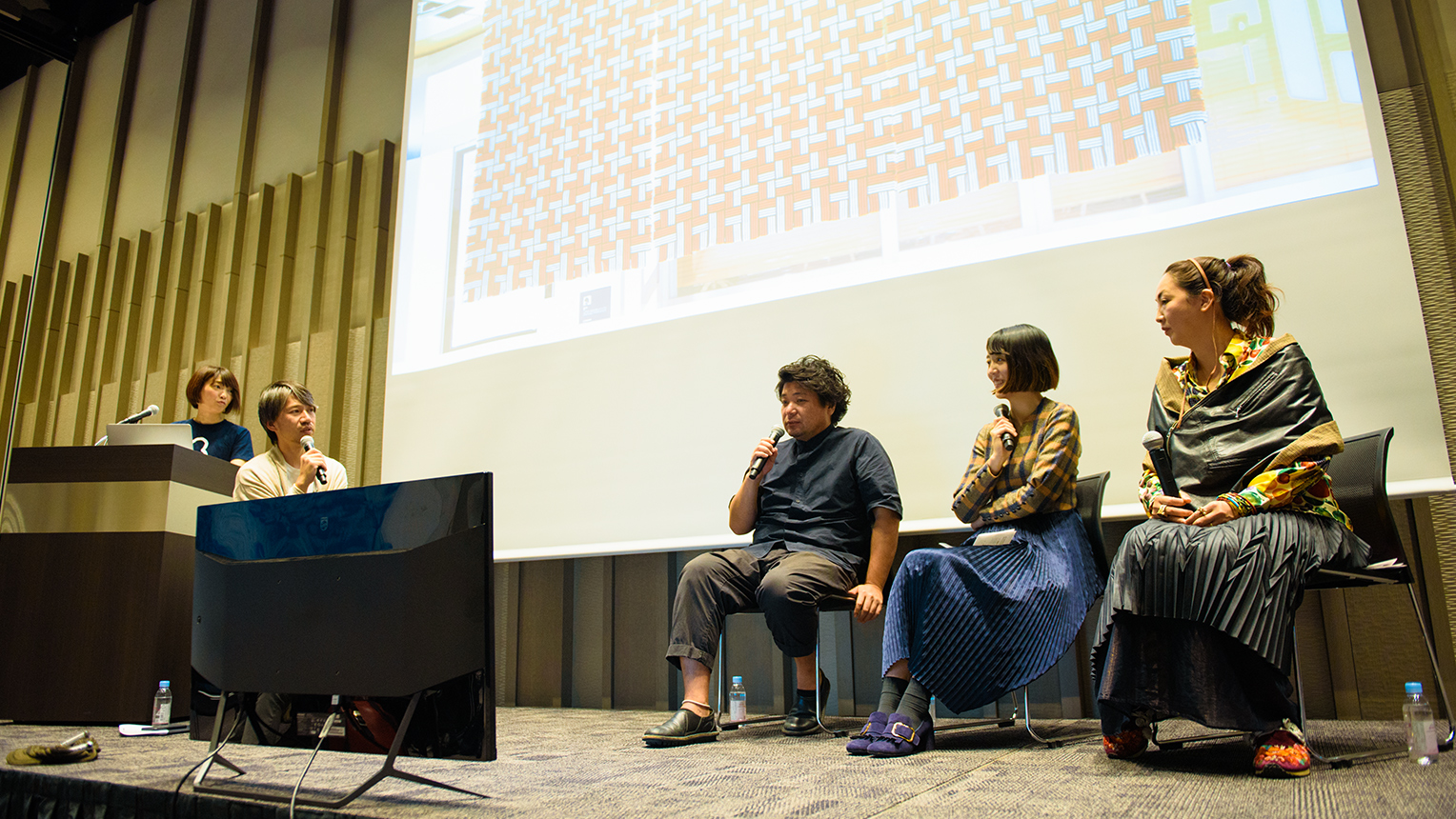
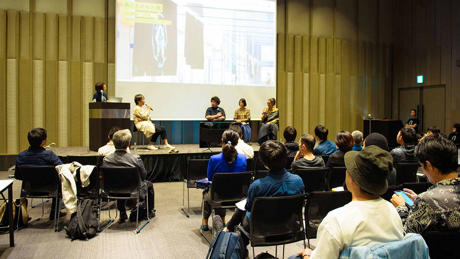
The “β Lounge” event series is organized by “nihonbashi β,” a co-creation project that connects creators with Nihonbashi to shape the city’s future. The second event in the series took place on October 26, on a theme of “the future of creativity, staged against the city.” This report covers a public talk held on the theme of the “Meguru Noren Exhibition” of traditional noren curtains held in the Mitsukoshimae Station underground mall as part of that event, ending on November 4. We spoke with exhibit creators Mr. Jin Kuramoto, Ms. Kimiko Sekido, and Ms. Chie Morimoto about the production of their works and the relationality between creativity and cities as public spaces. Our moderator was Mr. Koichiro Toda, creative director for the NIHONBASHI MEGURU FES.
What did you think when you saw noren as the theme?
Toda: This “Meguru Noren Exhibition” was a main content item for NIHONBASHI MEGURU FES, and saw a diverse group of companies and creators participate with noren works that express concepts relating to “the city of Nihonbashi” and “corporate identity.” The exhibit began as a project to generate a modern reproduction of the vibrant cityscape depicted in the “Kidai Shoran” illustrated scroll, which dates back to the Edo period (1603-1868).
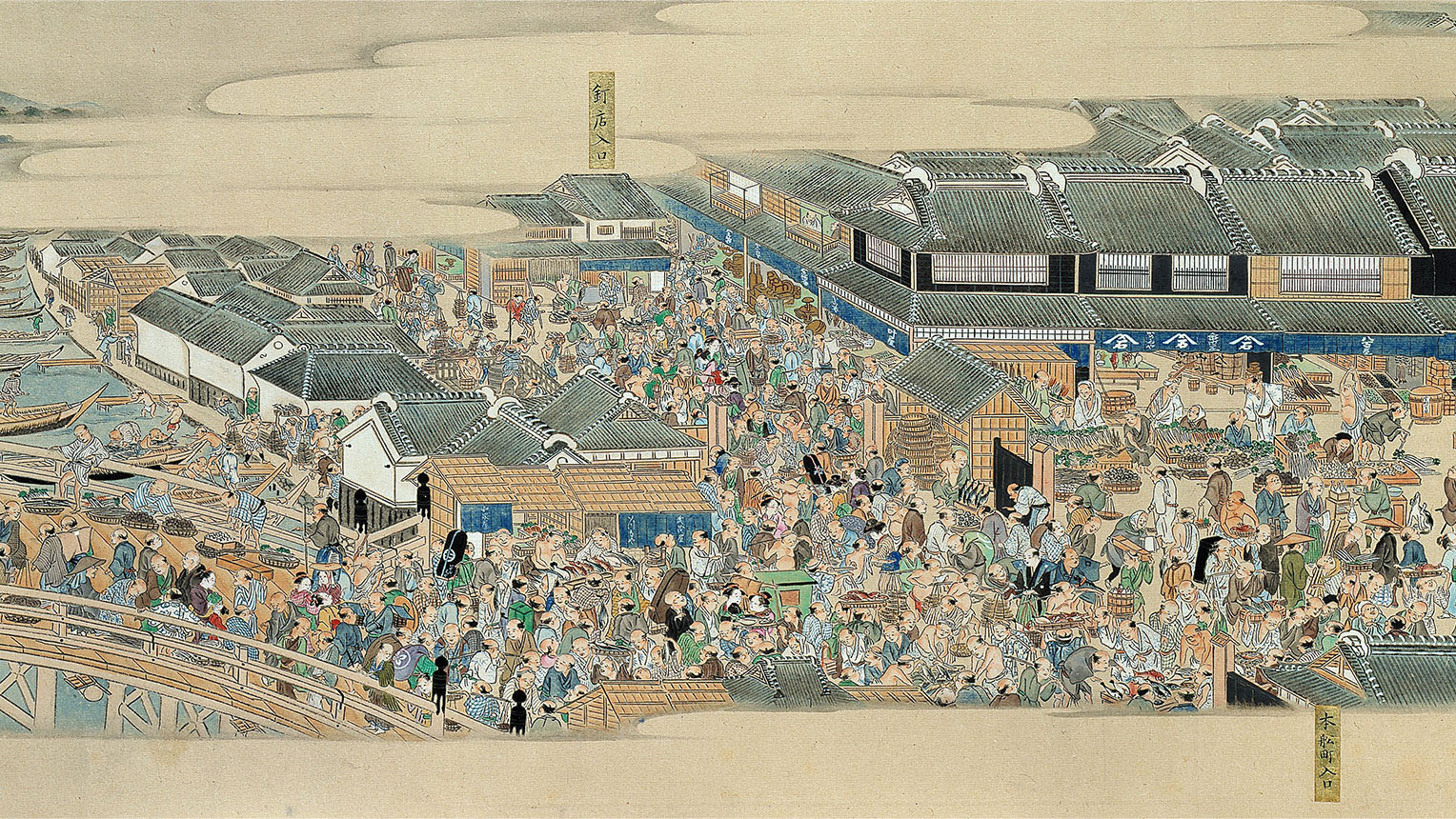
Kidai Shoran (Partial), Staatliche Museen zu Berlin, Photo: AMF / DNPartcom / @bpk / Museum für Asiastische Kunst, SMG / Jürgen Liepe
First, let’s hear from Mr. Jin Kuramoto, the product designer behind “TACTILE CLOTH.” Please give a simple introduction for yourself, and tell us about the noren you worked on.
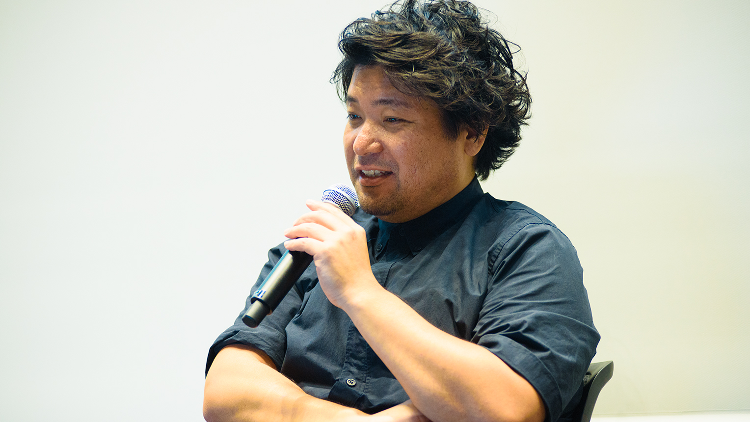
Kuramoto: My name is Kuramoto, and I’m a product designer. It’s good to be here today. I normally work on designs for a variety of products, like cell phones, appliances, sunglasses, cars, and so forth. For the “Meguru Noren Exhibition,” I made a type of noren that lets in a flood of soft light when opened.
Noren originally served a role in showcasing the types of stores displaying them, and digital signage and similar things are quite common when you think of modern signs. So my first step was considering “what expressions modern noren would be capable of” within that paradigm. That topic led me to the conclusion that modern noren would be better suited to improving the value of the experience for those who pass through them, which gave rise to this set of noren.
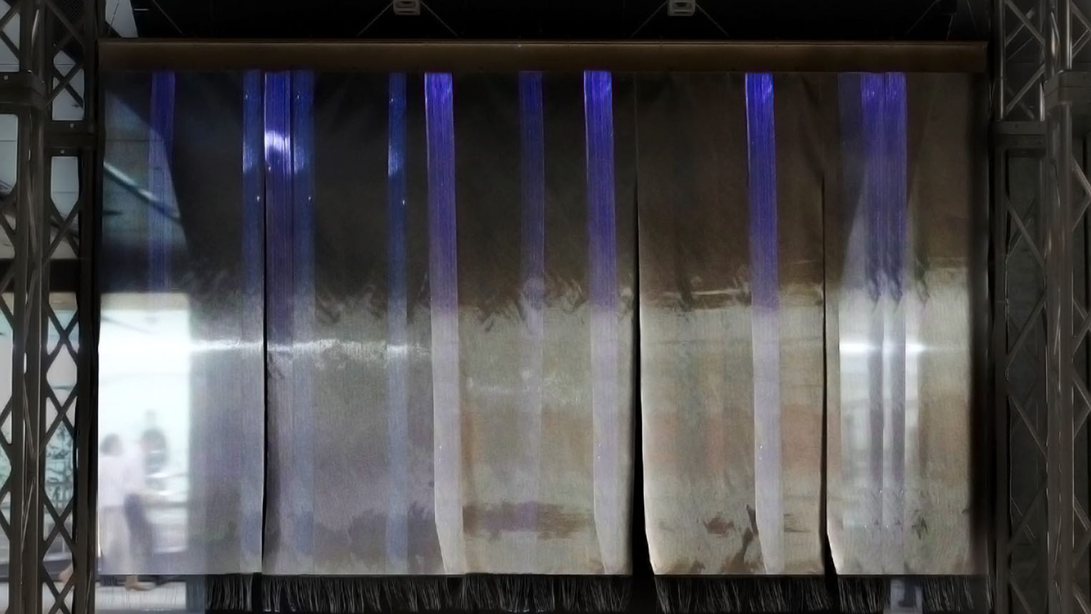
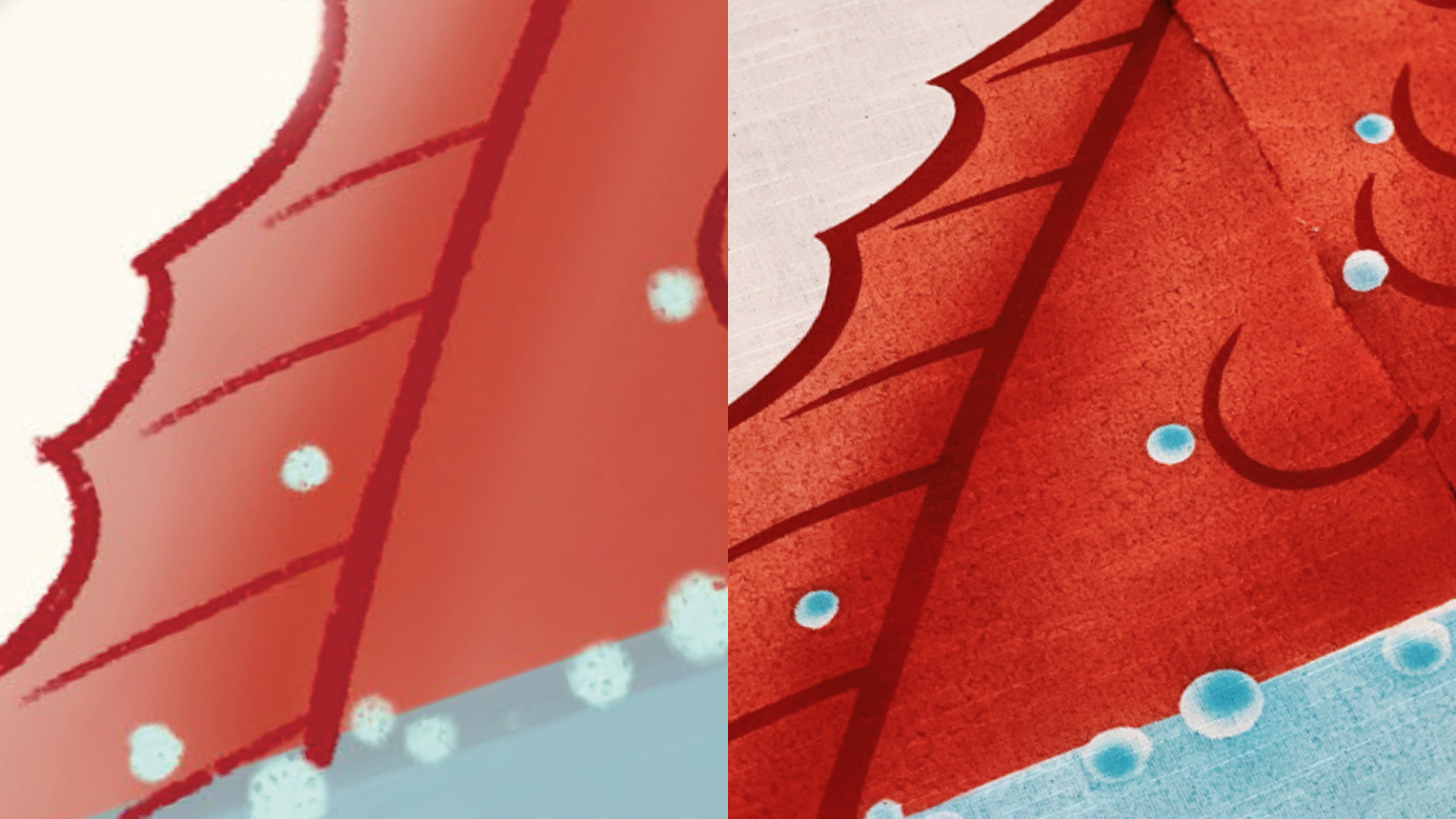
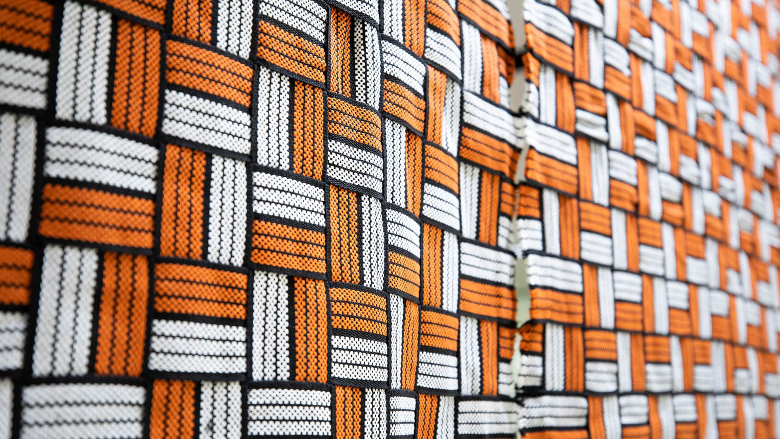
“TACTILE CLOTH” by Jin Kuramoto
As for why I settled on experience value, that relates to the starting point for the idea, which was a traditional old ryokan inn. We frequently perform the uchimizu ritual water sprinkling at the entrances of traditional ryokan inns. This water sprinkling actually reduces the entryway’s temperature by one or two degrees Celsius. That gives visitors a bit of a chill when they pass through the area. They experience a physical shift as they enter, in this process. All in order to allow them to savor the sensation when they climb into a brimming, hot wooden bath, and the water pours over the sides, filling the air with steam. I think it very meaningful that we can still experience that in our era.
Mr. Jin Kuramoto, Product Designer, JIN KURAMOTO STUDIO
Having the noren themselves glow when parted was the idea that came to me when I realized I wanted to provide that sort of experience. However, actually making them was extremely challenging. First, I started on making glowing cloth by taking optical fiber to an artisanal canvas weaver and asking them to “please make this into cloth.” But trial efforts didn’t go very well, and we eventually hit a time limit. Despite all the effort, we had to give up on the idea.
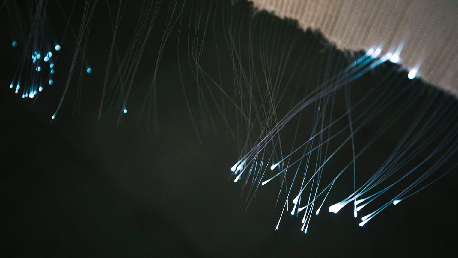
You can see the optical fiber woven into the cloth at the edges of the noren
So when we had no idea what to do, the staff found an existing type of glowing cloth for us (laughter). And its quality was rather nice, too. Thanks to them, we somehow managed to meet the deadline. I got help from engineers on systems like the one that makes it light up, sounds, and detection sensors, and finally finished it, basically.
Toda: Now, in contrast with the digital approach Mr. Kuramoto took, Ms. Kimiko Sekido produced a piece with analog artwork.
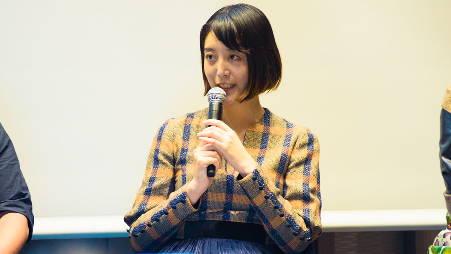
Sekido: My name is Sekido. It’s great to be here. I’m an art director at Dentsu, the advertising agency. I normally think about ways to convey corporate or product messages to consumers, and my job is fitting plans into actual designs.
In this noren project, I got my initial idea from the role noren once held. Noren were originally a nonverbal medium for illiterate people to tell store types. So producing noren even in the modern era, I wanted to address the challenges of that function. And since we would be displaying these in a high-traffic underground mall, I wanted it to be recognizable from a distance in a way that would inspire interest in Nihonbashi. All of that led me to realize that I should go with an iconic image.
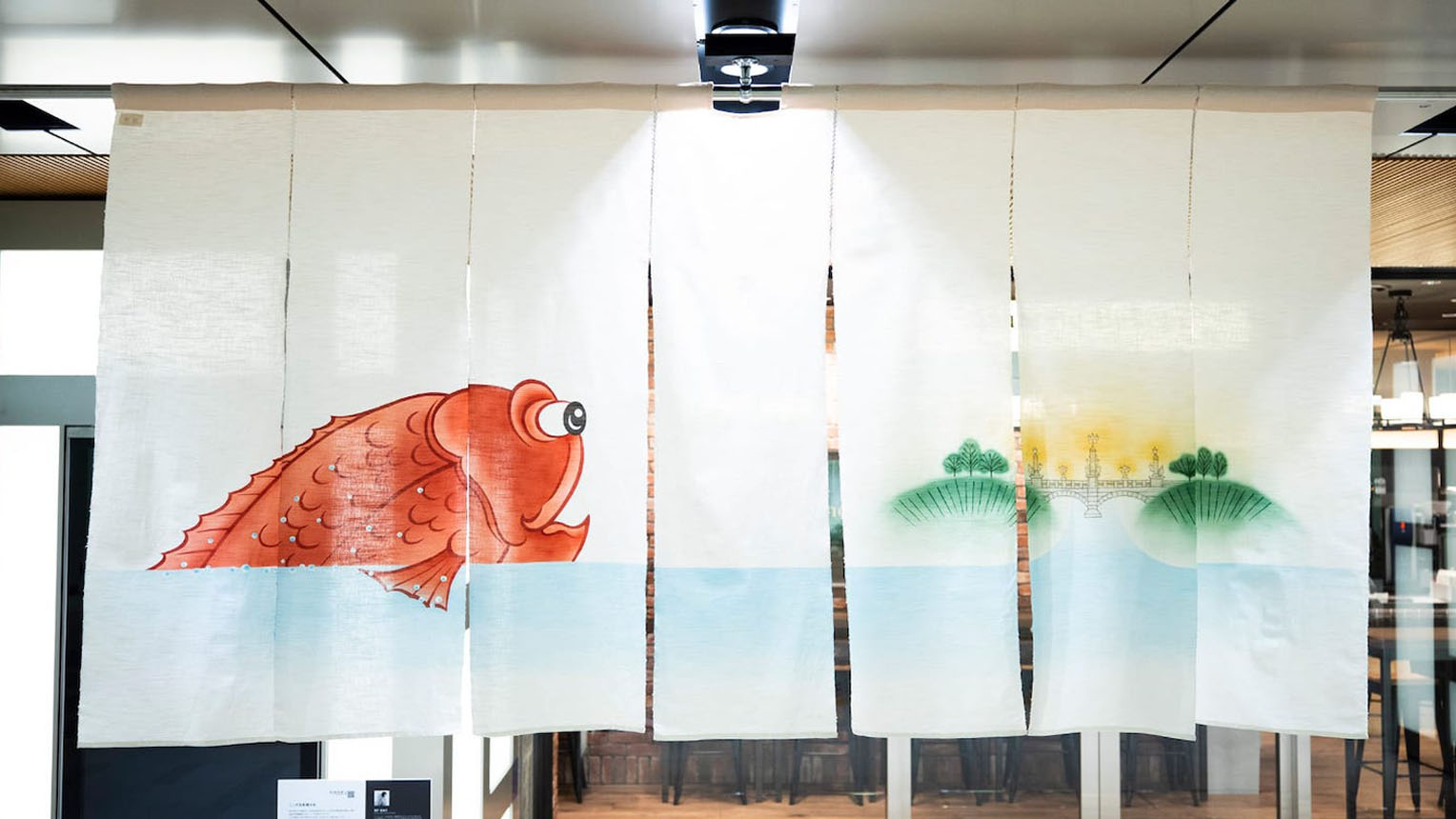
“Ah! This is Nihonbashi.” by Kimiko Sekido
I looked into Nihonbashi regional history when I considered specific designs, and learned Nihonbashi had a major riverside fish market and was a marine shipping hub in the Edo era. There was even an Ike-dai Yashiki, or live tai (sea bream) pond, during that era, and the image really stuck with me. Nihonbashi lost the fish market over the course of disasters and wars, but with the restoration of the bridge and recent developments, it is regaining its energy. On that point, I envisioned a story about “what would those tai fish from the Edo period think if they saw Nihonbashi now?” I decided to express the concept with illustrations of that.
Ms. Kimiko Sekido, Art Director, Dentsu
This is a rough draft I drew, and you can see the imperfections if you look at the water droplets and other details. But when I actually gave this to a yuzen silk hand-painting artisan for production, they inverted the base colors of the droplets, added gradation, and finished it into a perfect design. Having an artisan work over my design and plan and upgrade them was a truly great experience.
The illustration presented to the silk artisan (left), and the finished, dyed work (right)
Kuramoto: I thought this noren was amazing. I normally look for an explanatory factor, like a good point, when I create things. Using that philosophy in production, you rarely come up with ideas like illustrations, which compete on their style in a sense. So I thought it was amazing that you decided to compete with artwork, and embedded a story in the image.
Toda: I feel like I understand the idea of moving on to the artwork after pinning down your concept. However, I was surprised by the timing of Ms. Sekido’s decision.
Sekido: I always feel like it’s a challenge to balance logic and intuition in advertising work. But my own personal desires were involved this time, so I just wanted to grapple with the original expressive methods noren used, without overthinking it. I was also struck by a sense of the variation when it hung beside the other creators’ works, and felt that choosing the graphical expression route was the fun option.
Toda: Next up is Ms. Morimoto, who also participated, as the creator of a corporate-produced noren work.
Morimoto: I actually have a deep fondness for noren, and often make the sort of backstage noren used in plays at marbling printers in Kyoto. So I was confused when Mr. Toda didn’t speak to me immediately about this event he was working on (laughter).
Toda: This is the first I’ve heard of that (laughter).
Morimoto: I went independent from Hakuhodo, the ad agency, 12 years ago, and founded the office goen°. Since then, I’ve worked as an art director while treasuring my connections.
Of course, I produce a variety of ads, but since the theme today is creativity and the city, I’ll introduce some work that I’ve done that relates to the city. Just recently, I worked with Mr. Kengo Kuma, the architect, on the “Aore Nagaoka” complex that will serve as a city hall and hub for residents in the city of Nagaoka, Niigata Prefecture. This is an unprecedented structure, which serves as a city hall while sporting a skeletal frame structure with glass paneling. We expected local people to oppose this sort of sudden constructions, so we held monthly workshops with the city planners and chamber of commerce over a year. We discussed it over drinks together, and through communication, we finished the project. As a result, all of the residents of Nagaoka won an award together from the Architectural Institute of Japan.
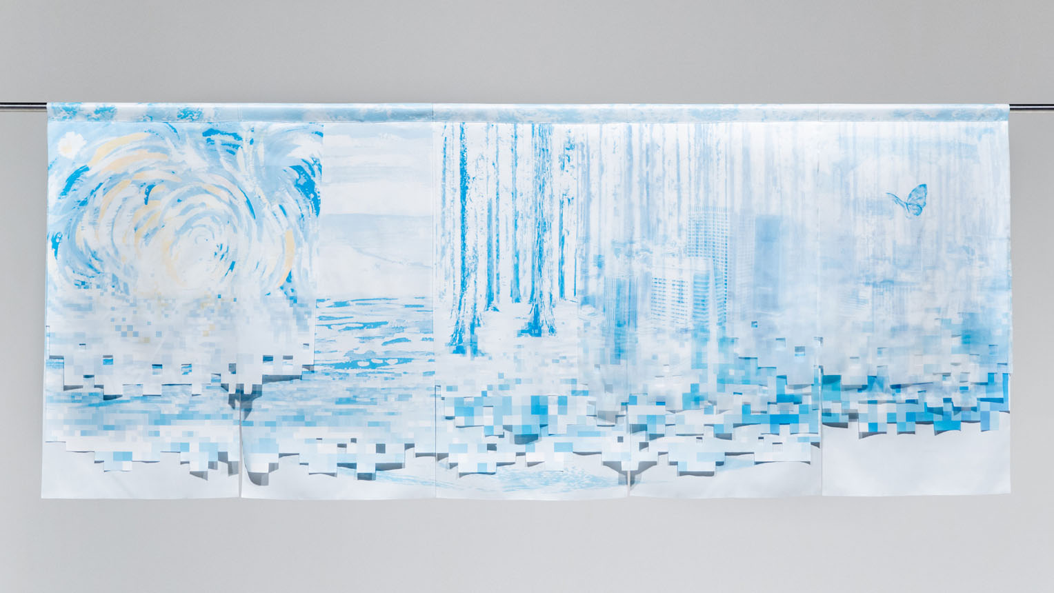
“World is made of various materials” by Chie Morimoto, for Toray Industries, Inc.
Now, about the noren for this event. I was in charge of the noren design for Toray Industries, in their planning department. When I looked into Toray more deeply for production ideas, I learned that they were the origin of all kinds of materials. That made me want to express the idea of a variety of overlapping starting points through noren. I’ve added multiple layers of different fabrics, each with a meaning representing the sea, forests, sun, city, and rays of light, and made the earth from them. The design weaves each element together to represent Toray.
Toda: How did you present the idea?
Morimoto: I made poster-sized versions of each layer, and explained that each layer has its own conceptual basis. I hung them all up on the conference room walls for the presentation, and let people actually pass through them.
Ms. Chie Morimoto, Art Director, goen°
Toda: Since we have these creators with us today, I wanted to talk about some other interesting noren works. Specifically, the katsuo-bushi fish flake “Mekuru Hana Noren” which was produced by Ninben Co., Ltd., and the obi sash noren by Mr. Jo Nagasaka, from the creator division. First, I’d like to ask about the katsuo-bushi noren.
Kuramoto: It’s impressive how well the fluttering of katsuo-bushi flakes on food matches with the fluttering of the noren when opened. You feel like you’re going into a katsuo (dried bonito) when you pass through them.
“Mekuru Hana Noren” by Ninben Co., Ltd.
Sekido: It’s cool how bold they are, presenting their product as-is.
Toda: Yes, you can really sense their deep passion for katsuo-bushi. I thought that was great, too. I think noren are a very physical presence. So this noren is great, with how it lets you physically experience the product.
Morimoto: You want to touch it, and it looks delicious when it waves. If only it smelled like katsuo-bushi. It would be even better if you got the scent of mellow dashi broth when you passed through.
MC: At the time, they talked about wanting to dye it with dashi broth, and I’ve heard they actually wanted it to smell like katsuo-bushi (laughter).
Toda: If they had, there would probably be cats circled around it all the time, which could be cute, too (laughter). And the other point was Mr. Jo Nagasaka’s noren made from obi sashes.
“Noren” by Jo Nagasaka
Sekido: This piece is amazing graphically in photos, even, but in person it has a very strong presence as a product. I think it’s amazing that a simple woven lattice leaves such a strong impression.
Morimoto: You really want to touch it when you see it. I think the woven obi sashes match with noren as a subject.
Toda: As an object, it has a quality that really makes you want it. Mr. Kuramoto, you know Mr. Nagasaka; what were his thoughts on this piece’s creation, in your opinion?
Kuramoto: We’re good friends, personally, and he’s incredibly skilled at thinking while he stares at an object, then finding the best elements within it. I think he finds ways to present what’s good in things.
Creating a chance for city residents to consider things personally
Morimoto: Noren are a good size, aren’t they? Art directors love double B-size posters, after all. Noren are close to that double-width poster size.
Toda: When you put it that way, they also connect with that ad for the band Mr. Children that helped raise your profile, Ms. Morimoto. The ad where you photographed lots of people actually spelling out the lyrics in wide angle, on a riverbank. Ms. Morimoto, your work often involves actual tangible objects or participation by lots of people, like in the city planning case you talked about earlier. What made you decide to take that approach in production?
Morimoto: When I was young, I had a lot of amazing senior designers around me, and thought about what my strengths were, what I should do, and how I should think about it. At the time, I noticed that I had a strong desire to communicate with large numbers of people. That made me want to create things with more participants. That feeling must be coming out in the work I produce. And maybe it’s seeing acceptance as something with scarcity value as a result, in this age of virtual communications.
Toda: After all, this is the inverse of the philosophy for ads, in essence. I think it’s a really fun idea for the person right there to gain passion, and it’s similar to the philosophy in urban planning. Mr. Kuramoto, as a product designer, you also participate in events like the Milan Furniture Fair – the world’s largest furniture expo – don’t you? They say the entire city gets caught up in the event. I think that sort of event is fascinating in terms of the relationship between cities and design.
Mr. Koichiro Toda, Moderator and Creative Director of NIHONBASHI MEGURU FES
Kuramoto: Events like Milan Fashion Week are similar, too, and independently of the content itself, it’s fun just having a lot of people in one place, excited over something. In addition to that, these events need an idea of how to push the people who gather in a direction, and I think Ms. Morimoto is really great in that field. It’s sort of like showing this crowd a marker to follow and suggesting it might be fun or exciting to do something as you work them up.
Sekido: I actually was one of many students who participated in a job for Ms. Morimoto, back when I was a student. I remember it being a very fun atmosphere.
Toda: This also goes for city planning, but what is the trick to everyone having fun together?
Morimoto: The important thing in city planning is making things personal issues, rather than other people’s problems. Keeping up things that the person wants to do. I start out at a sprint, but find myself at the back of the crowd halfway through, and in a sense I get left behind (laughter). I start as the captain and by the end I can’t even get onboard, much less a spot on the crew, so it’s like I’m seeing off a ship the town residents are on (laughter).
Toda: Mr. Kuramoto, are you interested in large endeavors like city planning, as well as product design?
Kuramoto: Very much so. I feel like it might be the era for it, and that there is a limit to what can be achieved by enhancing individual capabilities. I’m interested in designing ways to motivate people to the maximum, since you need to do that for participants in order to use everyone’s abilities fully.
The city of Nihonbashi, from a creator’s perspective
Toda: Approaches like the ones for this NIHONASHI MEGURU FES are a lot of fun, where you involve the companies and residents of a city in planning and provide a venue for collaboration. And I think “fun” is a very important element of this way of doing things.
Morimoto: I agree. And in terms of the relationship between Nihonbashi and noren, I think it’s the sentiment that noren are a point of pride, or rather have always watched over our stores. For noren, you need quality and techniques suitable for that history and pride, as well as a sense of fun in making them. The city demands a certain level of skill given its history, so it’s not like Shibuya or other cities on that point. I think noren and Nihonbashi go very well together, in that sense.
Toda: Through NIHONBASHI MEGURU FES and my dealings with local residents, I sensed their generous levels of challenger’s spirit, and their will to make changes. I was sure that a lot of people would be unwilling to change their ways out of an excessive emphasis on tradition, so that was surprising, and something we all should learn from.
Sekido: I got a sense of how skilled Nihonbashi is at separating things to keep and things to upgrade, as a place. I think it would be great if there were more places with that attitude outside of Nihonbashi, and they could all keep their own identities while expanding on city planning that involves all types of people.
Kuramoto: Honestly, I didn’t have a very positive view of the large-scale development in Shibuya and Nihonbashi, and thought it should stop, personally. But participating in this project gave me a chance to think on the area clearly, taking in a diverse group’s views. From the inside, you can see how many people are passionate about this. As one of them, I helped bring about the “Meguru Noren Exhibition,” and that experience led me to think that urban development isn’t such a bad thing after all.
Toda: Ever since I first heard about NIHONASHI MEGURU FES, I’ve been wondering how people go about urban development, and this project’s attitude of letting things stew while we think has been extremely informative. There is a lot we can achieve by pooling our strength for creation. That’s why I hope we can create places for people to produce things alongside colleagues, not just creators, and connect the people with their city. Thank you all for participating today.
Text: Yasui (Konel), Photo: Daisuke Okamura
The Theme is “OFF TO MEET” And They Have a Message for Modern Society.
Placing a Major “Pin” in Kabutocho. Completion of the “K5” Micro-Complex.
.jpg)
SAKURA FES NIHONBASHI / OFF TO MEET Short Report: Background on Original Souvenir Production.