Collaboration of expression with artisans. “A single frame comic Noren” with a story.
Collaboration of expression with artisans. “A single frame comic Noren” with a story.
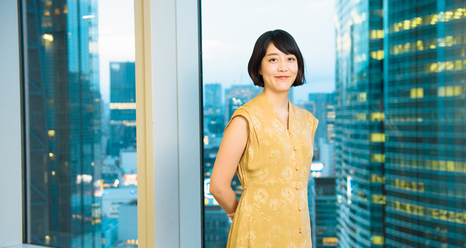
[Meguru Noren Exhibition - Interview with Creators vol. 3 Ms. Kimiko Sekido]
NIHONBASHI MEGURU FES which has been taking place for about 2 months since September 27. Various creators participate in one of these events called “Meguru Noren Exhibition”, to design Noren curtains to express the town of Nihonbashi. We have made a series of interviews with three young creators who took the challenge to make the Noren for the exhibition starting on Friday, October 11.
For the 3rd volume, we interviewed Ms. Kimiko Sekido from Dentsu Inc., an art director of Zespri Kiwifruit Brothers and Otsuka Pharmaceutical ion water. We had Ms. Sekido, who has been receiving many awards in the recent years, talk about the thoughts and the way of expression incorporated in the Noren artwork.
Aiming to realize non-verbal communication through Noren which anyone can feel the town of Nihonbashi
- First, could you tell us about the intention behind the Noren project which you created?
Whenever I create advertisement for work, I keep in mind “not to output anything closed in a narrow world”. Based on this way of thinking, as a Noren that would be hung on a new opening facility in Nihonbashi, I tried to create a Noren that would even draw the interest of those who are not in touch with Nihonbashi on daily life.
- Specifically, how did you put those ideas into the Noren design?
In creating the work, I learned that Norens originally were helpful as a sign that allowed people who cannot read to differentiate what kind of store it was. Getting a hint from the non-verbal function that does not limit its users, although it is crucial that the Noren can satisfy those who understand the history of Nihonbashi, but I aimed for a Noren that can give positive impressions such as “looks like a fun place” and “looks like a lively place” to people without prior knowledge of Nihonbashi or who just walked by it.
Also, through learning about the history of Nihonbashi, it was impressing to learn that fish market thrived during the Edo period, logistics by ship had popularity, and “Ikedai Yashiki cage” existed to keep expensive fish (sea bream) alive exclusively for the imperial court. I decided to use “sea bream” as a motif for the Noren and to depict it together with a river that brought energy to Nihonbashi. Nihonbashi was victimized by earthquake disaster and war fire and lost its riverside fish market, giving an impression that its behind. However, the current Nihonbashi has been recovering its energy with the recent bridge renovation and the redevelopment of the town. My Noren design is what came from an idea sort of like a manga comic that “I want the sea breams of the Edo period to see the ‘current’ Nihonbashi.”
“I had been wanting to make a Noren someday seeing them being used by stores and brands that succeeds the goodness of the old Japanese style,” said Ms. Sekido.
- That is a very cute sea bream, and it seems like many different generations can enjoy it. What is the intention behind using a comic like way of expression?
The reason for depicting the sea bream as a character is related to the environment of the artwork and the audience.
The exhibition area is the entrance part that connects to the metro has many traffic of people, and I thought that there are many people who sees it from a distance while walking, without stopping. Therefore, I wanted to make an icon that would catch people’s attention with first sight.
On the other hand, for those who came to see the work up close, although it may be enough for them to go through the Noren but I wanted them to have emotional involvement in the work by giving it a story like a single frame comic. I was also able to create a work that is not too difficult, easy to understand, and catchy - the essence I treasure when designing - so I would be very much happy if various people can go through the curtain.
In fact, when I first received this offer, I kept in mind of the rich variation of the exhibitions. I believe that expressing myself by thinking of the balance when all of the artworks are exhibited is my own way of designing.
New colors and expressions of design born from the collaboration with artisans
- Were there any difficulty or something that left an impression when creating the Noren?
Before I received this offer, I have always wanted to make a Noren. However, I did not know the details of the technologies and the type of artisans involved in the creation.
Because I was given an opportunity to create a Noren this time, I wanted to collaborate with artisans with special techniques. I kept this in mind from the sampling stage.
I was very moved when the sample arrived after giving the rough drawing at the beginning of the creation. This is, in fact, because I was working with an artisan of sugaki (hand-drawn) yuzen who directly dyes cloth with free hand painting and the reproducibility of the rough drawing was very high. Even “the slight touch of the brush” which I did not even intend on was accurately reproduced. Needless to say that I was moved, I was able to brace myself to fully convey my intentions so that the artisan would not be lost.
- During the creation process, were there anything you discovered that is different from your regular job?
In the past, I realized how narrow our usual range of colors are when I saw the actual works at the Katsushika Hokusai exhibition which cannot be reproduced in art catalogs. I had many opportunities to feel fresh about colors this time too.
Because of my job, I often work with print medium and onscreen that is constructed with CMYK and RGB. However, because the Noren was directly colored using dye, I was able to feel a type of color development and texture different from my usual work.
Also, it was interesting to see how the artisan interpreted my rough drawing into a drawing that is appropriate for hand-drawn yuzen.
For example, splash of water was depicted in mat circle using different blue to differentiate it from the sea surface for the rough drawing, but it was expressed in gradation using only one blue color of the sea surface in the sample product. With the decrease of the colors, it became simple and also created a three-dimensional appearance in the work. I was impressed that this is the work of a professional.
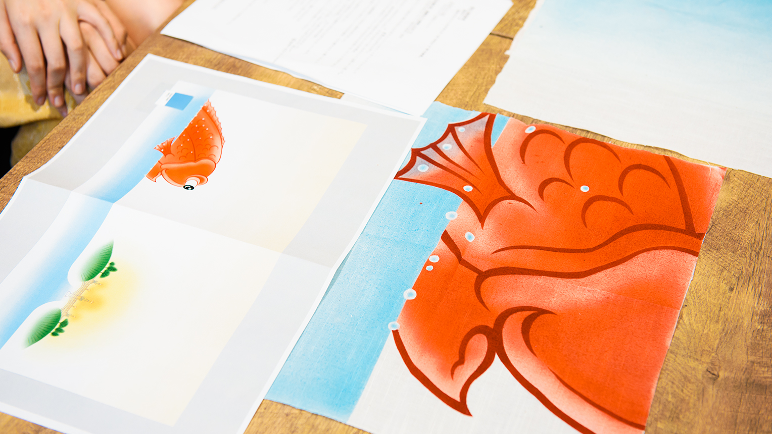
If you compare the rough drawing and the sample product, you can see that the way of artisan’s expression such as the colors and the strokes bring slight difference to the appearance of the artwork itself.
- The theme of the artworks this time is “The town of Nihonbashi.” It’s very rare to create a work that’s themed on a town but in what ways did you feel that the project was exciting?
I felt the amusement and the importance of understanding the character of the town through researching, walking around, and hearing about the future development of the town of Nihonbashi. Town planning is a good prime example. In expressing the character of the town, it is necessary to make an update by selecting what to leave behind. With such difficulty, Nihonbashi has an exquisite balance of the “Japanese-like atmosphere that Japanese people are familiar with” and “scenery which foreign tourists would want to take photos” and is a place with comfort and a sense of sizzle. For instance, if we reproduced “Nihonbashi during the Edo period” simply because it expresses Japan, it would turn out as something that looks good superficially, but it’s actually built upon a great balance.
Although there is a tendency to emphasize “for foreigners” and “for tourists,” I believe that it’s important for the town to be a familiar place for not only those who come from the outside but also those who live in it. It would be splendid if the design can bring out the uniqueness of the town without standardizing it. In that sense, there is a commonality with my work as an art director in which I create the character of the company or products.
The Noren I made this time is what was created from keeping that in mind, so I would be very happy if the people who go through the Noren could take an interest or be familiar with Nihonbashi.
Interview and Article: Kei Furuta (Konel) / Photo: Daisuke Okamura
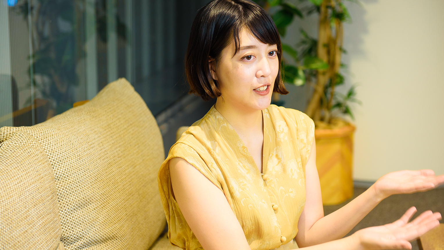
Kimiko Sekido
Art director/designer. After graduating from the Tama Art University Department of Graphic Design, started working at Dentsu Inc. Her works of art direction includes Zespri “Kiwifruit Brothers” and Otsuka Pharmaceutical ion water “Otona wa nagai,” and Netflix “Rilakkuma and Kaoru” campaigns.
The Future of Cities and Creativity – “β Lounge” Volume 2 Public Talk Report
“New perspectives” born from daily experimentation. Taking a look at the shape of contemporary design that “we+” aspires to.
A meeting of equals made in the darkness; the reason why Dialogue In The Dark Japan values “dialogue”.