The Challenge of Re-designing Traditional Motifs. “Meguru Noren Exhibition” Launch Event: Discussion Session Report
The Challenge of Re-designing Traditional Motifs. “Meguru Noren Exhibition” Launch Event: Discussion Session Report
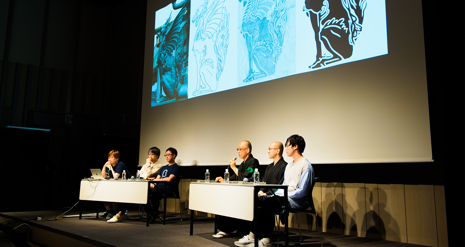
This fall, under the theme of updating the fascinating assets of Nihonbashi using new artistic forms of expression, the first-ever “NIHONBASHI MEGURU FES” will be held. The “Meguru Noren Exhibition,” being its main attraction, is a design event for various creators to express “The Town of Nihonbashi” and the “The Companies of Nihonbashi,” using the traditional motifs of Nihonbashi called the “Noren (Japanese store curtains).” Original works of noren will be displayed across a length of 150 meters to re-imagine the lively atmosphere of the town, back when Nihonbashi still had a riverside fish market.
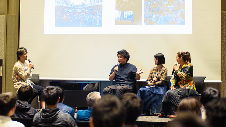
On June 5th, a launch event was held that invited participants who created these works of noren for the “Meguru Noren Exhibition,” including the companies of Nihonbashi, guest creators, and the young designers who were looking into submitting their works to the design competition. Today, we would like to highlight a snippet of the discussion session by guest judges which were also well-received by the participants.
What is be the meaning behind designing a “Noren” today?
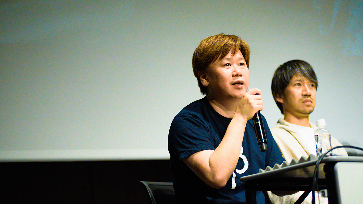
The moderator for the discussion session was Mr. Masayoshi Boku, a representative from Bascule Inc.
Mr. Masayoshi Boku (hereinafter, Boku) : Thank you all for coming today. I would like to begin by talking about the theme of “Designing a ‘Noren’ in the present day.” Before that, I want to ask everyone here; “Have you ever designed a noren?” As I understand it, in addition to the companies and stores that have long supported Nihonbashi, we have a participation of young designers today. But not many here have experience in designing a noren.
Most of the participating companies are all thinking something to the effect of “How we can Express our Company Identity through the Motif of a Noren.” Likewise, the creators here too are wondering on just “What should we base on to create a noren.” That is why for today, I hope we can all share why we are designing a noren in the present day, and what are the approaches that can be taken for such an activity. To begin, could we have a word from Mr. Hatoba, who created this fantastic Kylin noren that is displayed at this venue today.
Direct expression, and “minimalist” expression. 2 aspects in the approach of “Mon (crest).”
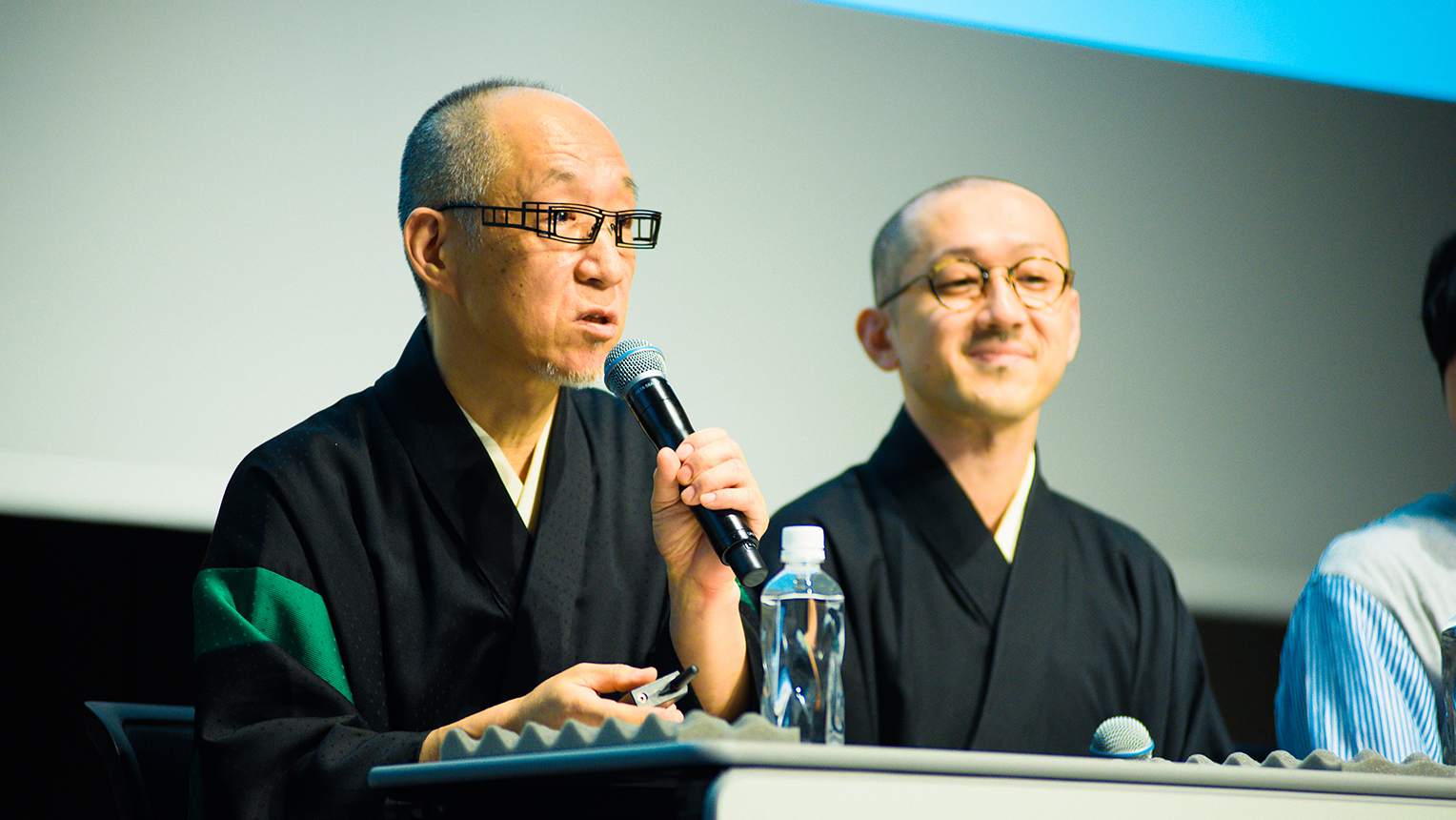
Painters of Family Crests: Mr. Shoryu Hatoba (left) and Mr. Yohji (right)
Mr. Shoryu Hatoba (hereinafter, Shoryu) : Good greeting everybody, my name is Shoryu Hatoba, and I am a Monsho-Uwaeshi (artisan painter who paints family crests onto kimonos by hand). I would like to talk about my approach called “Mon,” but there are two methods. One is in direct expression, and the other finding meaning by trimming away until the bare minimum. As we may have it, a noren that is currently hanging in Nihonbashi is a great point of reference, so I would like to begin by explaining this one.
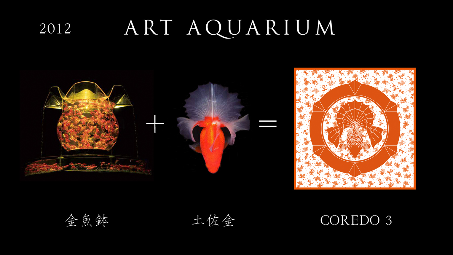
The Goldfish Crest (2012) at the “ECO EDO Nihonbashi Art Aquarium”
Shoryu : In 2012, I had the opportunity to create this Goldfish Crest for the “ECO EDO Nihonbashi Art Aquarium.” I designed the crest to show the Tosakin-goldfish exactly as it may look from atop a goldfish bowl. This approach would be the direct expression that I had previously mentioned.
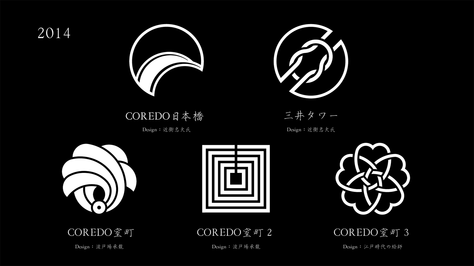
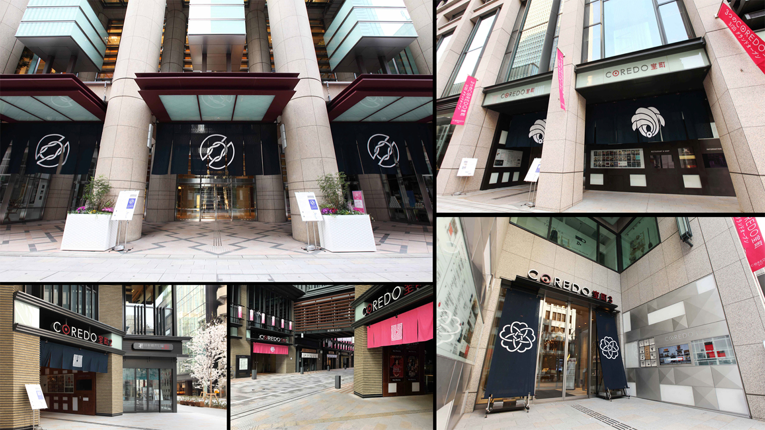
Crest designs of the noren per each building. COREDO Muromachi 1 (lower left) and COREDO Muromachi 2 (lower center) were designed by Mr. Hatoba
Shoryu : These are the crests we designed for the COREDO business facility in Nihonbashi in 2014. The designs of COREDO Nihonbashi and Nihonbashi Mitsui Tower were worked on by the creative director Mr. Tadahiro Konoe, with the COREDO Muromachi 1 and 2 worked on by myself. The crest of COREDO Muromachi 3 is a design by a painter of family crests during the Edo era.
Since the theme of COREDO Muromachi 1 was “Sakae (prosperity),” I thought of a crest design of a Noshi (strip of paper placed on a gift). The bottom part with the knot indicates the shape of a road-origin marker, as well as being the design of the “O” in COREDO. In addition, I made sure there were “3 fans facing west, and 2 fans facing east” to express the keyword of this entire project, which was the “Gokaido (Five Highways) and Nihonbashi as its starting point.”
The theme of COREDO Muromachi 2 was “Tanoshimu (Have Fun),” so due to Nihonbashi being a cultural center long ago, I turned the “Mimasu (3 Boxes),” which was the crest of the Ichikawa clan who were a family of Kabuki actors, into the “Gomasu (5 Boxes)” as a play on words to associate with the “Gokaido (Five Highways).”
I further made a line heading towards the heavens to express an auspicious atmosphere. These are all a way of expression that embodies minimalism.
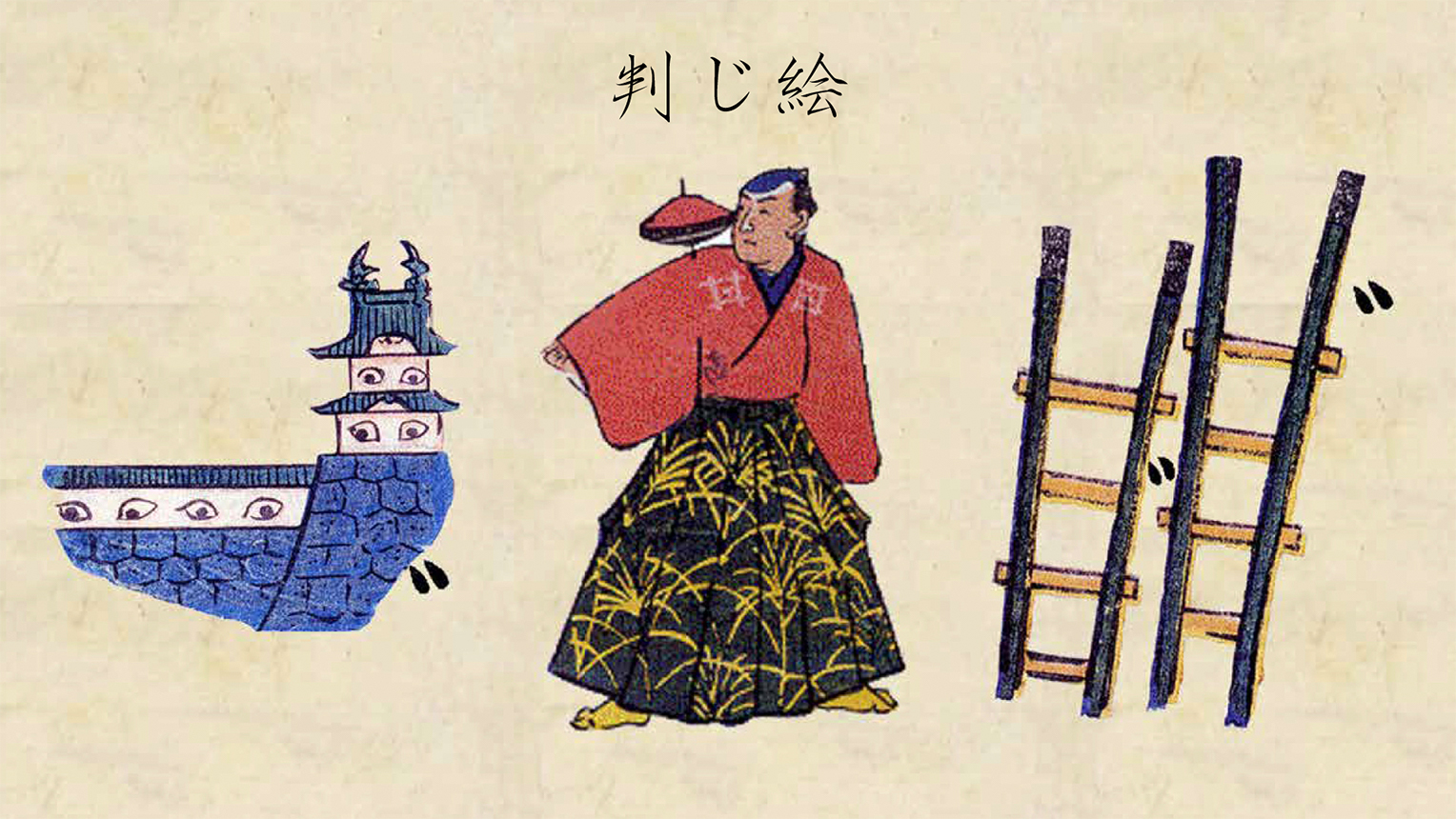
“Hanji-e (picture puzzle),” a riddle using pictures, that were popular during the Edo era among the general public.
Shoryu : I would like to continue on and show the following to highlight other ideas and expressions. This here are called “Hanji-e.” They are “riddles” that were popular during the Edo era. From the left, we have the Mejiro* (eye-castle), the Komagata* (top-shoulder) in the center, and the Nihonbashi* (two ladders) on the right. What we have here is a way of expression through combining these factors within a crest. *Note: These are word plays using the Japanese language. For example, Mejiro (a name of a town in Tokyo) literally means “castle and eyes” as seen in the picture of a castle and eyes with voicing mark.
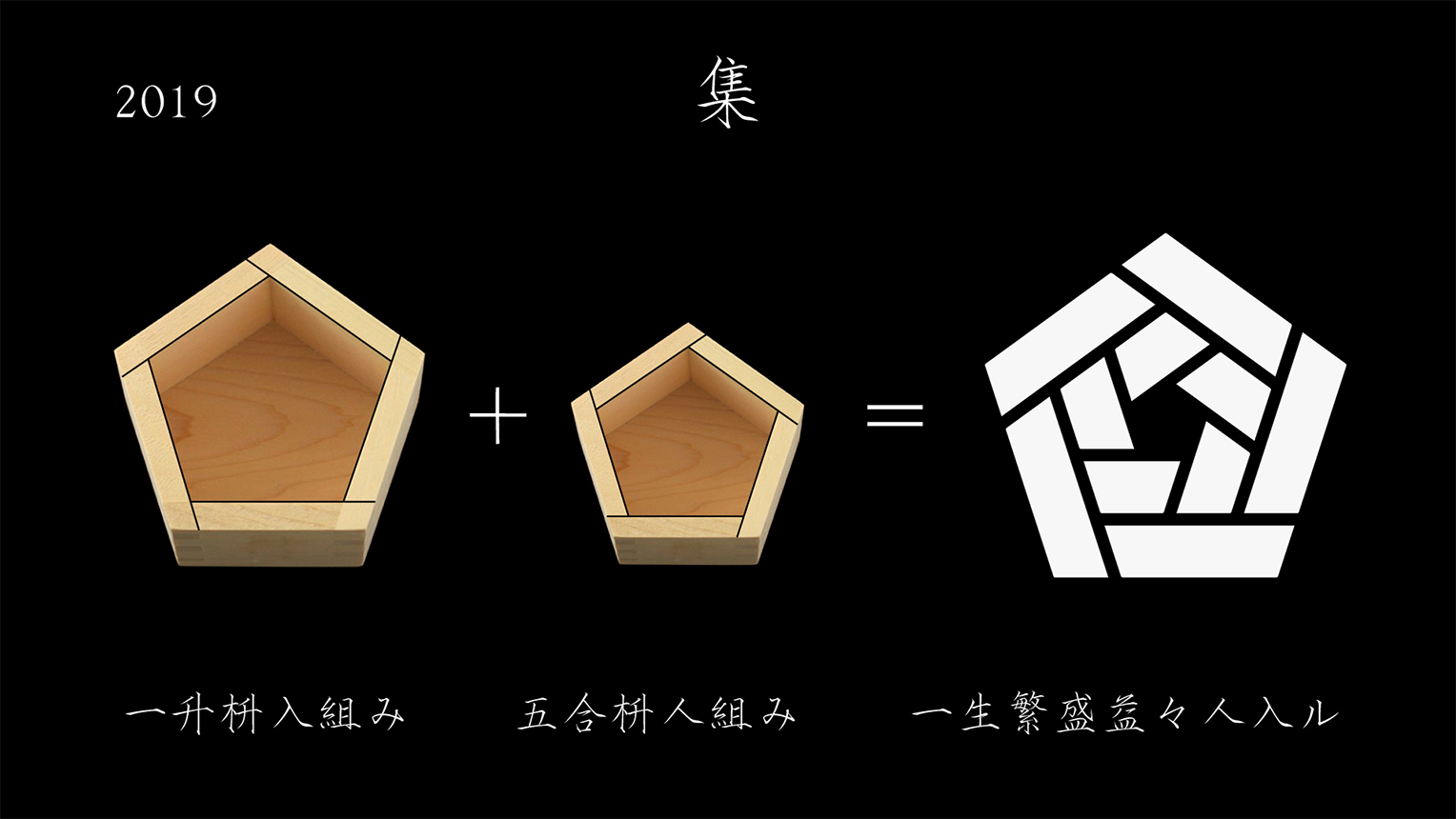
The crest of the COREDO Muromachi Terrace, scheduled for open in the fall of 2019
Shoryu : A crest that utilized this type of expression is for the COREDO Muromachi Terrace that will be opening in the fall of 2019. Here, the theme was “Tsudou (Gathering).” Similarly, I incorporated the “Five” from the “Five Highways (Gokaido)” here too. I began by having the right shapes of the outside box be joined over the top of the left shapes as a play on the Kanji character of “入 (Enter),” whereas the inside box have its left shapes joined over on the top of the right ones as a play on the Kanji character of “人 (People).” By doing so in this way, I wanted the crest to have the meaning of “Long Prosperity and Many Gathering of People.” This was to shape an image of everyone as a whole heading toward a future like a gate, whilst incorporating a message by a method similar to the Hanji-e.
Boku : Thank you. I understand that there are many corporations that are thinking of creating their own crests, and designers wanting to try creating the crests for the town of Nihonbashi. So what I want to ask Mr. Hatoba, is what exactly constitutes a “proper appearance and feel of a crest.” What exactly are the secrets to establish such things? I also understand that there is an aspect of word play and funny puns, just like the unique Hanji-e mentioned previously.
Shoryu : That....is extremely hard to explain. This will get into where we draw the line between what is and can’t be considered as being “crest-like.” The difference between a logo and a crest can be understood just by looking at the two, but to explain this using words is pretty difficult. However, as I will be explaining later, a crest is a form of expression using only “Lines” and “Circles,” so a challenge like this to “find beauty within limitation” is not something you experience often, and it may instead turn out to be interesting.
Noren is a form of media that embodies “Japanese-ness”
Boku : Those may turn out to be the crucial points of the design, and I hope everyone here will challenge towards something similar. We just had Mr. Hatoba state from the approach of how a crest could easily be a symbol of a noren, but next we would like to hear what Mr. Nakamura, who has created numerous norens, has to say about the role and history of norens, and its many variations.
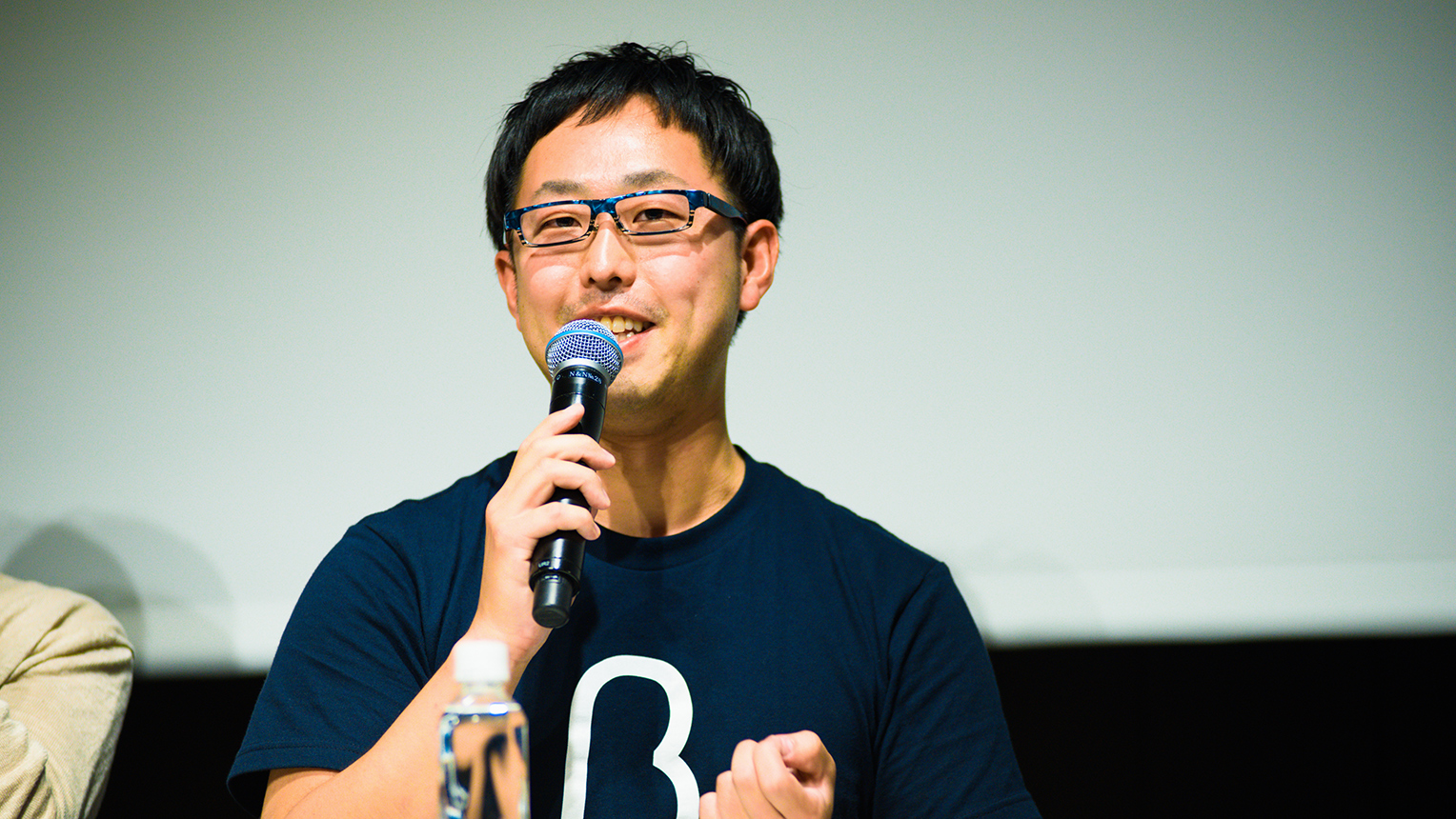
Mr. Shin Nakamura, Noren Director
Mr. Shin Nakamura (hereinafter, Nakamura) : My name is Shin Nakamura, and I am the CEO / Director of NAKAMURA. As introduced by Mr. Boku, my main work is in creating noren. Through collaborating with designers, constructors, artisans, etc. I am involved in the planning and designing of norens that are displayed in the entrances and spaces of business facilities. Our company is involved in two major challenges. One of our challenges is in raising the status and awareness of norens, and proposing various new ideas involving noren to business facilities. The other is in having the noren become an interface in proposing the skills of traditional Japanese handcrafts and artisan craftsmanship.
Norens had existed for a long time, from its very beginnings as a simple drape to keep away debris all the way back in the Yayoi era (300 BC to 300 AD), to the Muromachi era (1336 to 1573) when “marks” began to appear in norens, to the Edo era when it took its current shape as a form of advertisement, and finally to today. Noren may be something we are all familiar with, and though we may have never really put close attention, contextually there is something very Japanese about it.
A partial example of Mr. Nakamura’s past works as producer and creator
Nakamura : One of the keywords is “Duality.” To “separate space without cutting off.” I personally feel very fascinated in this concept. Every time I’m creating a noren, this concept always comes up in my head and it just seems like a very traditional value of Japan. To me, when there are two things, what makes something Japanese, is the idea of co-existence, rather than conflict. For example, just like how the Kanji and Hiragana letters co-exist together in text, there is something very Japanese in having no clear-cut boundaries. I feel that the noren exemplifies that concept very well.
Continuing on, even under the keyword of “Media,” to me is very Japanese. Noren is prevalent only in Japan, so there is something iconic about it. When a person who is not Japanese ever sees a noren anywhere, he/she may not know the word “noren,” but they would understand that the curtain is a sign that the restaurant serves Japanese cuisine. It has even been said that the reason for adding markers to the noren during the Muromachi era was that the literacy rate was quite low during that period, and the marks were added to let people know that “this store sells fish.” I believe it is a primitive form of media, and a very Japanese medium.
Another aspect I would like to point out is the “Layer.” The noren as a symbol of the history and branding of a company. There's even a word to express an ancient form of franchising called “Noren-Wake (Sharing a Shop Curtain, giving someone the right to use the shop’s name).” It may not be physical properties, but I feel there is enormous meaning behind an intangible noren. But, although it may have “weight” as an intangible asset, the noren itself is not restricting, but rather flexible, and is fascinating just how free-form it is.
Finally, from the perspective of a “Border.” I’ve always felt that “going under” a Torii-archway to go from the inside to the outside and vice versa, to be a very Japanese form of manners. For example, even though you can see what is behind a noren, the inside and outside is still separated because you have to “go through” a noren. I think this shows a distinctive understanding and culture of this country regarding borders.
Noren being a “Window” for a Company, Similarities to Advertising
Boku : Thank you Mr. Nakamura. By utilizing the features of the noren described by Mr. Nakamura, I feel that not only you are designing on a flat surface, but you will begin to see the meaning behind the “design of the noren itself.” Next I would like to hear from Mr. Toda. Mr. Toda is a creative director who is involved in providing support to mass-appeal a company and/or a brand. Currently he is in charge of the overall direction of the NIHONBASHI MEGURU FES, and I feel that there is a similar relationship between “a brand and a noren.” Since I feel that the townscape of Nihonbashi involves the presence of a noren, I would appreciate if we could hear your opinions on that matter as well.
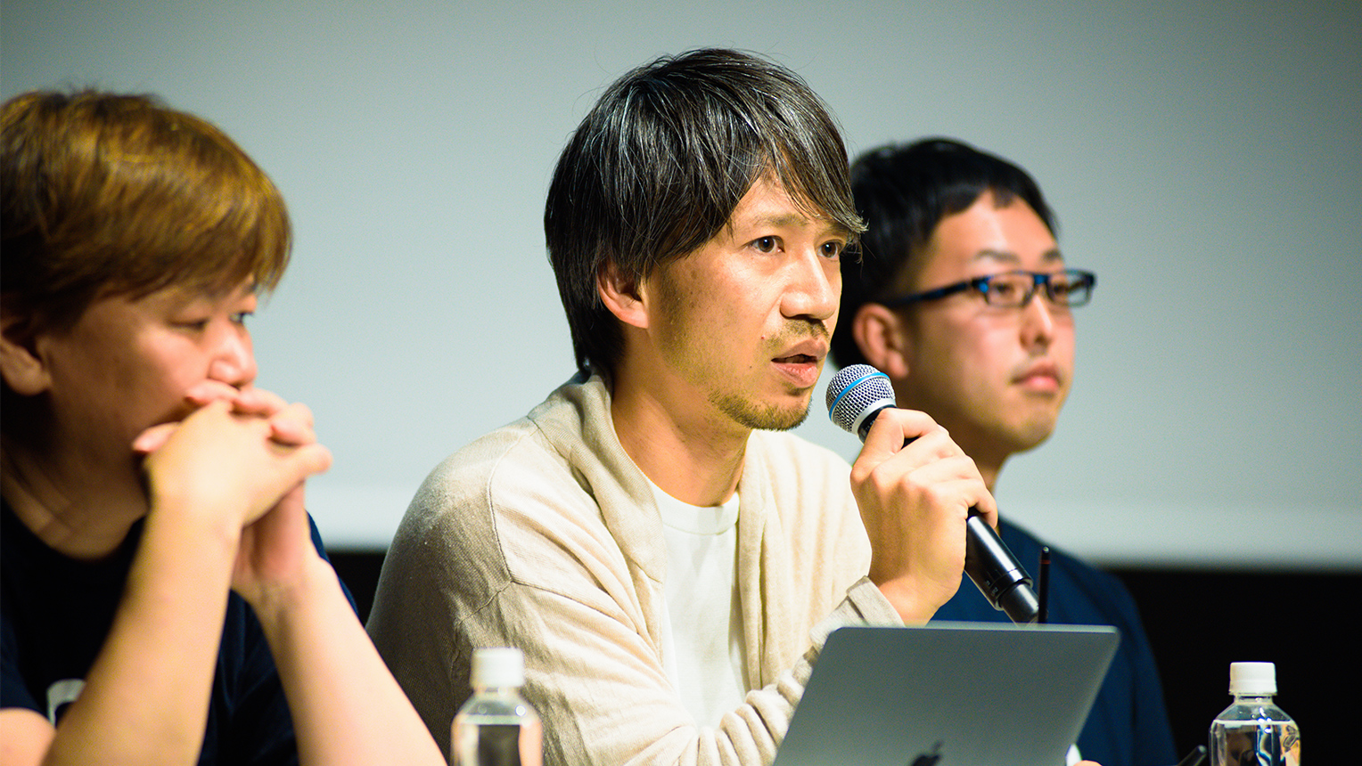
Mr. Koichiro Toda, creative and art director of CC INC.
Mr. Koichiro Toda (hereinafter, Toda) : Thank for your time, I’m Toda. I manage a company called CC INC. where we support in creating businesses through a fusion between the Creative and Consulting. Although we had many opportunities to be involved with various companies from an advertising perspective, I have never personally created a noren before and therefore am out of my comfort zone. So for today I would like to talk about my inspirations and perspectives from the position of an outsider. I believe that if you expand on the concept of a noren, eventually it will lead to advertisements.
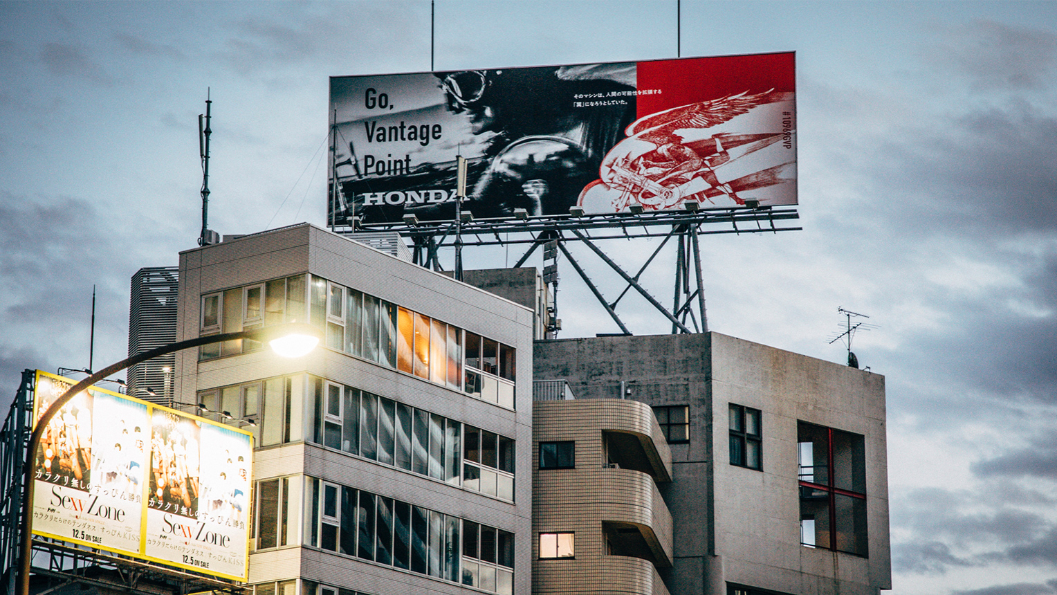
Advertisement for Honda’s “Go, Vantage Point” (2019)
Toda : Although I have been involved in the world of advertisements for close to 20 years, I feel that compared to noren, advertisements have more information packed into them. This is a recent advertisement I was in charge of for Honda. We used ONE OK ROCK’s song “Go, Vantage Point” and structured this advertising campaign around SNS by way of TV commercials and posters throughout the town. In recent years, the existence of hashtags for information gathering have made a complex world where having people looking at an advertisement would trigger something else. We work in building a visual medium through the arrangement of such trends. On the other hand, the challenge of creating norens that everyone here will be taking part in, is in its concise straightforwardness. It is very interesting, but very difficult at the same time. But there is something deep and provocative about that.
Advertisements, albeit having an enormous amount of information and different in shape, are similar to noren in that they become something akin to a “window” of a company in the town. We intentionally try to do the same thing in advertisement as well. I believe it would be interesting if you try to make sense of a noren in the same manner as an advertisement. You place importance on what a company wants to communicate, all the while trying to extract the given information and circumstances in order to highlight, or add another function.
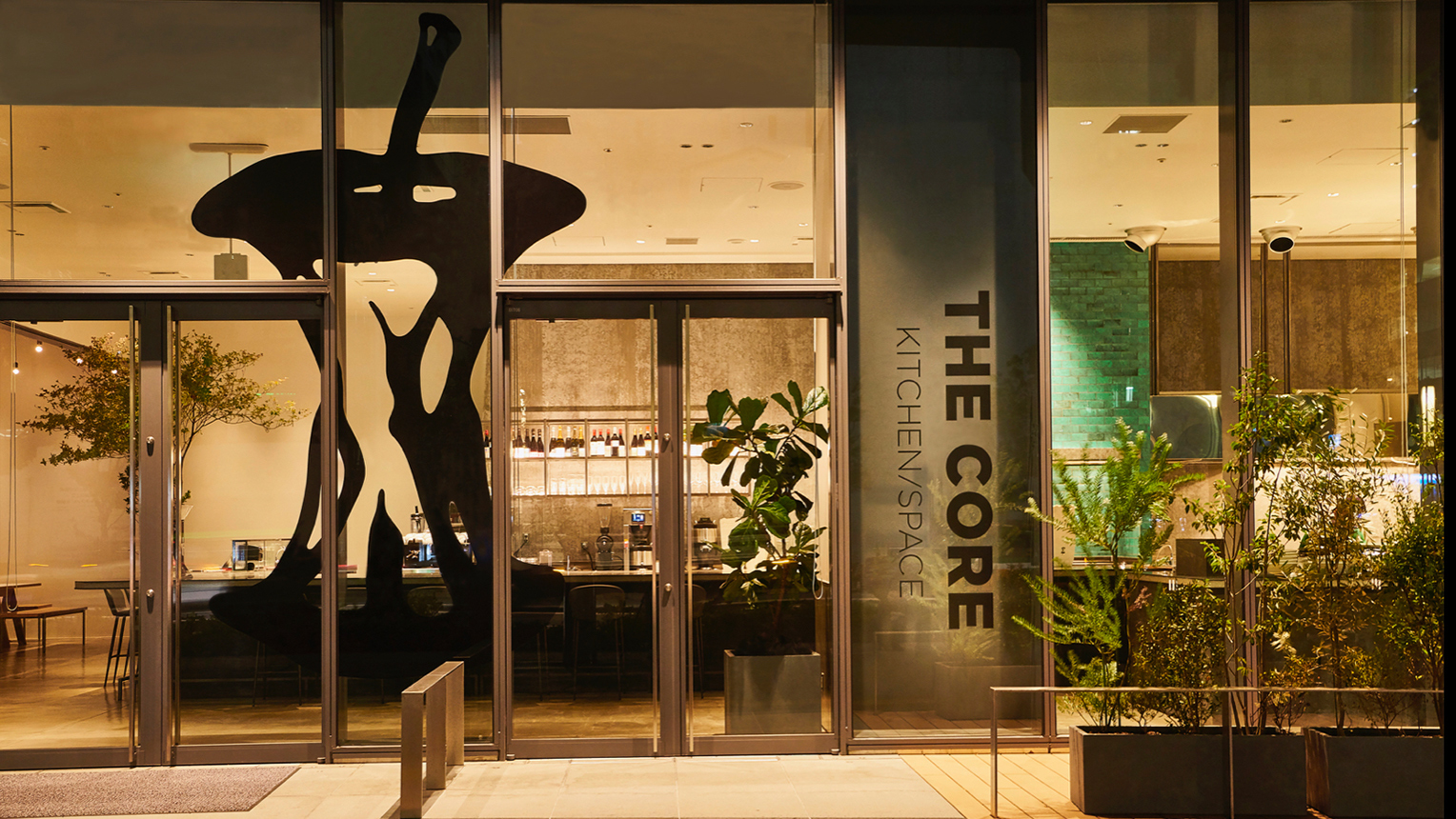
External view of “THE CORE,” a cafe & dining, and event space
Toda : I want to show an example of “THE CORE.” This is a cafe & dining location, as well as an event space that I was a part of from its conception stages. At this time, based on the idea of a “CORE,” I decided to design a logo under the theme of a core root of something, and ended up with a shape of an apple after it had been eaten. In addition to wanting a place that could function as both a cafe and communal space, I worked to add another layer to the design by incorporating the story of Adam and Eve, and the tree of knowledge using the image of an apple.
Furthermore, we designed the restaurant to be open-window so that it faced the street and town. I personally feel that by doing so we were able to add a function similar to that of a noren. Like this, I think you will be able to create an interesting noren by consciously “linking the inside and outside of the town.” I feel that the medium of a noren will change shape going forward because it still has the possibility to be a new device for people to discover something new or interact with when they pass by. I think it will be a good idea to really think about such things.
The Kylin Crest, Comprised out of an incredible amount of precise circles
Boku : Thank you Mr. Toda. Like Mr. Toda had stated, the possibility can really grow if you think of designing from the perspective of a brand being a “window.” We would now like to move to the next theme, and that is the theme of the design competition, “Noren to Express the Town of Nihonbashi.” Regarding this, we would like to hear our guests on how exactly they would move forward if they were to design a noren. To the back of the stage is the Kylin crest that was actually made under this same theme. First of all, I would like to first hear from the creator himself, Mr. Hatoba, about this.
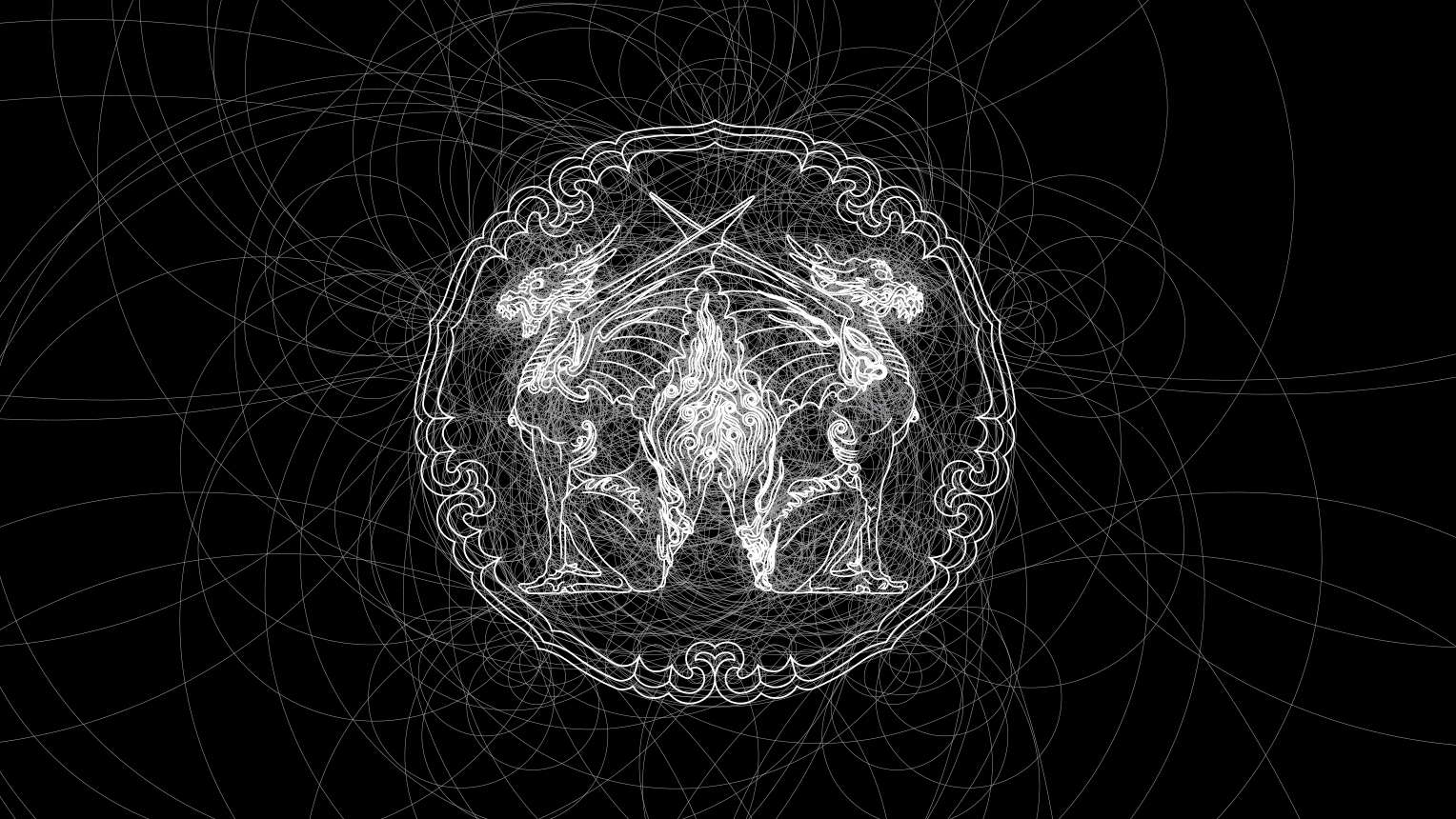
Drawing an arc through an infinite amount of lines in the shape of a Mandala symbol
Shoryu : “2,582.” Did anybody know the meaning behind this number? It is the actual amount of precise circles required to draw this Kylin. This Kylin crest was made from using only precise arcs of circles. The most amount of precise circles I needed to draw a crest until this piece was “1,077” for the “Konoebotan,” meaning this required more than twice that number of circles. Just to draw 1 Kylin it required 1 week, so it took 2 weeks for the entire process.
Next I want give an overview about the creation process. Us two, father and son, first went with stepladders and took photos of what shaped into the design. We then traced the photos, and after deciding which contour lines we needed to keep as precise arcs of circles, we drew up the crest. Next involved an indigo dyeing process to thicken the lines, so we made the lines thicker from the line drawing process, and after making a new outline, we used precise circles to clean up the lines to shape the final product.
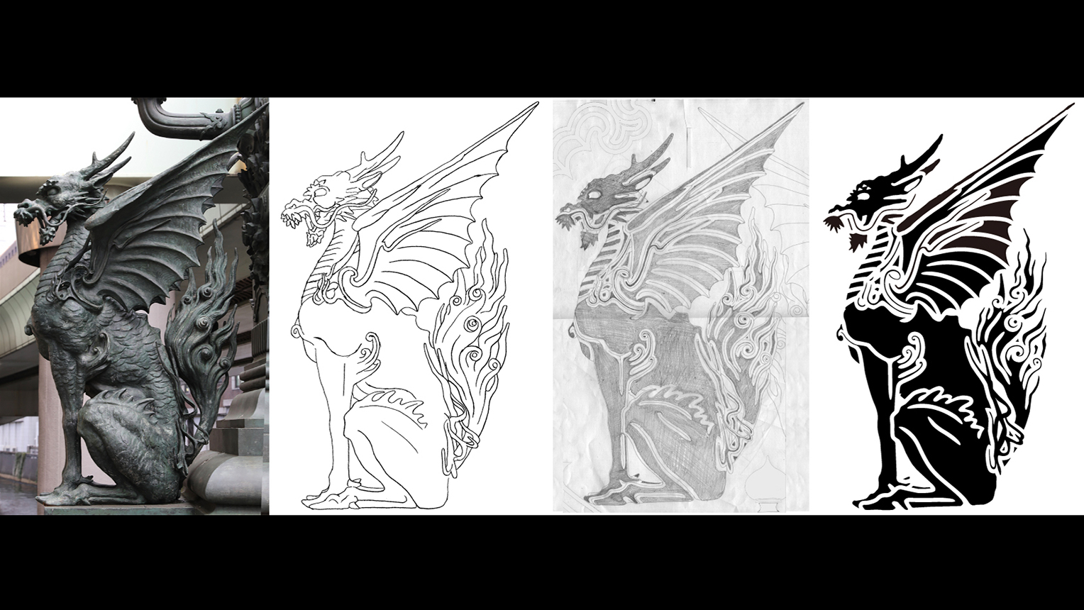
Building process of the Kirin image motif.
Shoryu : We added some tweaks to the ring part that surrounds the kylin design. By utilizing a decoration design on the actual Kylin statue, we combined 5 of these designs as a play on the “5 Highways (Gokaido)” to complete this.
Boku : I encourage everyone to see this up close later, you will be surprised. Not just the precise arcs of the circles, but as a work of art it is beautiful. In addition to being a play on the word “Gokaido”... This might be kind of hard to live up to (laughs), but the stories of the people actually making a noren should be beneficial.
What kind of noren should you make in Nihonbashi, a town devoid of ads and signboards?
Boku : Next will be Mr. Yago. If we can hear from your past experiences as a creator, what you would do if you were to create a noren.
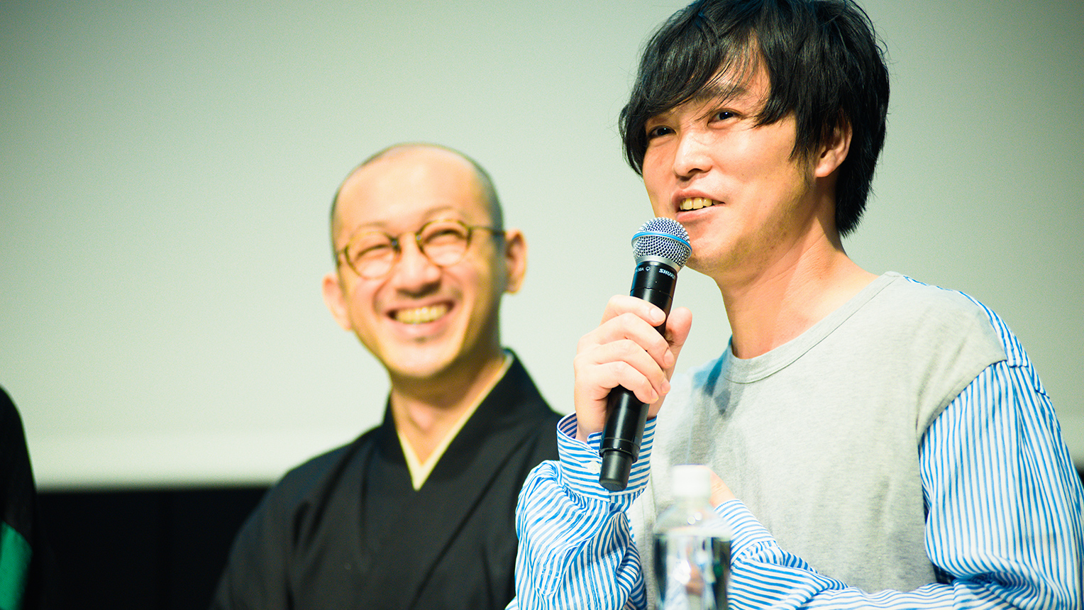
Mr. Naonori Yago, art director at SIX INC. Also serving as both competition judge and guest creator
Yago : Since I am going to participate in the Meguru Noren Exhibition as a guest creator, I have to make something worthy ranking with Mr. Hatoba’s creation...Let me just say that....that art work is incredible (laughs). I unfortunately still am working on a design, but I do feel that there are a couple of important points.
One, is that it has to be something related to Nihonbashi, and that you have to update the noren itself. Next, is that instead of just hanging a noren at a store, the idea should be tuned up to be exhibited and displayed. Personally, I am thinking of a colorful noren. I don’t think many of us here have seen a noren with various color combinations right?
This is because when I started thinking of a design, I have been reading a great deal of books regarding Nihonbashi. This was where I learned that the town often had the new replacing the old by way of many merchants from various regions coming to Nihonbashi since the Edo era. There was always a constant flow of setting up shops, some businesses prospered, while others withdrew. Due as such, recently I have been thinking that a colorful expression would be perfect for a noren.
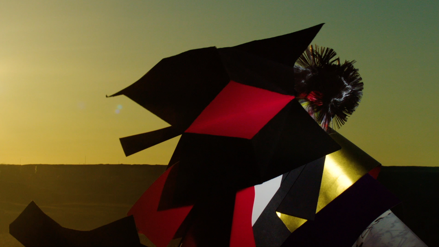
Advertisement for the LAFORET HARAJUKU GRAND BAZAR, under the theme of “Festivities”
Yago : Regarding the work of thinking about the town, I was previously involved in work for the LAFORET HARAJUKU for about 10 years. This here is an ad for the annual winter GRAND BAZAR that LAFORET always held, and made under the theme of “Festivities.” Originally the word “bazaar” had the meaning of festivity, and as most of you may know, Harajuku is a town where many fashion and cultures are born. People have a habit of holding a celebration whenever a child is born, or there is prosperity. So by holding a bazaar in Harajuku, we decided that the design should be about the celebration of the fashion and the culture born in the town.
There was another advertisement under the theme of a “clown,” and this was done in the motif of a circus. Since the GRAND BAZAR was held for a period of 5 days, we took it to mean a bazaar that had a performing clown that came and went quickly, but also left many people happy and at peace.
Similar to how I kept thinking about “how the LAFORET should be in Harajuku,” for this event, I wanted to try and challenge myself with the mindset of “how a noren should be in Nihonbashi,” or “what to create in order to realize the future of Nihonbashi,” etc.
Boku : Compared to cases in Harajuku or Shibuya where the town itself is building its advertisement, the town of Nihonbashi is almost devoid of ads and signboards. That is precisely why thinking about how you could present the town through the utilization of the noren as an interface would be an extremely worthwhile endeavor. But since Mr. Yago still has yet to announce anything, you can’t disclose too much can you? (laughs).
Yago : Uh, I did say colorful...but it actually might not be colorful (laughs).
An updated noren to envision the future of Nihonbashi.
Boku : Could we have some final comments from our guests regarding what kind of submissions they are looking forward to.
Toda : I think there are many cases where the very nature of being a designer, may make them put too much logic into their work and the creative elements gets lost. I want to see and look forward to works that boldly take up the challenge to push past such cases, and the creator making a noren from an entirely new perspective.
Nakamura : Today I raised 4 keywords as a guideline, but please keep in mind that these are my own ideas and meanings that I particularly take interest in whenever I create a noren. Like what Mr. Toda just said, I too feel that having the desire in creating norens that have off-the-wall inspirations from entirely new perspectives will lead to incredibly valuable results. So please do your best as much as possible.
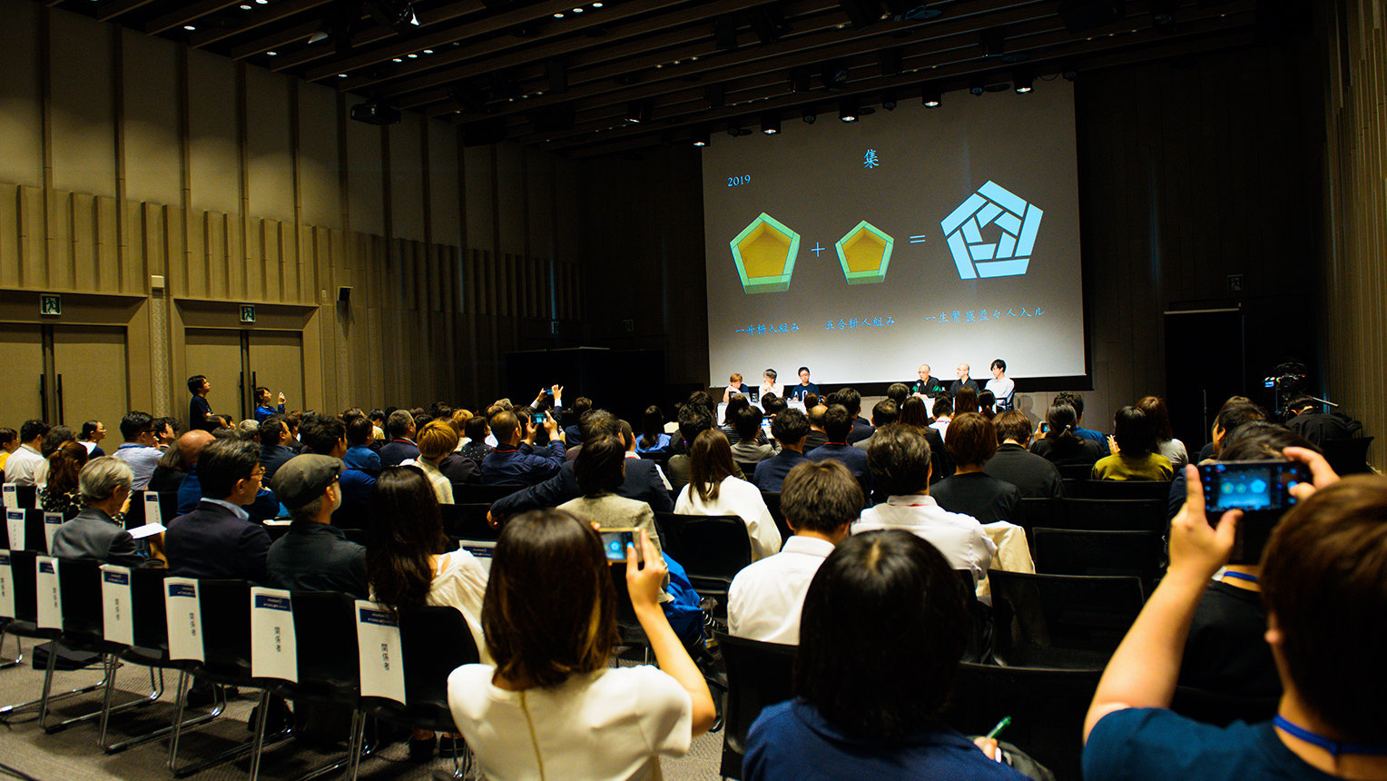
A gathering of young designers and company representatives considering submitting to the competition Shoryu: I myself is from the “Crest industry” and am limited from stepping out of my boundaries. That is why I would be pleased to see any works that would surprise me with completely new and radical concepts.
Mr. Yohji Hatoba : Please excuse me for not introducing myself, I am Yohji Hatoba, and am also a painter of family crests. Crests originally were born from a world that used only monochrome (black and white) colors, and were distinctive in that they were only drawn using precise circles and straight lines. Similar to the theme of the noren and how there is “beauty in the limitations,” crests have a trait in that it has never really used too much colors in its traditional production process. Nowadays, with more new technologies, you can make norens with vibrant colors and gradations. But even in such a free-form environment, I would be interested in at least one submission that would take up the challenge in creating a monochrome, black and white traditional crest.
Yago : I am hoping for a noren that could re-imagine Nihonbashi. Graphics are a form of expression that could draw up the future, so I am hoping to see something that imagines how Nihonbashi would change by way of the noren.
Boku : Thank you. We held the “Mirai-no-Noren (Noren of Future) Exhibition” last year, and due as such we were able to interact with many creators and companies through the production process of noren, and opportunities for creating new projects. I believe the noren has the power to express the brand of a company or store. Just like last year, I believe that due to the production of noren by the creators here today, it would develop further interaction within this town. I hope that every creator here today will take this opportunity to pull out their ambitions and work towards something you’d think is fantastic to establish in this town. Finally, please give a warm round of applause to our guests today.
(applause)
Interview and Article: Rui Minamoto / Photos: Daisuke Okamura
