Keyword “The Aesthetics of Edo” Behind the scenes in the rebranding of long-established Nihonbashi tea store, Yamamotoyama.
Keyword “The Aesthetics of Edo” Behind the scenes in the rebranding of long-established Nihonbashi tea store, Yamamotoyama.
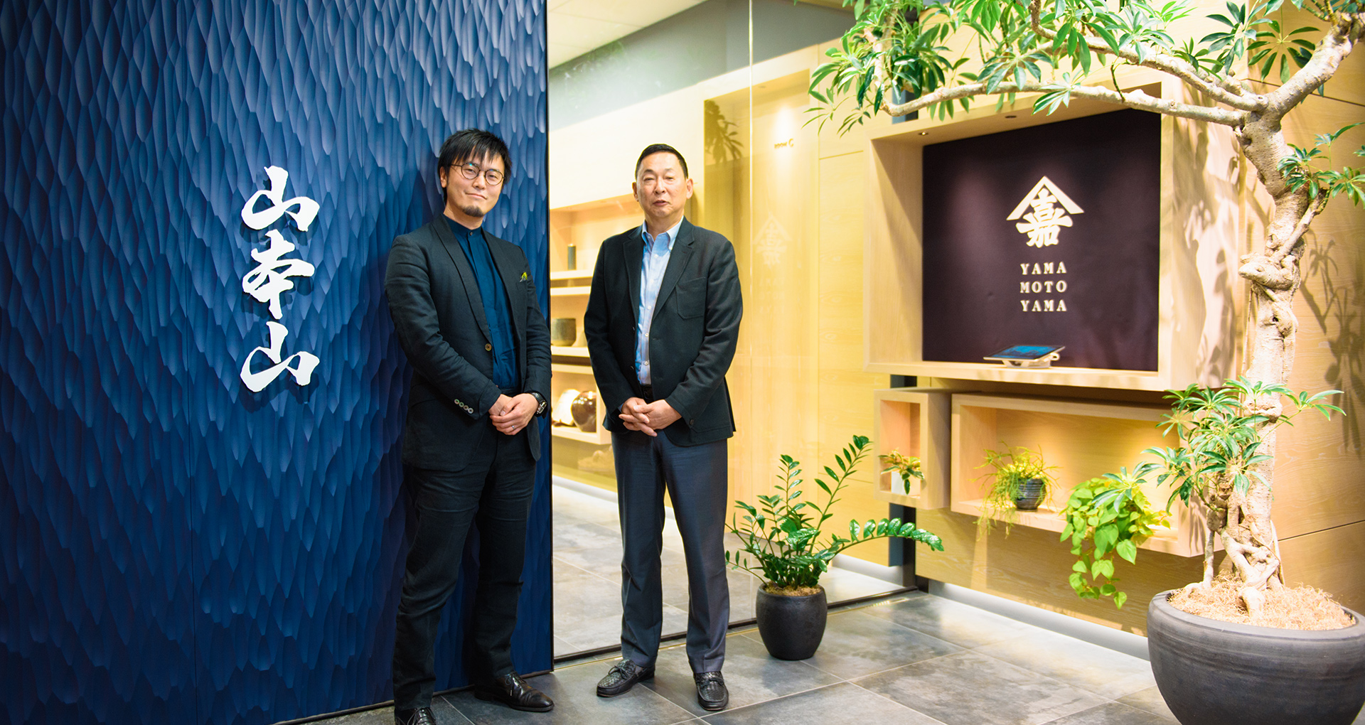
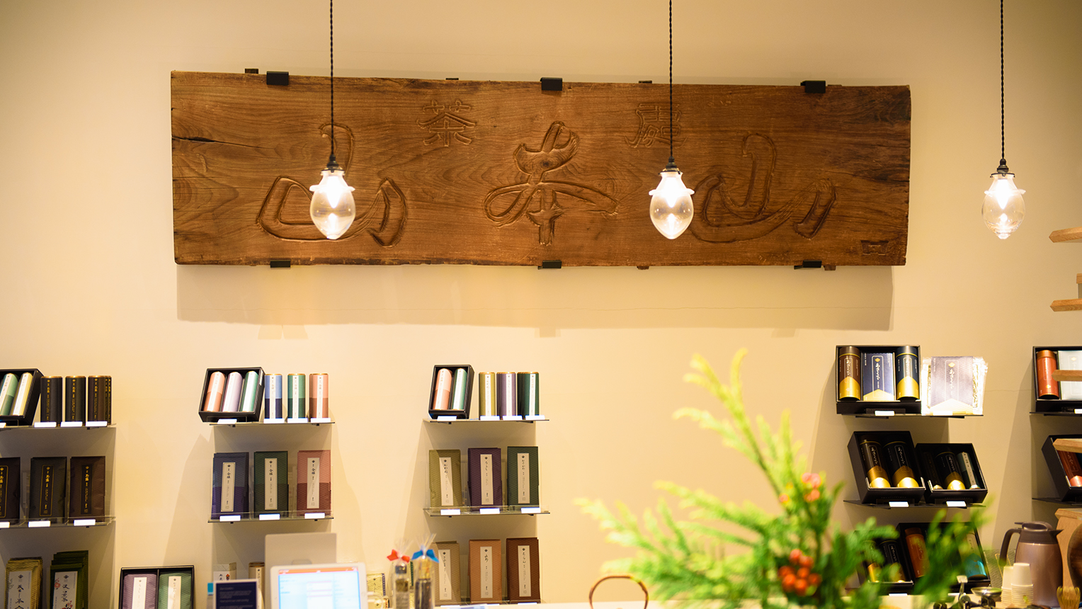
Yamamotoyama has been selling tea in the Nihonbashi area for over 300 years ever since its establishment in the 3rd year of the Genroku period (1690) by Kahei Yamamoto. Known across the nation for its catchphrase “Yamamotoyama when read forwards, Yamamotoyama when read backwards,” this long-established seller of tea and nori (seaweed) has undertaken its rebranding on a grand scale. In charge of all design aspects of the project, such as the revamping of the logo and product packaging, was designer Mr. Eisuke Tachikawa and his team at NOSIGNER, which handles a broad range of areas of design from graphic & product design to architecture. In order to convey in a modern environment the value of the company which was the first tea seller of sencha (green tea made using whole leaves) in Edo and also the inventor of gyokuro (a high-grade shaded green tea), what kind of design strategy did NOSIGNER employ? Through this interview with the 10th president of Yamamotoyama, Kaichiro Yamamoto, and Mr. Tachikawa, we take a deeper look behind the scenes of this project.
Why was the Rebranding Necessary?
-Please tell us about the rebranding of Yamamotoyama came about.
Mr. Kaichiro Yamamoto (Hereinafter referred to as Yamamoto): For the last 20 years or so, Yamamotoyama has been increasing the number of products it has without making any significant design changes, like we’ve kept the main house and keep adding expansions to it. All of them were built during different times with no consistent design or concept, so there was no sense of unity. That’s why we decided to deconstruct the expansions and give them a comprehensive makeover. The family business has always been in sencha, but from my father’s generation we started to deal in nori as well, which with the growth of department stores sold well as a gift item. Due to this, Yamamotoyama gained a reputation as a nori dealer, so we felt it was necessary to reestablish the fact we are a company that deals in tea.
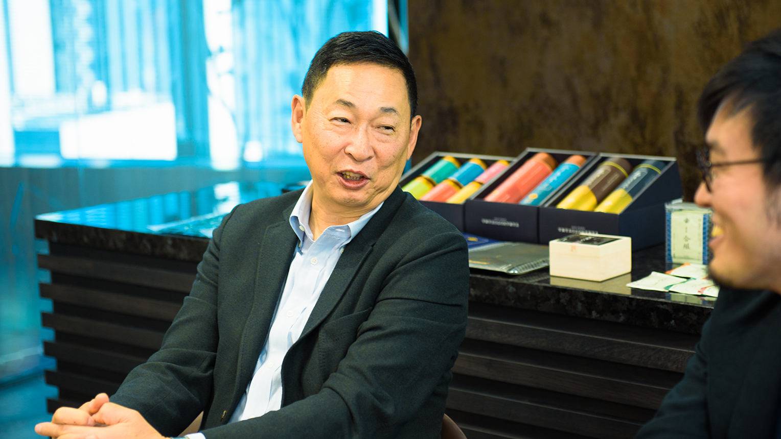
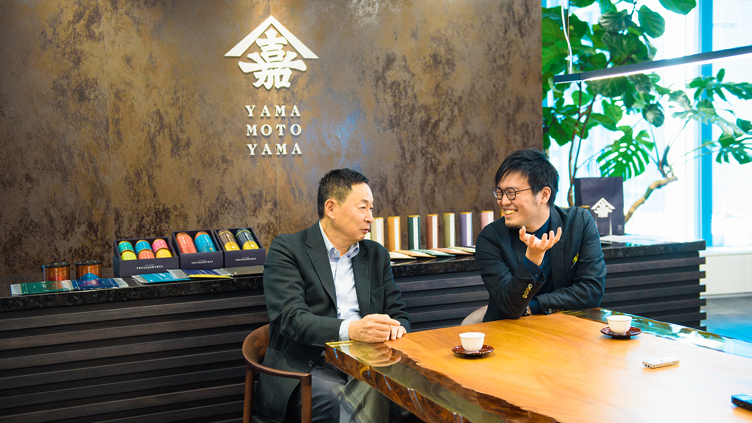
The 10th president of Yamatoyama, Mr. Kaichiro Yamamoto.
Mr. Eisuke Tachikawa (Hereinafter referred to as Tachikawa): We became involved in the rebranding project after entering the competition to design their new flagship store in Nihonbashi. It was at this time we proposed the idea of reworking the brand strategy and customer experience of Yamamotoyama, as well as also designing the new store. Ultimately, a different team ending up handling the design of the store, but Mr. Yamamoto chose us as their branding partner. From there we entered talks about the overall design strategy regarding the logo, packaging, and so on with vice president Ms. Nami Yamamoto.
NOSIGNER’s Mr. Eisuke Tachikawa, who oversaw all design aspects during the rebranding.
Yamamoto: My daughter, Nami, was born in 1986 and is currently the CEO of our American firm, but it was she who recommended Mr. Tachikawa. I took part in the meetings, but for the most part I stayed quiet and let my daughter handle everything. The world I see in my 60 years of age and the future my 30-year-old daughter sees are without a doubt different. In creating the future of Yamamotoyama, I felt the attention of people closer to her age would be important.
The High “Resolution” in Everything.
-So, does that mean the two of you didn’t have so many opportunities to speak to each other directly?
Yamamoto: Actually, I had dinner with Mr. Tachikawa on a number of occasions once the rebranding started to go move forward. It was my daughter who chose him as our partner, but as proprietor I felt it was important for us to be in close communication. In reality, during our dinners we barely talked about specific work matters, we just discussed how this particular cut of meat was good or that one was bad and so on (laughter).
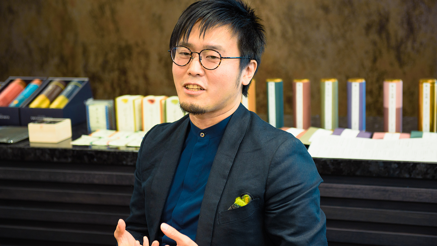
Tachikawa: From Mr. Yamamoto’s perspective, I can understand that it would seem that way, but for me, through the entirety of choosing restaurants to how he ordered, it felt like I was experiencing the hospitality of a tea-ceremony house. Throughout this process, I could sense in everything the high “resolution” in which Mr. Yamamoto sees the world. Also, as Mr. Yamamoto is the 10th president of Yamamotoyama, he bears the future of 300 years of shop history on his shoulders and is in the position of passing the torch on, which is why he has to constantly be aware of their future in the greater flow of history. While being grounded in such tradition, he is also highly sensitive towards new things such as always using the latest model of iPhone, so I had a certain sense of nervousness as I knew I couldn’t make any proposals that weren’t up to standard (laughter).
During the course of the rebranding, the designs for packages, wrapping, carry bags, and other “communication tools” for key products targeted at department stores were revamped. photo:editorial department
Yamamoto: But having said that, Mr. Yamamoto here was asking sly questions like “why don’t you drive a Benz?” throughout our dinners. And then when I answer with “no particular reason,” he then tries to dig deeper by saying “those are the reasons I want to hear.” During the course of our conversation the reason why I don’t drive a Benz ended up being quite clear. Mr. Tachikawa is extremely skilled at drawing ideas and thought processes out of people. On top of that, he never took a bite of food before me. He was so careful I almost thought he might actually be a salesman from a trading company. I believe that designers need to be firm in the way they convey their ideas with individuality, and regardless of the need to be in touch with the market, that a designer who just gauges people’s reactions and does as the boss says is no good, so I actually went as far as asking my daughter “does this guy really have what it takes?” just to be sure. My daughter, who knows Mr. Tachikawa’s work well, said that he will be one of the people that drives the next generation, but I believe I responded that I wasn’t so sure about that (laughter).
Tachikawa: I’m not usually that careful around people. If anything, I’m probably far from it (laughter). However, Mr. Yamamoto is a person whose eyes see the world in a higher resolution, so I felt that I needed to meet those standards. Those conversations we had were quite pleasant and also highly inspiring. It was very much because of his eye that I felt the great potential of this project.
Returning to the Aesthetics of Edo.
-Did the interactions like the ones you just shared have an effect on the rebranding?
Tachikawa: Communicating with Mr. Yamamoto allowed me to get a grasp of the brand over a long timeline, which lead to the natural conclusion that we should take an approach that returns us to Edo, the source where the Kahei Yamamoto Store was established. Looking at the commoner-oriented culture of the Edo period, there’s things like the store emblems that function like brand logos for modern companies, the ichimatsumoyo checkered pattern often favored as a kimono pattern by kabuki actors, the lined patterns we can see in Ukiyo-e. These are all graphics with a strong contrast rooted in stylish aesthetics that even people like us in the modern era can look at and tell that they are cool. By making it our mission to dig deep into the aesthetics of the Edo period, we also unraveled the history of Yamamotoyama and sencha.
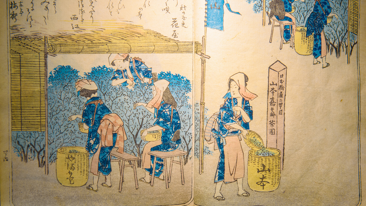
Yamamoto: In 1738, Souen Nagatani, the ancestor of the founder of Nagatanien, succeeded in making tea appear green, as opposed to its former color of being literally brown. The first person who had the privilege to sell this in Edo was our founder, Kahei Yamamoto, from the very place where our flagship store is today. 100 years from then in 1835, in the pursuit of greater flavors of tea, the 6th president invented gyokuro (high-grade shaded green tea).
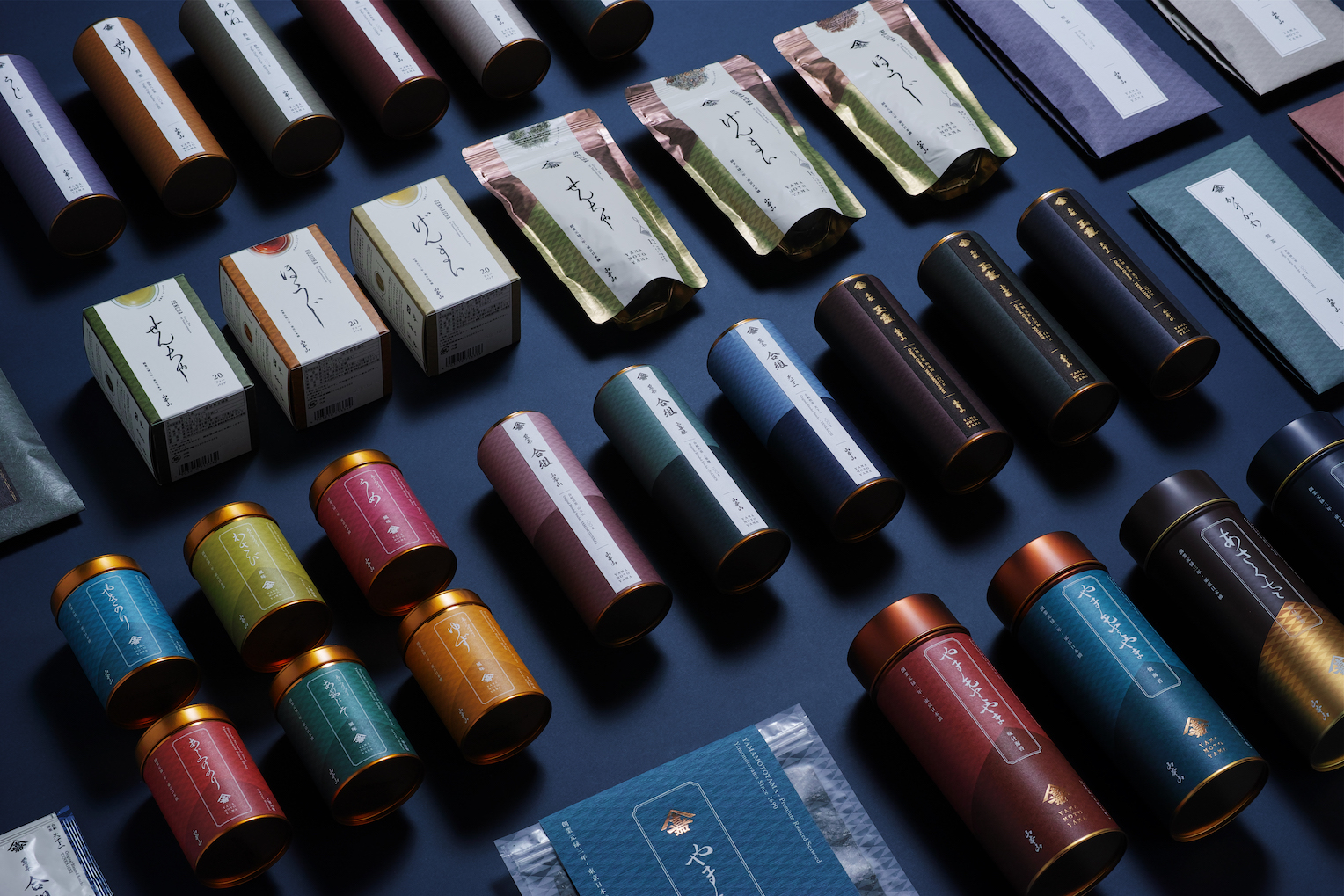
Tachikawa: Yamamotoyama is the forefather of sencha and gyokuro, and a store that has always adopted new technology and renewed the culture of tea, but that had never been conveyed clearly. I suppose they didn’t want to parade their status about, but in my opinion, I felt this is something they should be proud of. As we unraveled the store’s history, we found many things that would serve as a foundation for the reconstruction of the brand. In the rebranding, we made a point of returning the store to its Edo period state, by avoiding creating new elements as much as we could and instead utilizing things like the Yamaka (the first kanji characters of the founders first and last names) store emblem from when the brand was established, or using the scripts from the time when they were the Kahei Yamamoto Store for the kanji logo. For the American store logo, we used a font that was popular in France at the time it the original store was founded. Aside from this, we based various elements on the aesthetics of the Edo period, for example using cursive Japanese on the scroll-like packaging, or the use of traditional color schemes.
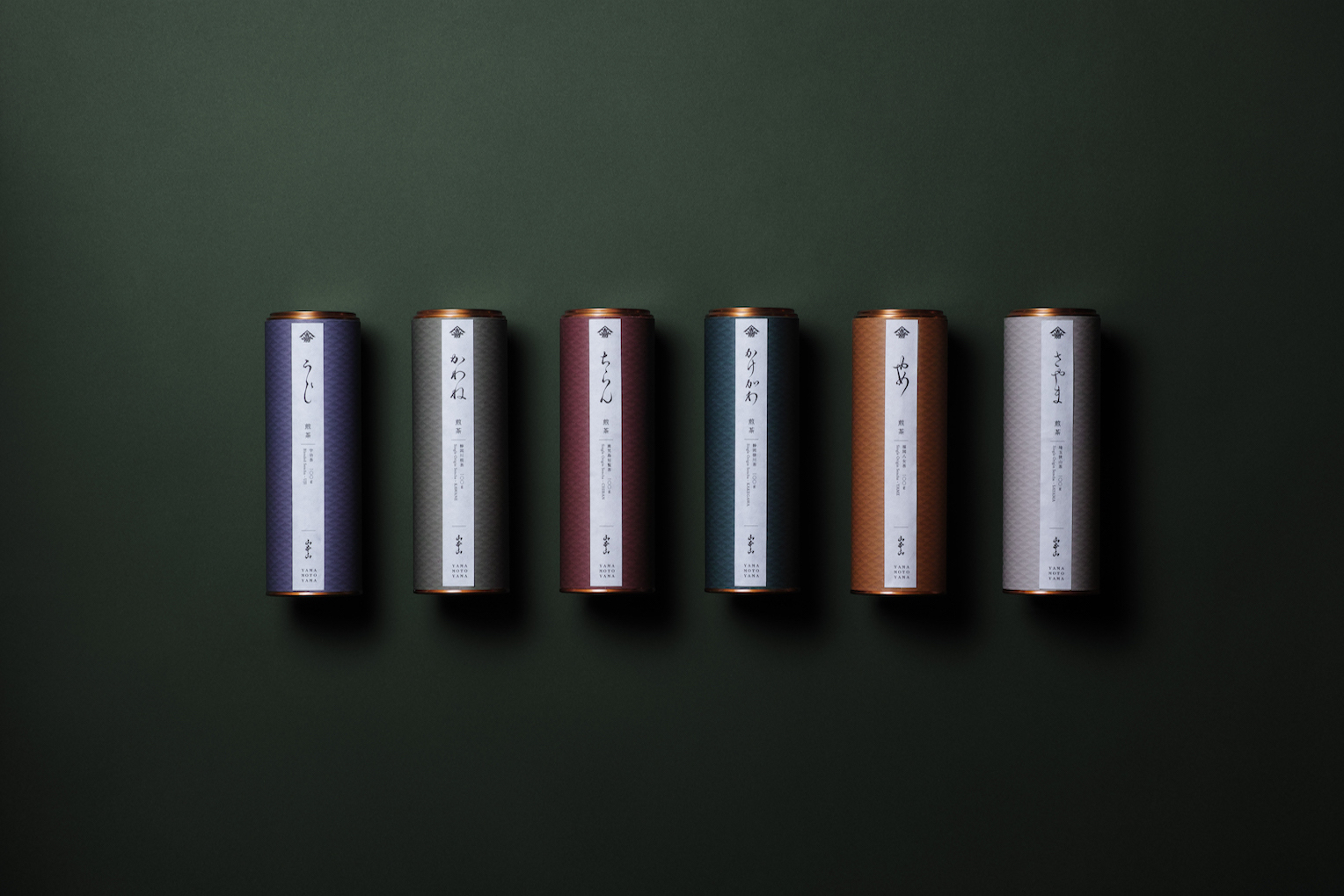
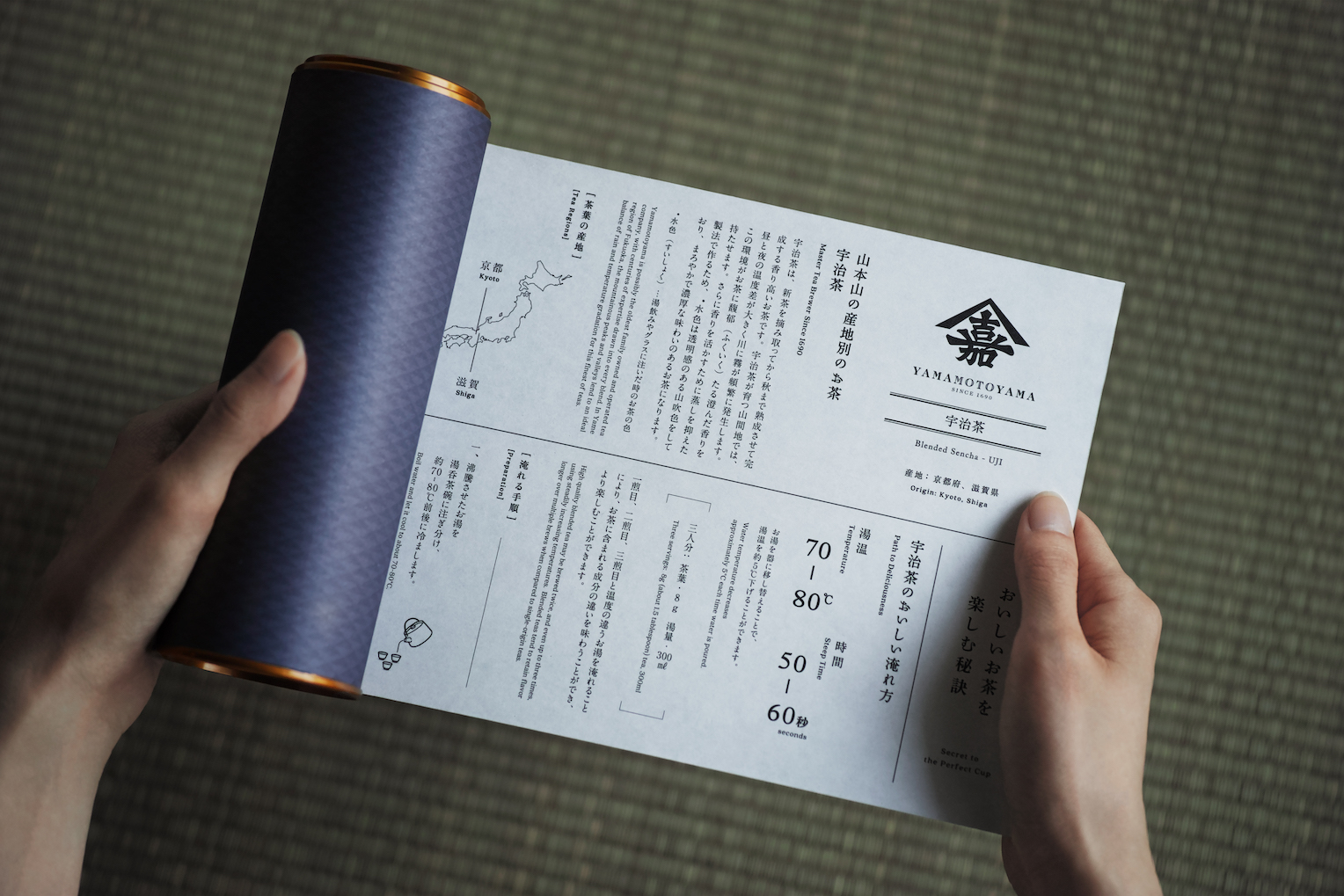
A tea package design inspired by traditional scrolls. The color variations are based on the classic colors of Edo, with cursive Japanese writing used for the product name emulated by Mr. Eisuke Tachikawa himself. photo:editorial department
Yamamoto: The packaging received a prestigious design award overseas, which even I felt I wanted show to the people around me, but in the end, it’s not me who decides whether the rebranding is a success or not, but the market and the customers. At the moment, the only products that have been renewed are those for the department stores, so I think it all revolves around the results that come to pass in the next two or three years.
Tachikawa: Up until this point, the process has been something akin to inner-muscle training. I think the company has now started afresh as a brand boasting Edo aesthetics. Like a two-stage rocket, I hope the brand can propel forward while considering initiatives for areas of innovation so that it will be recognized by new clientele as a cool kind of brand.
Grasping the Brand Context to Update to the Modern Age.
-You discussed the topic of re-conveying the fact you’re a tea company, but what do you think tea means to the people of Japan?
Yamamoto: Tea is an integral part of Japanese cuisine, and as we have the word ochauke (refreshments served with Japanese tea), Japanese sweets have a history of being made for the purpose of drinking tea. Also, there are numerous words and expressions in the Japanese language which involve the kanji character for tea, such as nichijousahanji (A daily occurrence), chamekke (playful or mischievous), ocha wo hiku (to be idle), which tells use that tea has a close connection with the lifestyle culture of Japanese people.

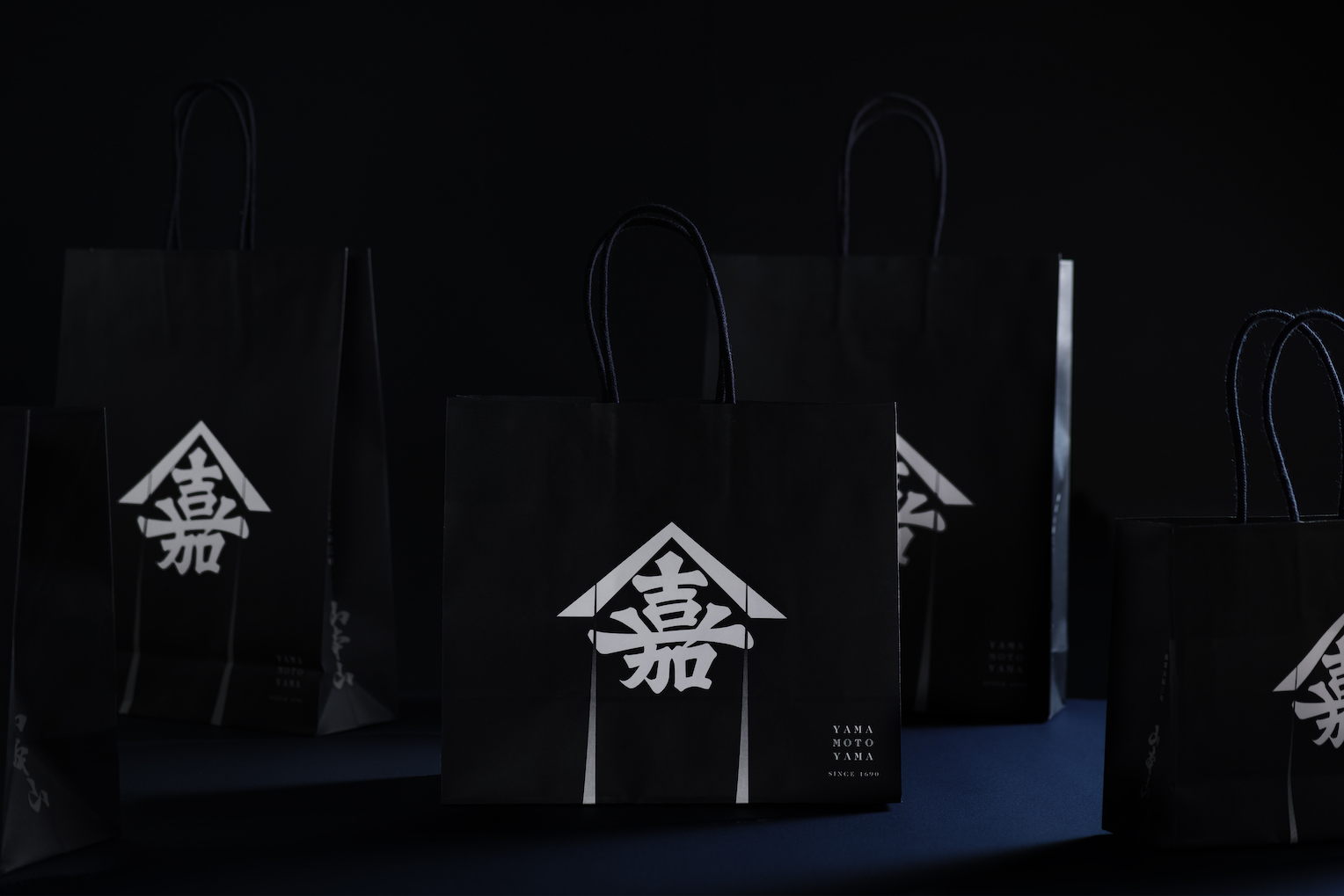
The Yamaka emblem used by the Kahei Yamamoto Store when it was first founded. With some minor alterations to its design, it is now used in various ways such on the store’s carry bags. photo:editorial department
Tachikawa: Throughout the project, I strongly felt that tea is a perspective which reveals Japan’s cultural and artistic history. Especially Edo’s tea culture, which was considered hip in the same manner coffee culture is today in modern times. The Kahei Yamamoto Store was a driving force behind this, so I can only imagine the large numbers of people of culture who would’ve gathered there. The question of what we would see if we opened up the potential of tea in modern times is a stimulating one, and for a country that has developed to a mature stage like Japan has, culture will be its main tool for taking on the world.
-As entities who carry the torch for the culture of Japan, the long-established stores and company across the country have an important role to play. It seems important for those stores to rebrand and update themselves for the modern day.
Yamamoto: I personally don’t really like the word “rebranding.” It’s a convenient word which is why I use it, but the “re” aspect of it gives off a sense of “being reborn.” I don’t think it’s the rebirth of our brands that’s important but the shaping of these brands we’ve been preserving for so long to suit the times we live. So, in that sense of rebranding, I think it’s something we have to challenge ourselves with every year.
Tachikawa: I know exactly what you mean. Particularly in the case of rebranding long-established stores, I think the degree to which we can draw out the brand’s context and maximize it is what matters most. There’s no small number of long-established stores experiencing economic difficulty that have been quick to adapt to trends in the world, set up social media accounts for easy communication, and so on. These kinds of initiatives might provide short-term results, but when thinking about rebranding, an archeologist-like perspective of decoding the mindset and potential of the brand from the context and genealogy that flows through its background is also important. For example, instead of me dictating the direction of the rebranding in a one-sided manner, I think that from the get-go, sharing the vision which the brand’s context and aesthetics are rooted in makes it easier to imagine what could lay in the future ahead. My role is simply to build on that.
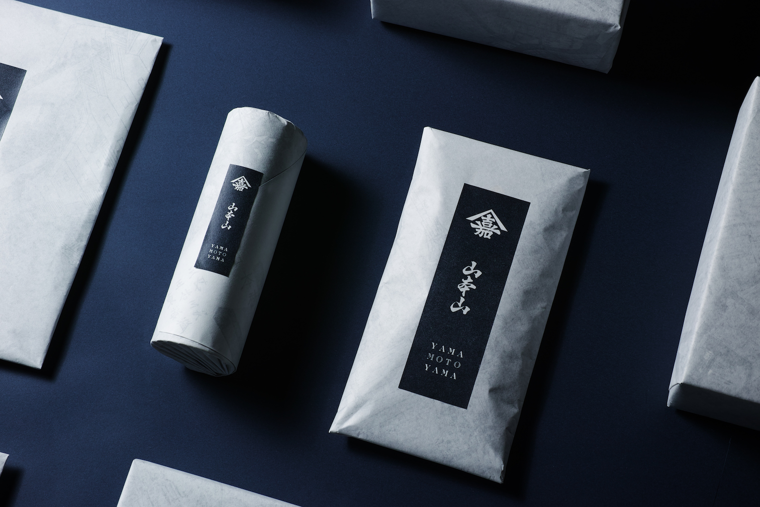
The revamped logo utilizes the yama kanji character that was used for item listings in the times of the Kahei Yamamoto Store. The English language text uses a font while was popular in France in 1690, when the store was founded. photo:editorial department
Yamamoto: For stores like ours, professing that we are long-established stores is not something we do, and if anything is not an act of class. But, as a result of this we may lose sight of our true value or lose the ability to discuss what’s important to us. Being in a position to observe our brand from the outside, Mr. Tachikawa was able to grasp the feelings of people on the inside of the brand and express them. In terms of this project, my role was that of the serving dish, and Mr. Tachikawa’s job was to think of a concept for foods that would suit that plate and pile them on in a delectable manner. I believe that when parties on both the inside and outside of the brand fulfill their roles, only then will we have made something that the customers will like.
The future the Next Generation Makes for Nihonbashi.
-The style of Edo was discussed earlier and Nihonbashi, the place where Yamamotoyama does business, is the cradle of Edo culture. To finish up, I’d like to ask about what you see in Nihonbashi’s future.
Yamamoto: Nihonbashi is an area with a lot of hidden potential due to its historical context, and as the origin point of roads in Japan, it also carries important meaning as a place of beginnings. It’s for this very reason that we want it to become a place that is not only stylish when viewed from the outside, but one that people can enjoy when they are there, and a place where people can direct their creativity towards the future.
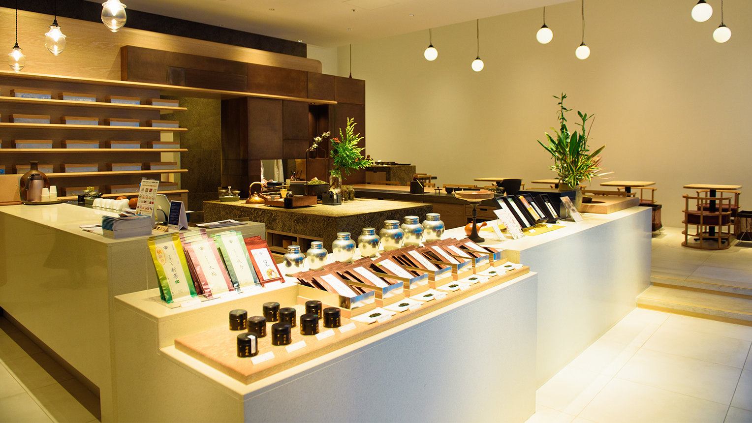
The Yamamotoyama flagship store, Yamamotoyama Fujie Sabo, which opened on the first floor of the Nihonbashi Takashimaya S.C. in 2018. Customers can enjoy a variety of Japanese teas and sweets, and nori-based dishes such as Nori Men Seaweed Noodles in a serene environment.
Tachikawa: I think by defining Nihonbashi as a place where new culture begins, we create the dreams that can be explored here. Recognizing these dreams and the divergences that exist between them and current-day Nihonbashi and bridging that gap, could quite possibly be the role that is desired from designers.
-There are more and more young creators in the Nihonbashi area these days, so it feels that there may be a future that becomes clearer to us through the fusion of the histories of long-established stores and the introduction of new sensibilities and technology.
Tachikawa: There are surely things that can have different beginnings while having the same aesthetics as culture born here in the Edo period, so it would be nice if such a thing could be depicted in a stylish way using modern technology. I don’t think Nihonbashi is a place that’s supposed to become a futuristic city. Through what do Japanese aesthetics and the style of Edo come to life the most? What is it that they lack at the moment? I feel that we’ll be able to see the greater direction of the area’s future by thinking about these things.
Yamamoto: I think it’s my job to pass the torch on to the younger generation. For discussion’s sake, even if I were to live to 100, I would only be able to see 40 more years of the world’s future. I don’t have any intention of taking on a challenge focused on changing the lives or culture of a world 40 years from now. On the other hand, young people have a desire to change their lives and the times they live in. Gathering those strong-willed, energized people and creating an environment where lots of people can share their works brings value to an area. This is precisely why we want to leave our work in the hands of the younger generation and maintain long-term relationships with the people we work with. There is a value that’s created from continuing something, which is what changes the times, but the environment in which young people in Japan can continue forward is lacking. It was the same for us, which is why we never changed our designs for a long time. What I took upon myself to do there was to gather young people from various fields who didn’t know the Yamamotoyama of old and unify them. I’d like the younger generation to be able to work to their full potential, and I hope that they can involve themselves in pursuits in this area that connect them to Japanese culture.
Interview & Words: Yuuki Harada (Qonversations)
Photography: Daisuke Okamura
YAMAMOTOYAMA
Established in the 3rd year of the Genroku period (1690) as the Kahei Yamamoto Store. During the Edo period, the original Kahei Yamamoto was a tea seller who popularized aosei sencha (a sencha made by kneading tea leaves before drying) among the common people, and the 6th president Tokuou Kahei is known as the inventor of gyokuro. In the post-war period, they began dealing in nori seaweed and moved into the overseas market of America, Brazil, and more. In recent years, they have been expanding their herbal tea business as well. 2018 marked the opening of their flagship store “Yamamotoyama Fujie Sabo” in the area of their original establishment, Nihonbashi.
https://www.yamamotoyama.co.jp
Eisuke Tachikawa
Design strategist and head of NOSIGNER. Guest professor at Keio University. Approaching design from a society-oriented perspective of aiming to create a beautiful future through design (social application of design) and explore thought mechanisms to increase the number of innovators in the world (structuralization of design intelligence), he has accomplished many design projects that tackle the challenges society faces. Recipient of over 100 international awards. An advocate of learning the mechanisms of invention from evolution theory to foster innovators.
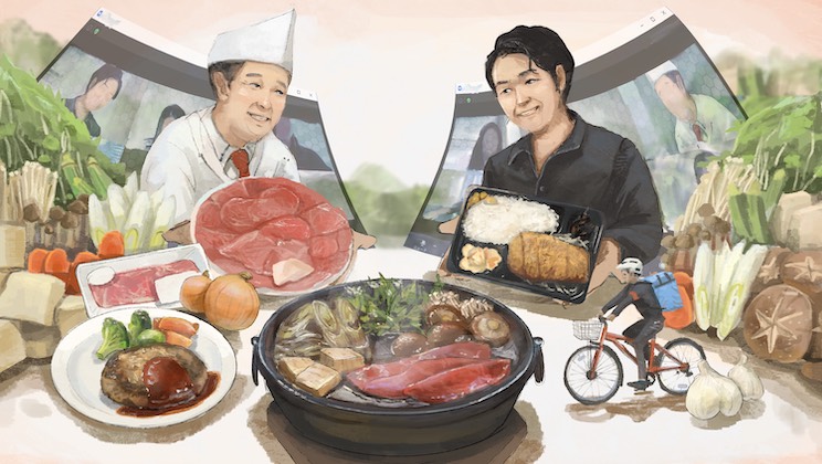
A Bit of Luxury in Your Day. Enjoy Some Delicious, Nutritious Unagi Eel. -Special Feature: Nihonbashi Dining at Home #1
Digital Educational Tools: A New Challenge for the Fourth-Generation President of an Established Blackboard Maker
The Best Ways to Eat Edo-Style Sushi, According to the Chefs at Established Family Restaurants. -Special Feature: Nihonbashi Dining at Home #2