Collaboration and curiosity calls forth new creativity. Looking into updates of the traditional Japanese form of expression, “Mon (紋),” which means “crest.”
Collaboration and curiosity calls forth new creativity. Looking into updates of the traditional Japanese form of expression, “Mon (紋),” which means “crest.”
This fall, under the theme of updating the fascinating assets of Nihonbashi using new artistic forms of expression, the first-ever “NIHONBASHI MEGURU FES” will be held by the whole town. As one of its main contents, a design event called the “Meguru Noren Exhibition (an exhibition for encountering and cherishing Norens)” will be held with focuses on Norens (shop curtains), which can be described as a symbol of Nihonbashi where long-established companies and stores get together. Through a collaboration between the companies of Nihonbashi and young creators, a townscape of Norens from long past will be recreated, similar to what is illustrated on the Kidai-Shouran scrolls. In light of the launch of this event, we interviewed Monshou-Uwaeshi (painter of family crests), Mr. Shoryu Hatoba and Yohji, both of whom not only have provided artwork to NHK Educational TV’s popular program “Design-Ah!” but also act as the judges/guest creators of this “Meguru Noren Exhibition.” The Hatoba’s father and son, who have created a new form of “Mon-Mandala (紋曼荼羅)” in their continued challenges in the limited form of expression of “Mon,” depict their stories pertaining to the designs of “Mon.”
A crest is not “an unchangeable tradition,” but is something you can enjoy yourselves in freedom of expression on it.
-On top of creating Kamon (家紋), family crests, you two have been performing unique activities, expanding it into the field of art and design, haven’t you?
Mr. Shoryu Hatoba (hereinafter, Shoryu): We both are craftsmen called Monshou-Uwaeshi, a Kamon painter who makes a living by hand-drawing Kamon onto kimonos. Initially, our founder worked as a Mon-Noriya (a crest paster), who did the work of putting paste in the shape of Mon on kimonos. In 1910, we were founded in Kyobashi, and in 2010, exactly 100 years after opening the first store, we established the “Atsuraedokoro-Kyogen” workshop under the theme of making Kamon as a design artwork. As you have mentioned, lately our activities have expanded to other areas and not limited to only painting family crests.
Mr. Yohji Hatoba (hereinafter, Yohji): Previously painting family crests was neither popular nor well-known as a profession, but after starting appearing on the popular program “Design-Ah!” of the NHK Educational TV, we slowly started becoming recognized and sometimes we are told, “hey, you guys are from that ‘Mon’ segment!” Appearances on the media definitely play a big influence.
Shoryu: Since crests are a very traditional form of expression, people are likely to accept them as those that should “never be changed” and “be preserved.” But thanks to television appearances and the like crests are beginning to be taken more casually as a different form of “design.” In addition, we have seen an increase in requests to make original crests, and I think that it has become revealed to the public that the world of Kamon is unexpectedly free.
From NHK Educational TV’s popular program “Design-Ah!” / “Song - Sinrabansyo (Song of Japanese Crests)”
Yohji: We received a lot of attention when we designed a noren for the COREDO business facility in Nihonbashi.
Shoryu: We were at first offered the theme from the business facility side and we started from there. For example, the COREDO Muromachi 2 houses a movie theater inside it, and its theme was “Fun.” So we took a traditional Kamon called “Mi-masu (三枡, featuring three sizes of masu, a wooden box-cup)” and arranged it to “Go-Masu” (五枡, five masu), in tribute to the fact that Nihonbashi was the hub of the Gokaido (five highways). So a modern interpretation and a traditional expression were combined. It was after this project that we began having more inquiries for creating original crests and I think this was how the idea that “it’s ok to make original Kamons” became more widespread.
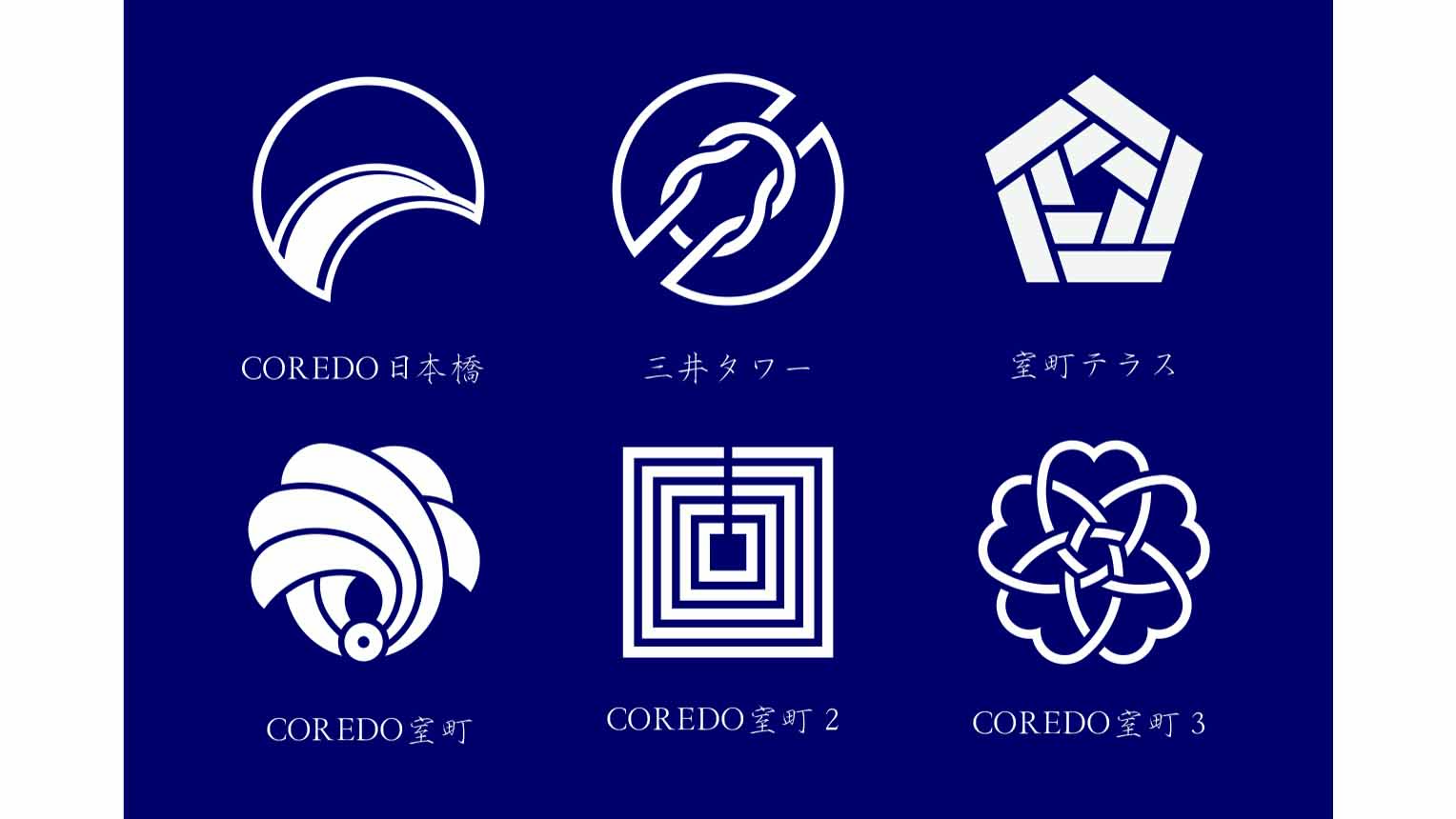
COREDO Muromachi 2 (pictured lower center), and other crest designs on the norens of each building
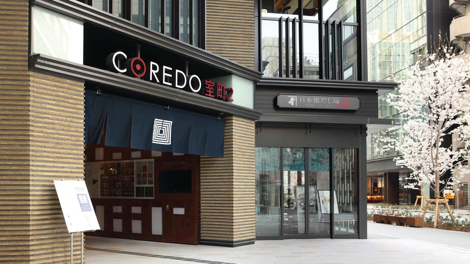
Noren hanging from the entrance to the COREDO Muromachi 2
Yohji: There are several buildings with norens in Nihonbashi. The designs of Nihonbashi COREDO and Nihonbashi Mitsui Tower were worked on by the creative director, Mr. Tadahiro Konoe, and COREDO Murosmachi 1 and 2 worked on by my father. For COREDO Muromachi 3, the design by a Monshou-Uwaeshi during the Edo era is used. It’s really interesting if you compare the different methods of expression. Some might say it’s only “noren,” but I believe its interpretations and expressions are wide and varied.
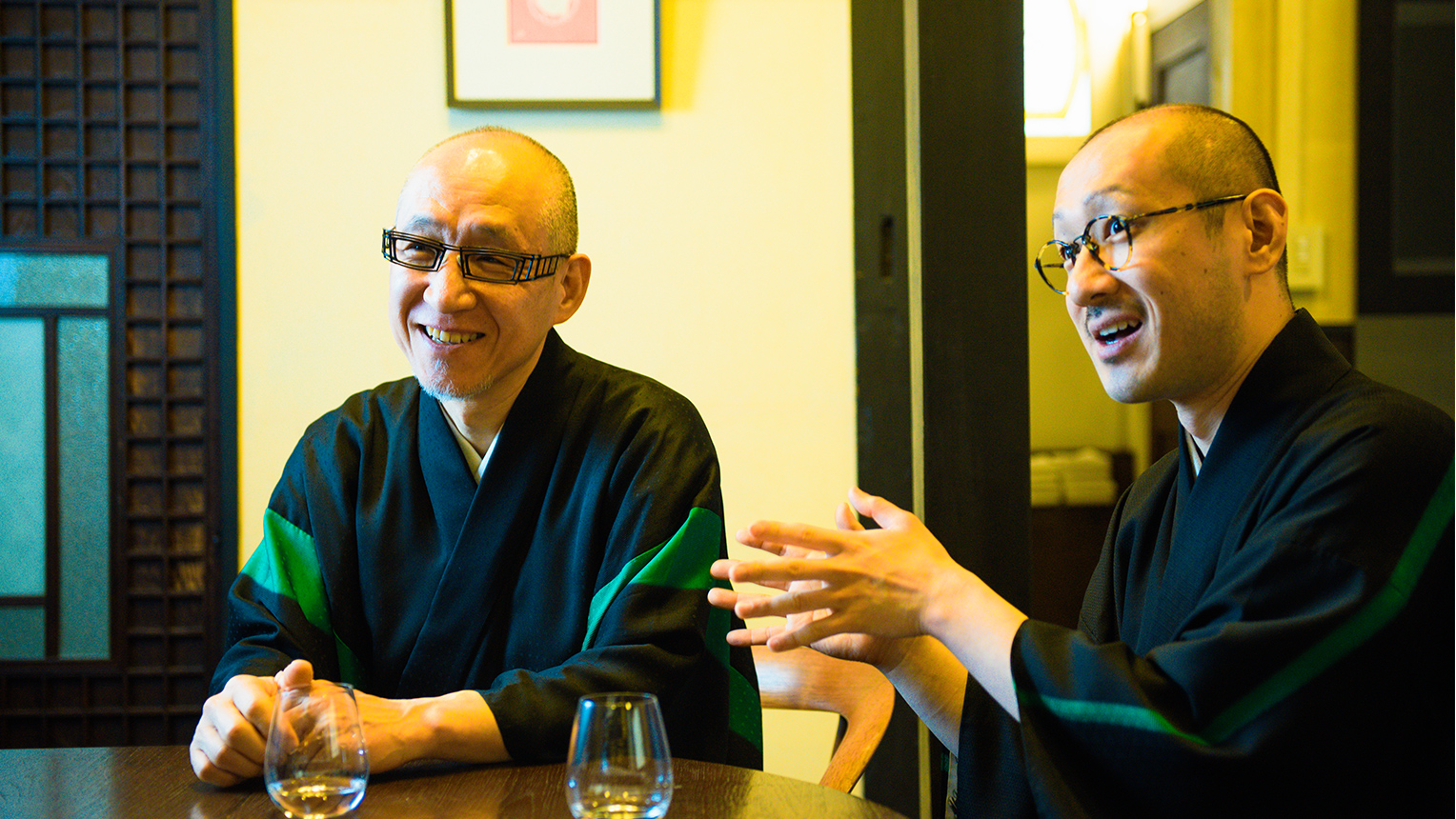
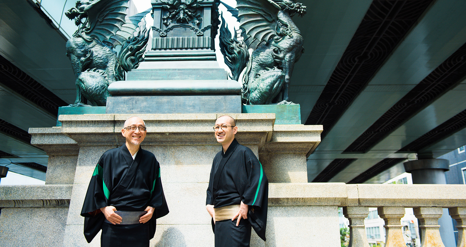
Mr. Shoryu Hatoba (left) and Yohji (right)
The simple and deeply mysterious world of Kamon.
-Historically speaking, what exactly was the purpose behind Kamon in the beginning?
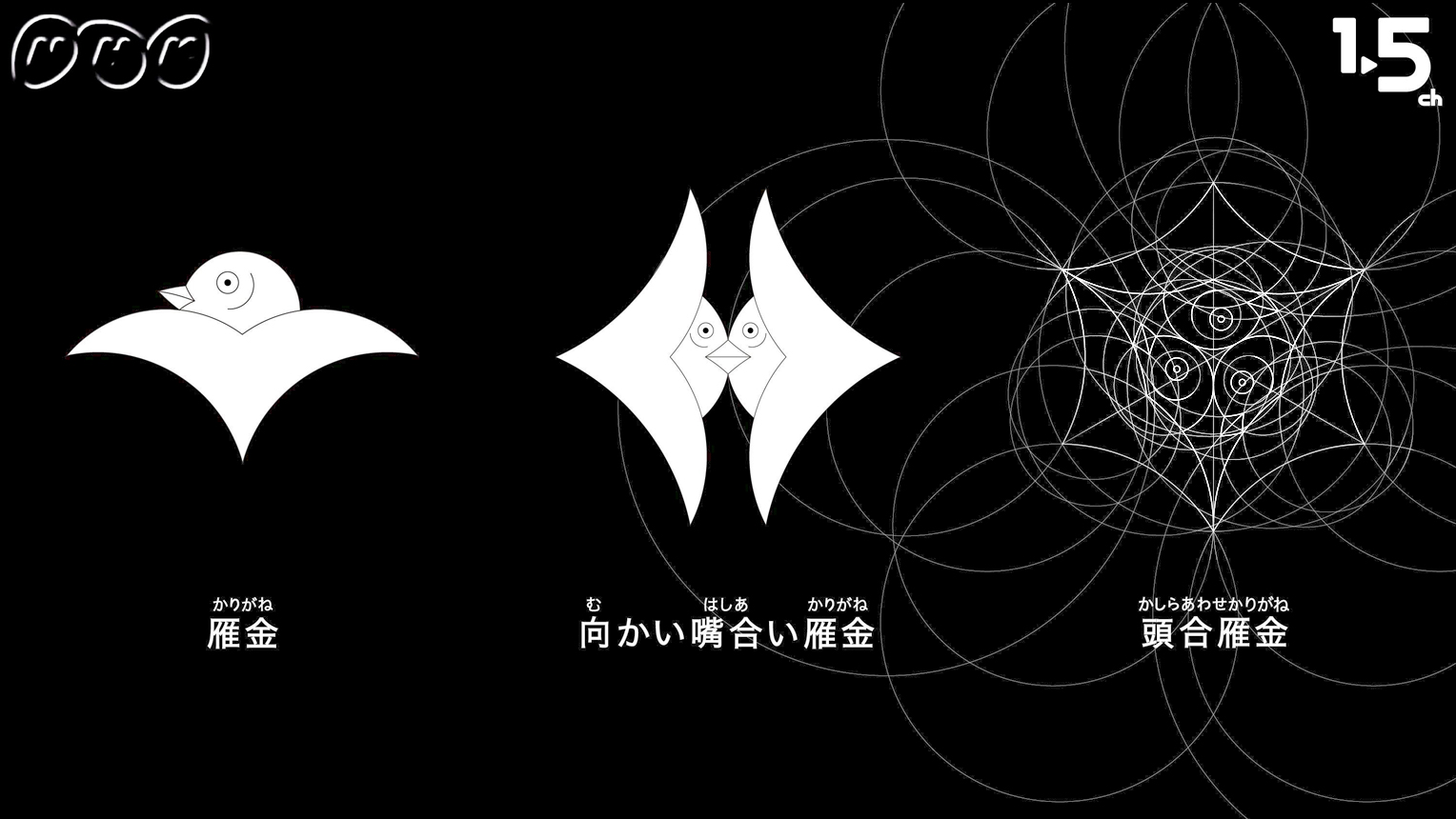
Yohji: We all know that Kamons are crests that are handed down from generation to generation within a family, and as shown in the TV program “Design-Ah!,” all Kamons are comprised of only perfect circles and straight lines. This is a world created using only the bare minimum of two shapes. Even when we draw up square shapes, we begin by using circles to ration out the angles.
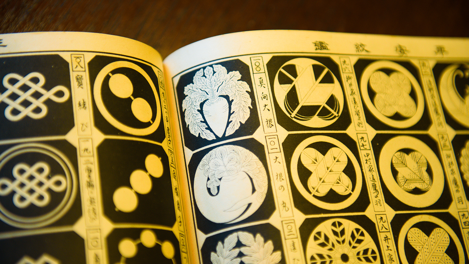
Shoryu: This is a traditional method using a bamboo compass called a “Bun-mawashi” to create a shape while drawing circles. This was at a time during the Edo era when specialized artists like us designed many ideas. Inside a collection of Kamons called the “Mon-cho (紋帳, registry of crests),” there are as many as 3,000 types of Kamon recorded.
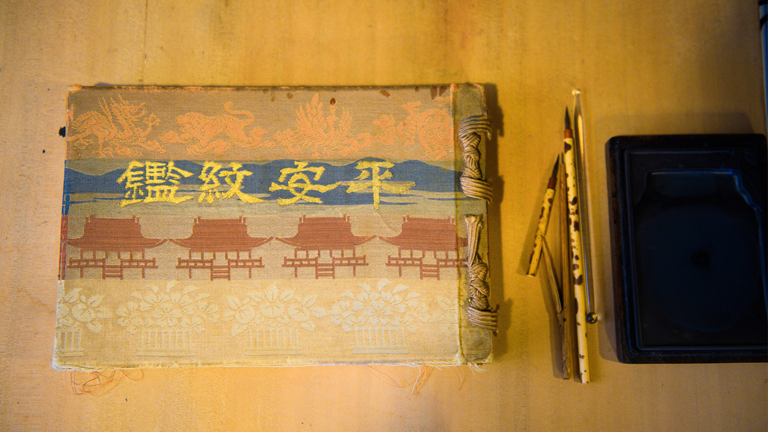
The Kamon collection “Heian-Monkan” and the bamboo compass “Bun-mawashi”
-Looking over the Monkan, there seem to be pages after pages of similar designs. How come?
Yohji: These are like variations on a certain motif. Various methods such as Chigai (difference), Daki (holding), Narabi (row), Wari (split), Kasane (overlapping), Mori (heap), Oi (chasing), etc. are employed to modify the original crest design. There also is a method called “Mitate-mon,” which was normally used during the Edo era, when, while there is a basic crest-form, another factor was incorporated to build a new Kamon. Since you couldn’t use the Kamon of a lord as it is, people in those days asked their painters to slightly “tweak the motif” when they place an order.
Shoryu: Now that a Kamon is created using only lines and a limited kinds of colors inside a small circle, there is a very strong emphasis on “finding beauty and essence inside a limitation.” On top of that, there is the added limitation of making the final design completely different from the base Kamon in terms of the methodology and design. In the Mon-cho, you can find many examples made within these set limitations. For example, there are in fact enormous number of variations to the current Government Seal of Japan, the “Kiri-mon”. There are even the ones shaped like bats, and another called the “Dancing-Kiri.”
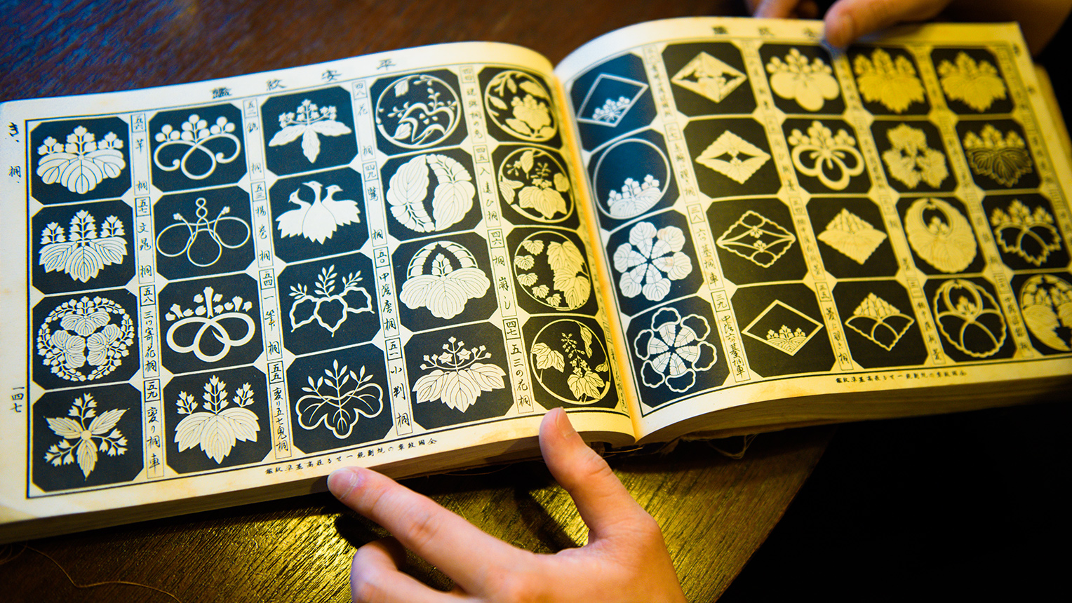
Variations of the Kiri-mon
Yohji: Sometimes, although the Kamon of the head family is simple, its variations might become quite complex after numerous additions. My favorite is this one, the “Mamuki-Daikon (Daikon radish from the front).” The complex patterns to the leaves are just so great looking. I’m also very perplexed as to why they had to draw this so real (laughs).
The “Mamuki-Daikon” Kamon
Shoryu: It’s true, there are many mysterious Kamons out there. Even though they are collected in one book, it doesn’t mean that they are systematically compiled. Although we have seen many different designs of Kamons as a designer, the background details of them are quite vague. One mystery about the Kamon is that there are only secondary sources, and no primary sources exist. This is a mystery even specialized researchers of Kamon have not quite been able to figure out.
Style and playfulness are all doors to inspiration
-When you two actually design a crest, where do you begin? For example, for the “COREDO Muromachi Terrace” that will open this fall, I’ve heard that a pentagon crest was chosen under the theme of “gathering.”
Shoryu: When we were offered this project, I immediately came up with inspiration and it didn't take very long time. We selected a pentagon to indicate that Nihonbashi is a starting point for the Gokaido (five highways), and with the added motif of the “Ireko-masu (入れ子枡),” which are several box-shaped cups of various sizes that enable to put smaller one into a bigger one, we attempted to show the image of people entering the city. What I imagined was Nihonbashi as an open space where people get gather, and also a place that functions as a gate.
Yohji: During the Edo era, people enjoyed riddle solving and word-play using a picture called “Hanji-eh (判じ絵).” Just like this “Hanji-eh,” we thought people who see this crest may be able to associate the meaning with the theme. In addition, we put a factor of wishes for good luck into it. The issho-masu (which is a big 1,800 ml wooden box-cup, and “issho” in a different kanji has the meaning of “lifetime”) is “incorporated” and the gogoh-masu (900 ml wooden box-cup) is mixed with it in the form of “person,” meaning as a whole “Forever Prosperous, More and More People” (“Issho-Hanjo-Masumasu-Hito-Hairu”). Funny, isn’t it (laughs)?
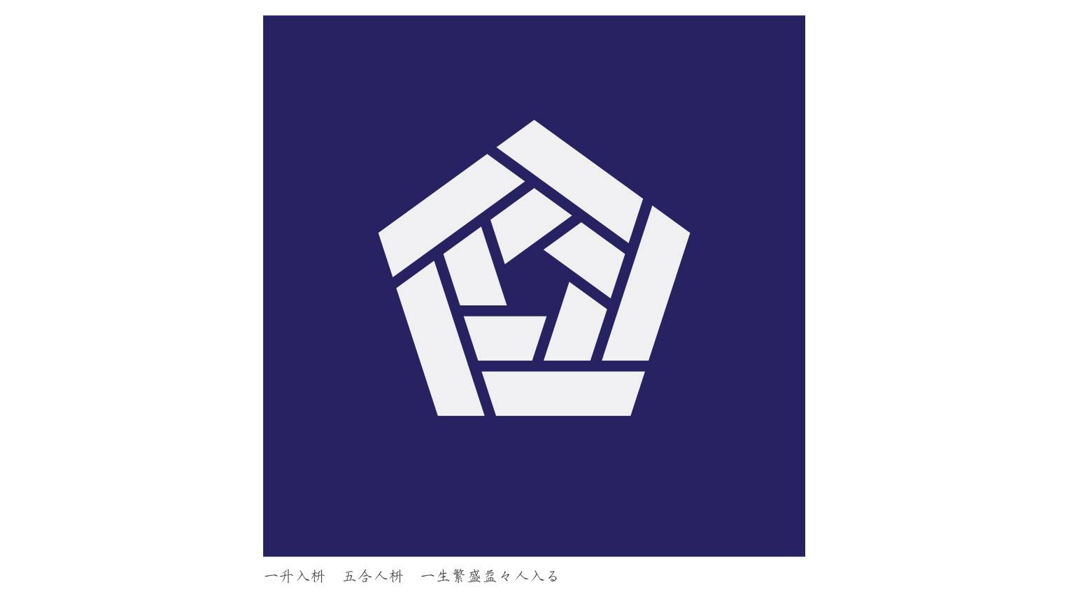
Design of the COREDO MUROMACHI Terrace Noren “Tsudo (Gathering)”
Shoryu: Although there are many set limits to crests, they are all not strict rules. Part of the charm is that there’s a lot of playfulness to them as well. I always keep to the basics, but at the same time try to be free and open in my way of thinking.
Yohji: I believe that our fields of expressions don’t have to be limited to norens or kimonos. Previously we had the opportunity for an art exhibition of crests using the shape of “rivets” of Japanese Wadaiko drums at the Isetan department store. Through such an offer, we were then able to display our artworks inside the lobby of the NOHGA Hotel (opened November 2018 in Ueno). So even the canvas and methods of expressions have become freer. Furthermore, the motif of the crest at this time expanded to card keys and bags to carry dryers, etc. while the design kept on being changed and modified. Lately it seems that this kind of side-expansion of the artwork “shapes” seems to be more common.
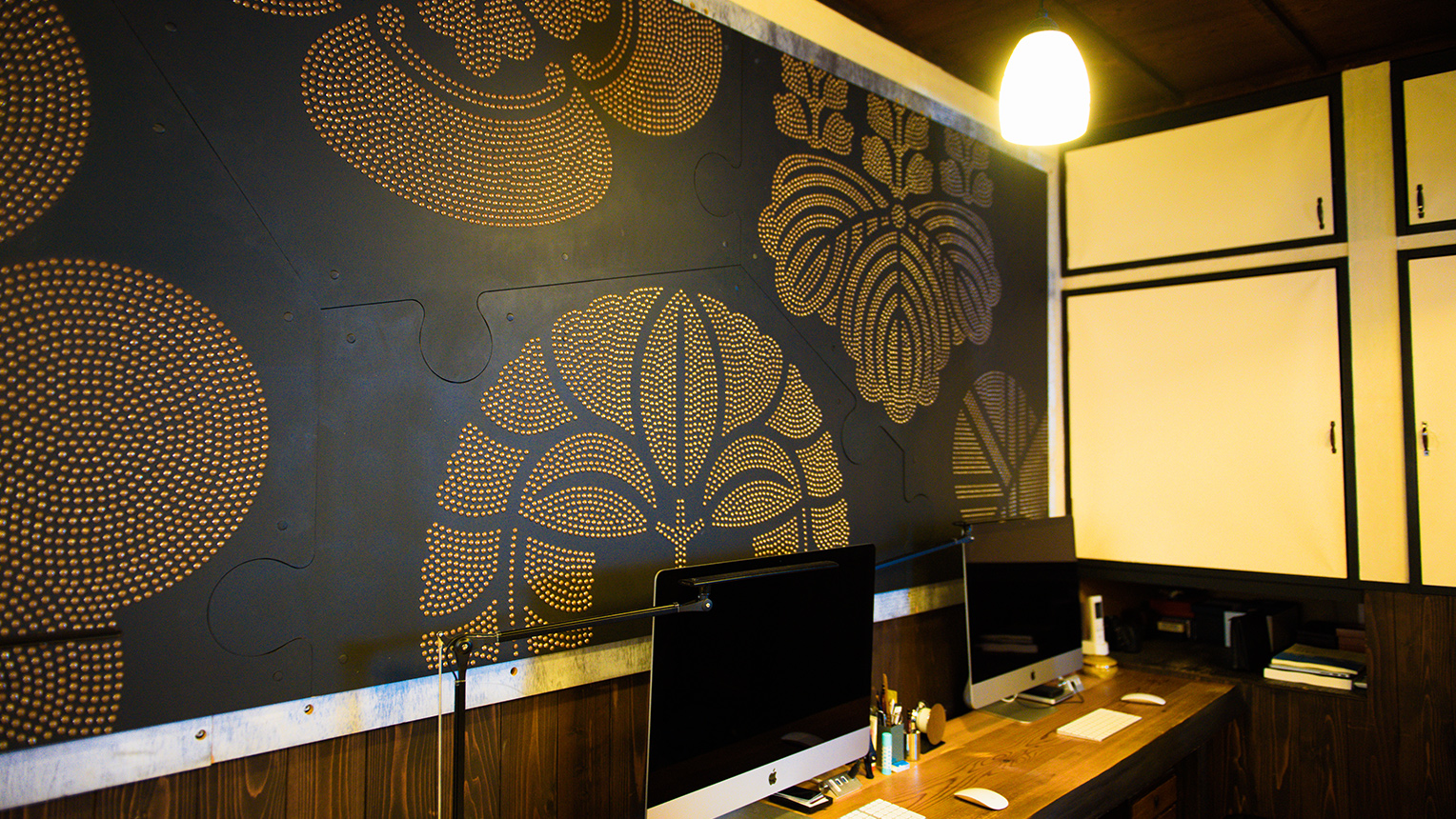
Artwork that lead to an exhibition at the NOHGA Hotel
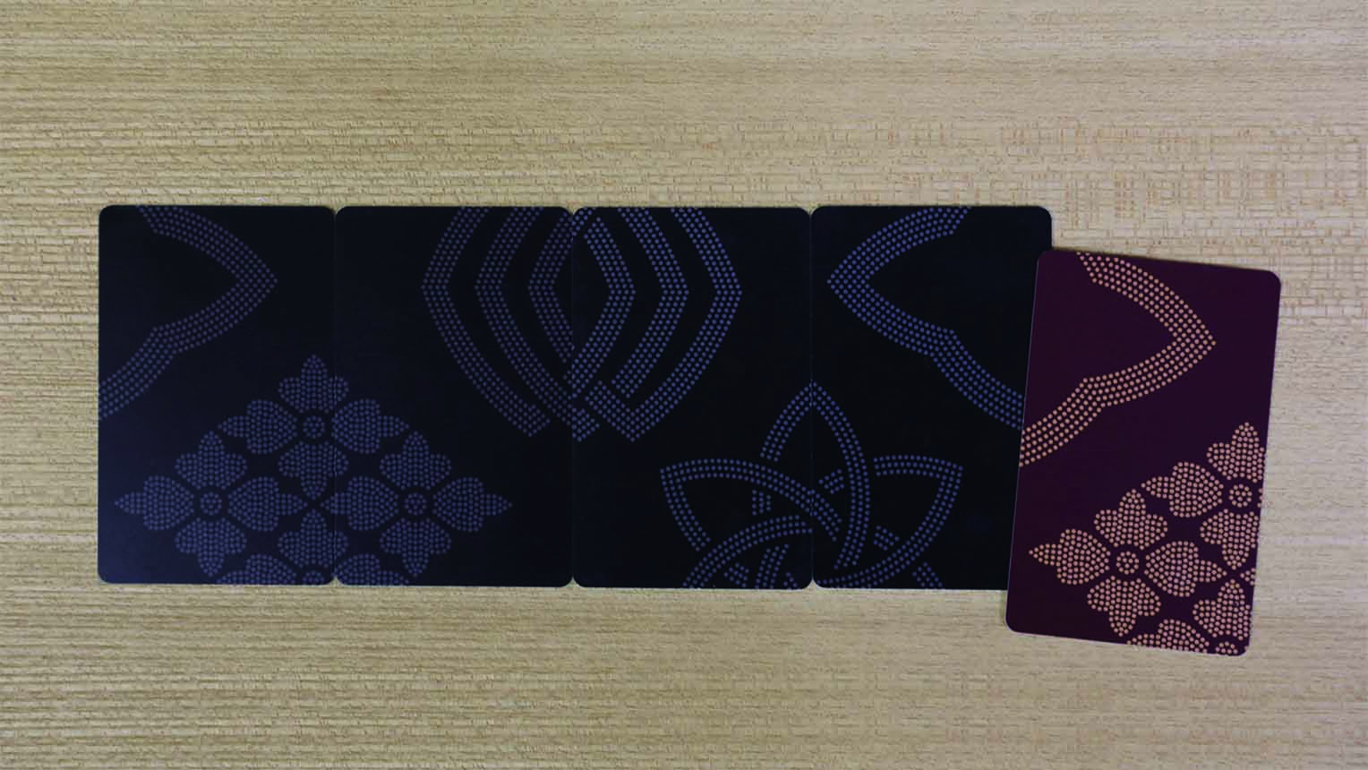
Card keys of the NOHGA Hotel. 4 types of designs available
Updating expressions, born from curiosity towards cross-collaborations and new methodologies.
-Your forms of expressions are constantly growing due to your cross-collaborations and challenges towards new things.
Shoryu: That might be true. Ever since we built the workshop here, we have been gradually granted offers of collaboration with different genres and industries, many of which have led to various inspirations. The same might be said about our creative process as well.
-Were there any new methods that you incorporated into your creative process that led to a change in inspiration?
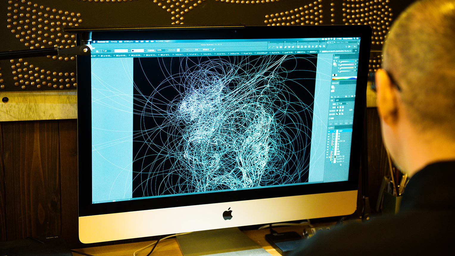
Shoryu: A while back we received an order to deliver an original crest in Illustrator format.
Yohji: We guess this was that moment when our style drastically took a complete turn. In terms of building “shapes,” although we had used a drawing software in the past, we had never used Illustrator. But with my father urging me to do, I bought a book on the subject and challenged myself, making full use of the one-month Adobe trial period (laughs). With this as a starting point, we bought an iMac and seriously started incorporating Illustrator into our production process.
-Were there any such hesitation and resistance to incorporating new digital tools?
Yohji: I felt that the tools were necessary in expressing the crest art form in the present day and I decided to incorporate it. I felt it was the sign of the times. On the other hand, my father loves fine and pretty things, so he must have just wanted to create something beautiful from utilizing data. Of course, getting familiar to the unique Illustrator tools were quite difficult initially. But one day when my father asked me if there were any tools to create a “perfect circle,” and that was the moment for me.
Shoryu: We decided to go back to the beginning, to the “circle” that we had completely gotten used to drawing using a bun-mawashi (compass), and after using only the Illustrator’s tools for drawing circles, we came to find our current method. When we show this production process, we often get surprised remarks such as “Usually you don’t do this, it’s very inefficient.” But for Kamon, this is truly the most efficient method. A “circle” really is the core behind the world of crests. The production method using this circle-drawing tool is what led to the inspiration behind using the draft lines of the crests to establish the “Mon-Mandala” as an art piece.
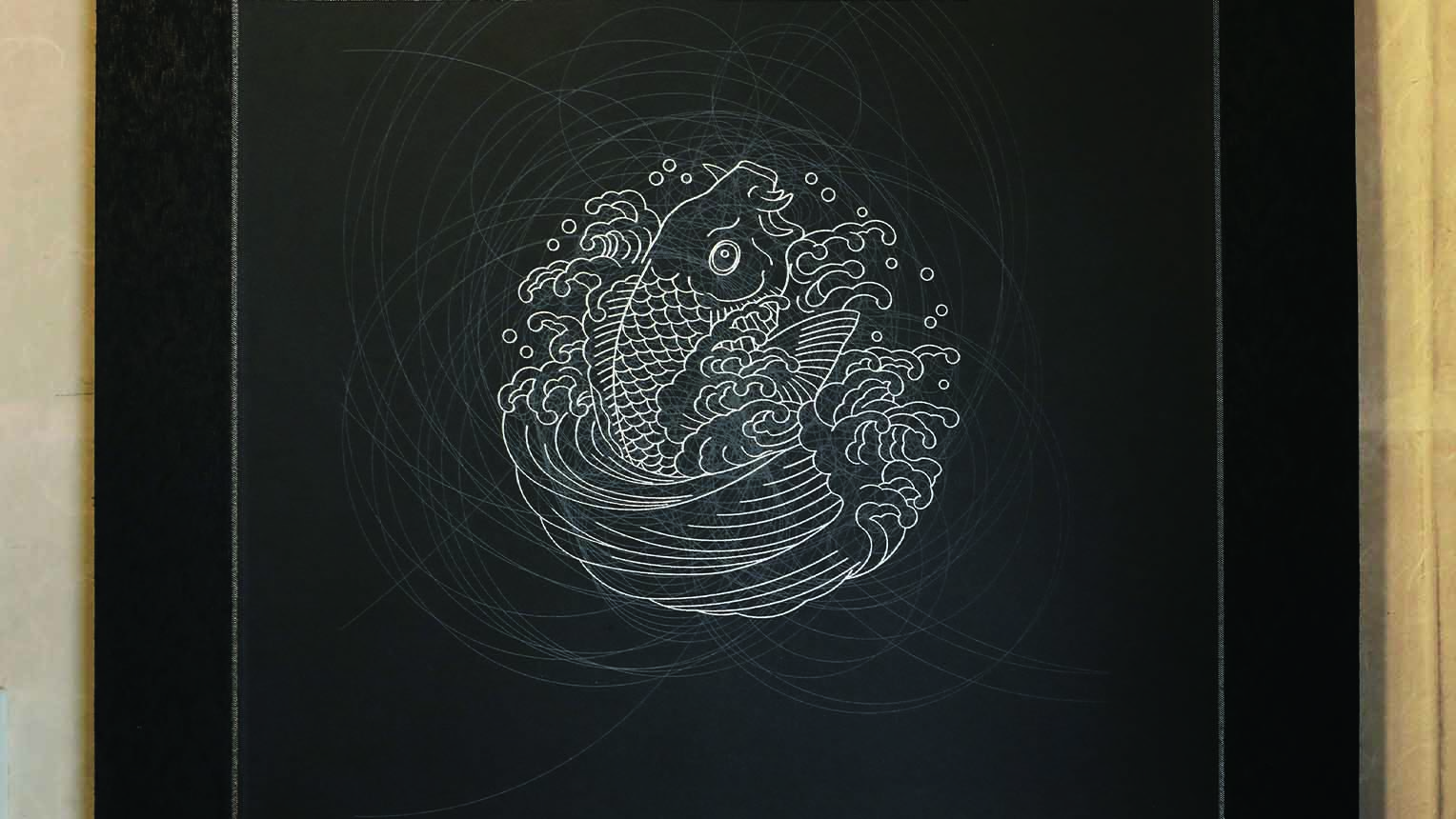
A “Mon-Mandala” art piece. Around the picture drawn with bold lines, arcs are drawn with infinite fine draft lines, a reminiscent of a Mandala symbol.
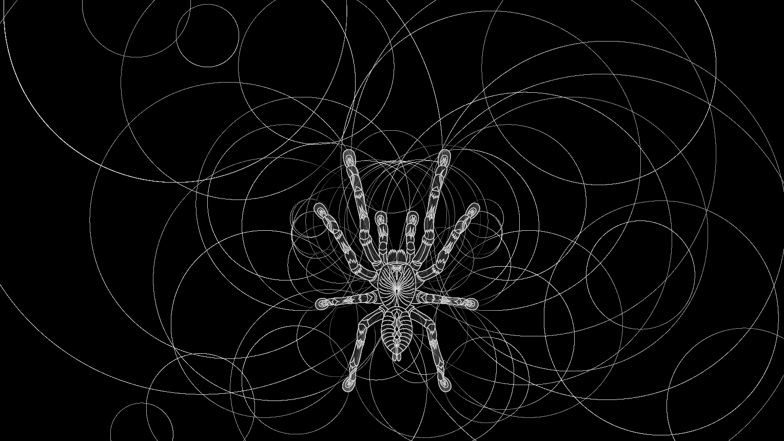
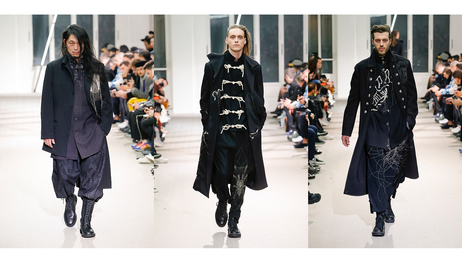
YOHJI YAMAMOTO pour Homme A/W 2019-20 PARIS COLLECTION Copyright: Monica Feudi The Mon-Mandala of a Tarantula was selected as a design to the collection
-Was it by coincidence that when using digital circle-drawing tools, you ended up with a Mon-Mandala art piece?
Yohji: Yes, it was. So, it was a by-product of my father having difficulty using Illustrator, and the end result turned into the Mon-Mandala. Adopting digital tools made us think of the draft lines drawn in designing a crest as one part of an art piece.
-We notice that for the noren you will be exhibiting in this “Meguru Noren Exhibition” you are visualizing with Mon-Mandala the Kirin statues, a symbol of Nihonbashi.
Yohji: We first went and took photos of what shall be shaped into the design. I remember, we brought the camera stand into the heart of Nihonbashi, and took many photos of the Kirin statues from various angles. We then traced the photos, and after deciding which contour lines we needed to keep, we drew up the crest. There are some know-hows involved when building white-out data of the noren, and for that I left up to my father’s instincts.
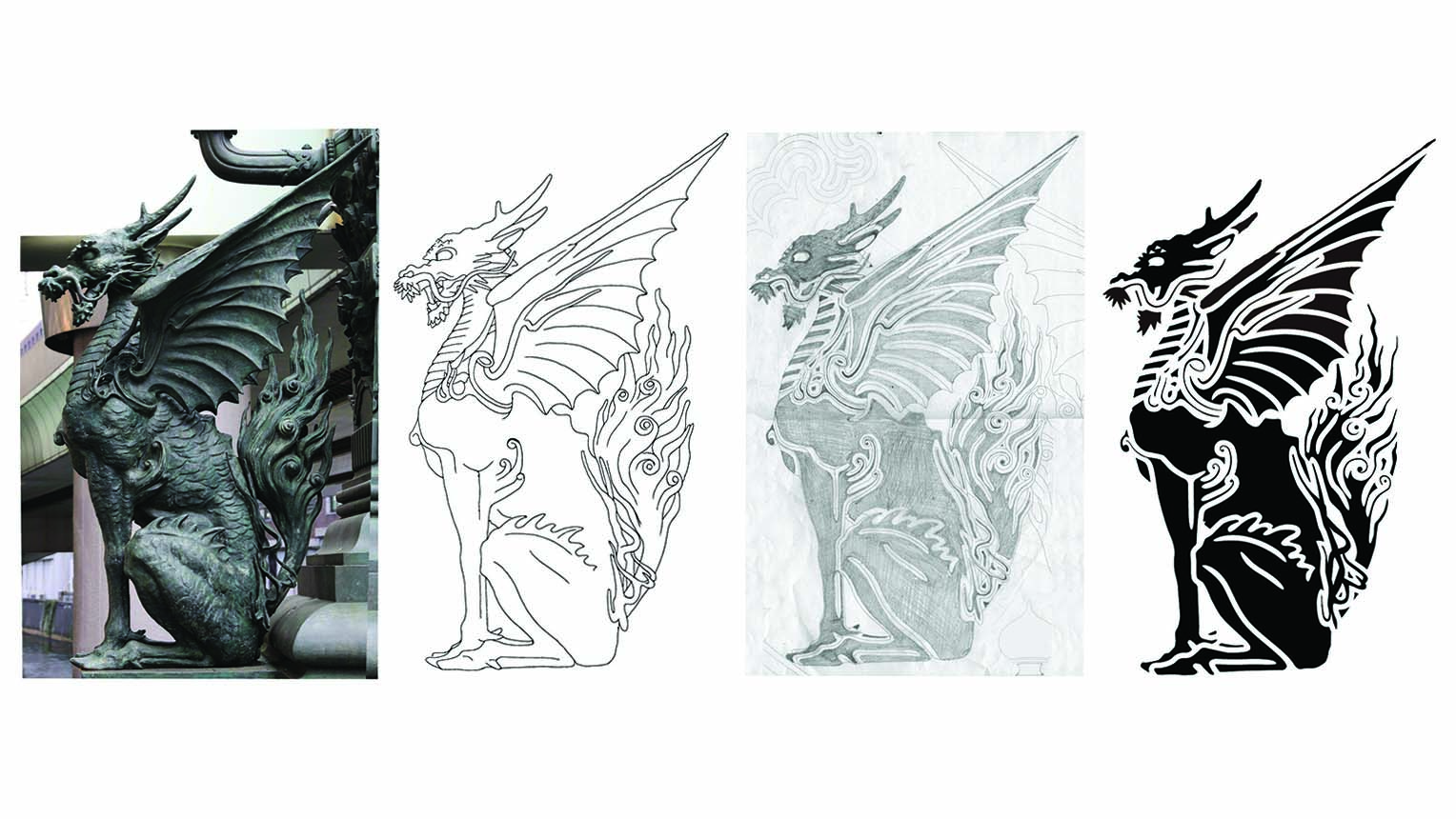
Process of building the Kirin image motif. From Left: Picture, tracing draft, contour line draft, and data motif
Shoryu: The Kirin statue is comprised of 2 statues, but with subtle differences to each, like one having an open mouth and the other being closed. We wanted to recreate these small details so it took more than a week to draw even one. For this crest the total amount of circles we used went past 2,500 (laughs). Especially difficult were the “eyes” that would affect the facial expressions.
Yohji: Since the base motif is complex, the draft lines that build the Mon-Mandala become complex like this as well. But we think those are really beautiful statues.
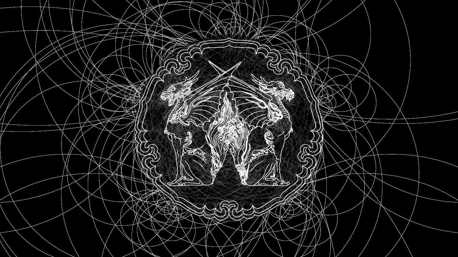
Production process of the Kirin crest using Illustrator. The complex Mon-Mandala beginning to take form
Wanting to remove the mental restraints towards crests and noren. Anticipating the “Meguru Noren Exhibition” as a place of free expression
-The “Meguru Noren Exhibition” are having an open invite for young creators to design a noren that visualizes Nihonbashi. As judges, do you two have any words of advice towards anyone who are thinking about applying?
Shoryu: If I were to apply, I would think how deep I can accomplish new expressions using the crest as an art form. For example, although the crest is a 2D form of expression, I believe it might be interesting if it became 3D. In addition, although I have said before that there are 3,000 types of crests collected in the Mon-cho, but in actuality, base-shapes used only amount to 300. When you look through them, there are unexpectedly very few motifs of animals and the subject matter may be quite limited.
So another interesting idea is to have a modern motif, but incorporate it with a traditional Kamon. Just like there are old and new materials in the world of rakugo (traditional Japanese comedy-stories), there should be no problem for having new and modern crest shapes. Such modern crests will in turn too, become the old and traditional, with even new shapes appearing in the following ages. If that’s how things continue to build up, then possibilities for the crest art form will grow even more.
Yohji: If we are to define a new form of expression, one example would be a Mon-Mandala, but I believe that having a trial and error process within the framework of the set limitations could lead to some interesting breakthroughs.
Shoryu: We just want to show that the world of the crest art form is so free. And that it was always been like this. The same applies to noren as well. There are no clear rules. What is interesting is that both were born out of casual necessity, but now there are mental restraints that place emphasis on “prohibiting against new changes.” We hope that these mental restraints will be removed for this “Meguru Noren Exhibition” and we look forward to meeting new expressions that we have never seen before.
Open invite for “Noren” designs towards a new symbol of Nihonbashi.
The “Meguru Noren Exhibition” Design Competition
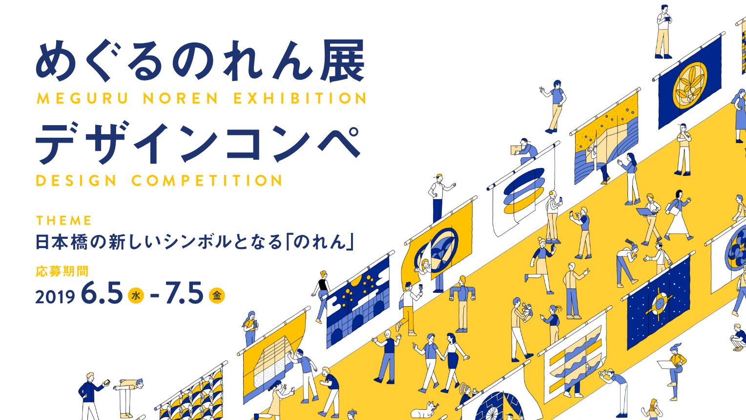
n the fall of 2019, the first-ever design event will be held in Nihonbashi called the “Meguru Noren Exhibition.” For a period of a month, “Norens” of newly inspired designs by companies, stores and guest designers will be exhibited all at once to welcome visitors to the town and recreate the vibrancy of Edo-era Nihonbashi depicted in the ”Kidai-Shouran" picture scrolls. This “Meguru Noren Exhibition” is part of an endeavor to update the artistic expressions of historical and traditional “Noren” and “Mon-crests.” In addition, it will function as a place for young designers to participate in building the community of Nihonbashi. We are having an open invite of participants to this first-ever “Meguru Noren Exhibition: Design Competition.” We look forward to new and inspiring ideas that express the fascinating charm of Nihonbashi where history and innovative spirit are mixed together.
[Official Website]
Interview: Daisuke Sasaki and Arata Nakamura / Article: Minako Ushida (Konel) / Photographs: Daisuke Okamura
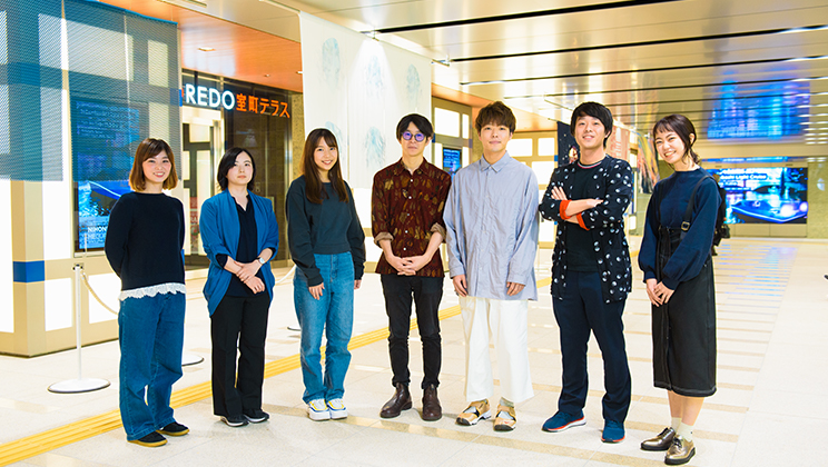
Taking on Youthful Tastes With Traditional Noren Curtains – A Conversation With the Creators of nihonbashi β Phase 2 About the “Meguru Noren Exhibition”
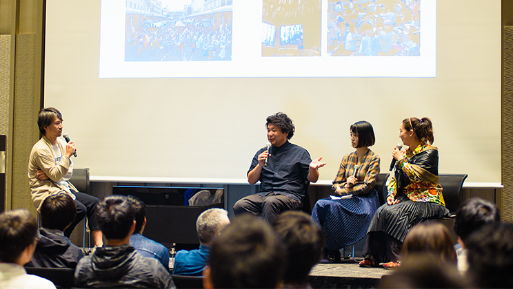
The Future of Cities and Creativity – “β Lounge” Volume 2 Public Talk Report
.jpg)
SAKURA FES NIHONBASHI / OFF TO MEET Short Report: Background on Original Souvenir Production.