Taking on Youthful Tastes With Traditional Noren Curtains – A Conversation With the Creators of nihonbashi β Phase 2 About the “Meguru Noren Exhibition”
Taking on Youthful Tastes With Traditional Noren Curtains – A Conversation With the Creators of nihonbashi β Phase 2 About the “Meguru Noren Exhibition”
The “Kidai Shoran” emaki scroll painting is a massive work of art 43.7 cm tall and 1232.2 cm wide, depicting Nihonbashi during the Edo period (1603-1868). Stories say that it was created in order to preserve a view of the prosperity of the era for future generations, as it depicts Nihonbashi street – the greatest commercial district in Edo – as well as the people who used it, both in great detail. In order to recreate the vibrant energy of the Nihonbashi it depicts, lined with noren bearing the trademarks and brands of the shops thriving along Nihonbashi street, the “Meguru Noren Exhibition” showcased massive noren 160 m in length at COREDO Muromachi Terrace. The event followed the program shown below.
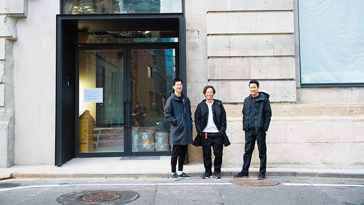
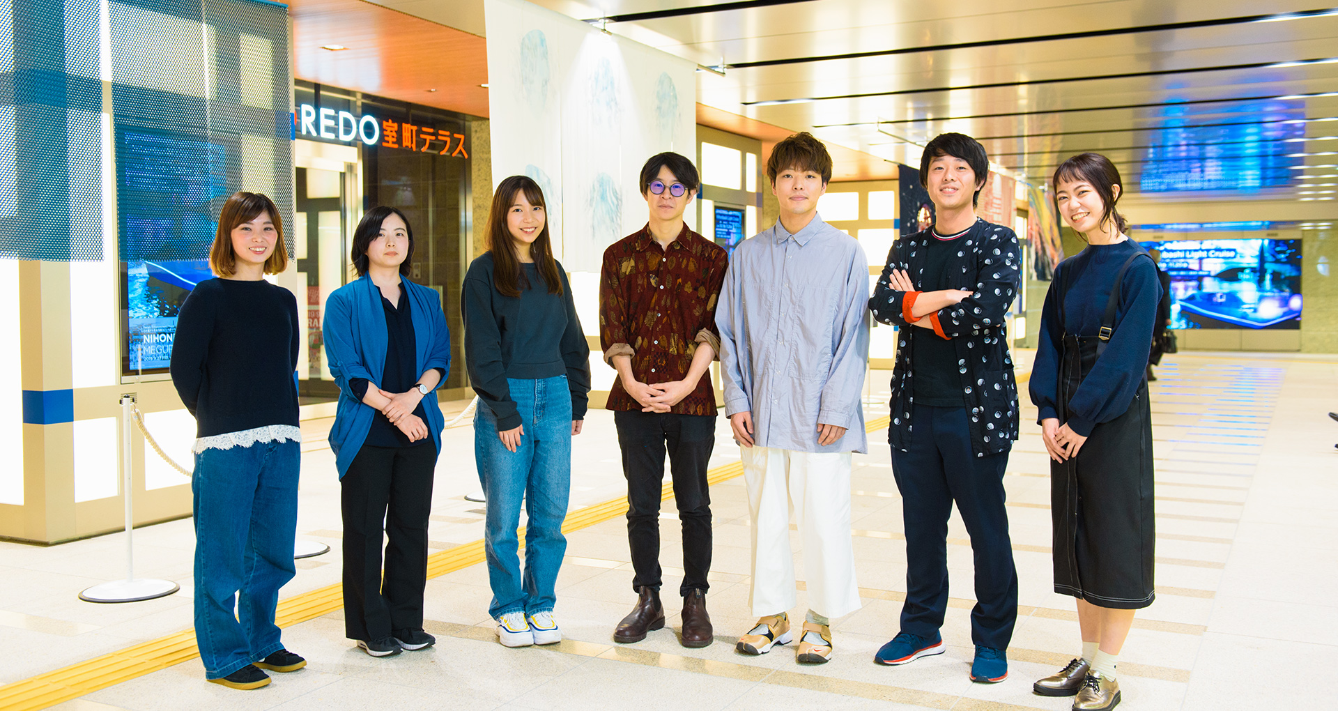
A team of five young creators won the “nihonbashi β” design contest with their joint project for the creation of Nihonbashi’s future, taking on the challenge of original noren creation alongside companies headquartered in Nihonbashi and renowned creators and tying these to youthful creativity in Nihonbashi. We asked the creators who participated about their processes, as well as how they expressed the spirit of Nihonbashi through the “Meguru Noren Exhibition,” and what they hoped to achieve as creators.
The creators who produced diverse perspectives on “Nihonbashi,” driven by diverse motivations.
- First, please introduce yourselves, and tell us about the concepts behind the artwork you produced.
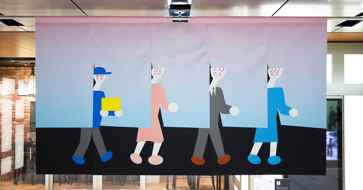
Mr. Shin Obinata (Obinata below) of Color Fab: “Color Fab” is the design engineering team from the Keio University Hiroya Tanaka Lab. I worked with Ryoma Takamori and Rina Kinoshita to explore the research theme, “How will 3D printer usage give rise to new, colorful expressions?”
We produced the piece “From Gradation to Gradation,” using the surface texture and unique digital coloration with a 3D printer, creating noren that seem to show a color gradient from white to indigo when viewed from either the left or the right. Our inspiration was the “Kidai Shoren,” an emaki painted scroll depicting the lively Nihonbashi area in the Edo period. When I first saw it, I sensed connections between the shops and across the entire town in the rows of uniform blue noren. We typically think of noren as connecting the interior of a shop or restaurant with the exterior, and this made me feel that they also produce lateral connections to our neighbors. That made me want to produce noren with a vision of connections in the new Nihonbashi, using lateral gradation from blue to white sections to increase awareness of the lateral connections. That’s how we arrived at this piece.
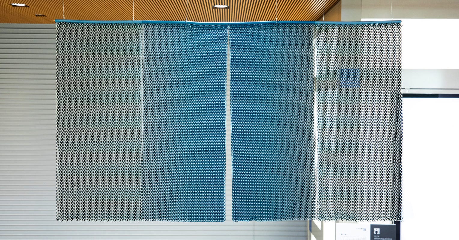
Color Fab’s “From Gradation to Gradation”
Ms. Ayaka Nishikawa (Nishikawa below): I typically work as a painter, with Shiga prefecture as my home base. I produced the noren “Accumulated Color” this time, in an effort to express my own feelings through color. I feel that the “color” of the land we grow up in seeps into the deepest parts of who we are. I’ve even had experiences where I found myself painting with colors close to those of the natural environment in my home town, without even realizing it. That sense made me suspect that Nihonbashi also had its own “color that seeps into you,” and I wanted to express the atmosphere and color that permeates people who live and work here.
The scenery centered on the river left a strong impression on me when I visited Nihonbashi, and I felt that the river itself must have taken on this “color that seeps into you” during its long vigil over the area. That was why I chose to express the light that reflects off of the city, and the sinuous winding of the air and water in this noren. I hope it resonates with deep-seated memories in viewers through its colors.

Ms. Ayaka Nishikawa’s “Accumulated Color”
Ms. Tomoko Suzuki (Suzuki below): I normally work as a graphic designer. This piece is called “Kiseki” (“tracks” in Japanese), and is based on a conversation I heard during a walking tour of Nihonbashi I went on during the planning phase of the project. The Shuto Expressway towers high above Nihonbashi, and it has name plates saying “Nihonbashi” on the bottom. I heard that this is the reason that “a lot of people get confused and think the Shuto Expressway itself is Nihonbashi,” which made a major impression on me.
When I looked into it further, I found that a lot of people think the Shuto Expressway ruins the view from Nihonbashi, and it doesn’t have the best image. But I think that this “view with the Shuto Expressway in it” is a part of Nihonbashi’s history, which stretches back the Edo period. When I looked up at the Nihonbashi sky thinking that, I envisioned a scene where “the light tracers from cars on the Shuto Expressway lit up Nihonbashi,"and wanted to express the image with noren.
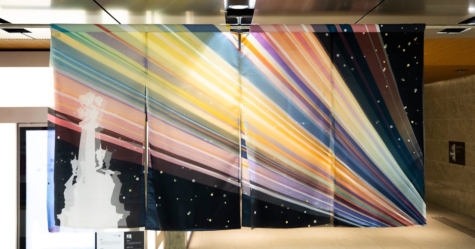
Ms. Tomoko Suzuki’s “Kiseki”
Mr. Takuro Nakano (Nakano below) of NO/SE: We were both hired at the same time by the same architectural company, and this event motivated us to form a creative unit. We produced “Musubi Machi,” (“city of connections”) a noren design which plots venerable businesses that represent Nihonmachi as points on a map and links them with lines. The intersections between lines produce new activity, creating Nihonbashi’s future. We put that thinking to work in the design. The cutout circle in the center represents the Nihonbashi area, while also reflecting our belief that noren should connect interiors and exteriors.
Ms. Haruka Sekoguchi (Sekoguchi below) of NO/SE: Noren serve as billboards and advertisements for businesses, so I thought of them as also having a function in helping residents find these businesses. I also felt that noren serve as a message of acceptance to new visitors and ideas that come to a city, and represent hospitality as such. That’s why I focused on my desire for this noren to connect Nihonbashi with the rest of the world when creating this piece.
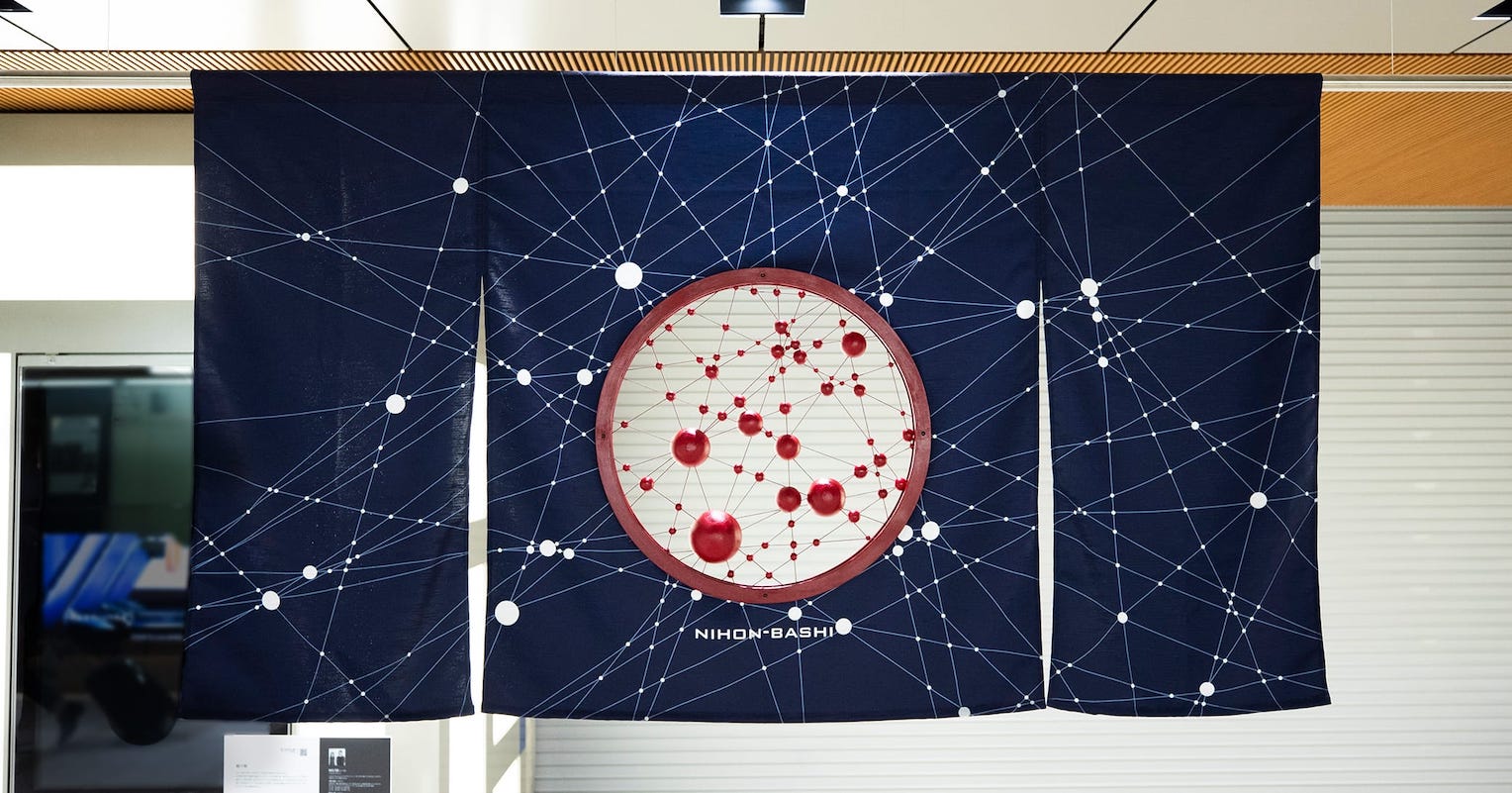
NO/SE’s “Musubi Machi”
- What made you decide to participate in this design competition?Please share what you related to in “nihonbashi β.”
Suzuki: Working as a graphic designer was growing a bit too routine for me, and the key factor for me was learning about “nihonbashi β” from a fellow creator and friend just when I was beginning to want to express myself freely. I want to brighten my home prefecture of Akita with my designs, so I really resonated with the plan this time and its pairing of the themes of “city” and “creativity” on the subject of “enlivening the Nihonbashi area with noren designs.” That made me decide to participate.
Nishikawa: For me, it was learning about the plan from a friend who lives in Tokyo, who said “wouldn’t your paintings be fun as noren?” I was curious about “painting on noren” since I normally use paper, and also interested in “creating artwork to be placed in a space people pass through,” so I resolved to join in. When I saw the actual exhibit pieces, I was amazed at how distinct they seemed when moving, and how pretty they were when waving in the wind or as people passed through.

Ms. Ayaka Nishikawa
Obinata: I had two reasons – “interest and intrigue toward noren,” and “sympathizing with the idea of fun that doesn’t end with simple creation.” I normally study craftsmanship and manufacturing using technology in my university lab, but I often feel that new technology alone will not produce anything truly fun and interesting… I had a feeling that you can only begin creating truly interesting things when you connect new technologies with ancient cultures passed down over the generations. That made me think it would produce interesting results to tie traditional noren with the technology we study. On top of that, a lot of design competitions end with submission of plans, while this one ran through production and exhibition. That was also a big motivator for me. I was also fascinated by the idea of something I produced fitting in harmoniously as part of a city, while countless companies and creators came together across the area for a big event.
Nakano: For me, the starting point was having a connection to Nihonbashi through my job. I can see every day that noren are an important part of Nihonbashi, so I invited Sekoguchi to join in with me when I heard the plan.
Sekoguchi: I have always had a strong image of Nihonbashi as a “city for adults,” and had never been here over my entire time as a student. So I had to come back and walk through the city again to participate in this plan, and found everyone very tolerant and easygoing, with a lot of people taking on fun challenges. I feel like seeing that side of the area brought me closer to it.
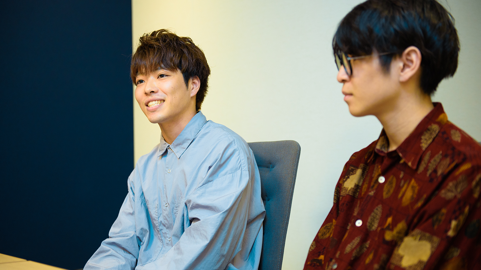
Mr. Takuro Nakano and Ms. Haruka Sekoguchi of NO/SE
A first try at making noren, envisioning the completed work during a process of trial and error.
- If you struggled with anything or had to invent methods to take on the challenge of noren product, we’d love to hear about it.
Mr. Ryoma Takamori (Takamori below) of Color Fab: I had never made anything as large as noren on a 3D printer before, so this was a series of new challenges. I think noren are normally made using cloth, but we used plastic resins for ours. It was all outside of specifications, so it was a series of trial and error processes. For example, we had to actually hang them and see how to best support them when figuring out how strong they needed to be to wave in the wind. When we simulated the strength, actually created them on a 3D printer, and hung them, they were too frail and broke once. But when we tried to actually display them, they were too heavy, and didn’t wave in the wind at all. We may have miscalculated a bit (laughter).
Mr. Shin Obinata and Mr. Ryoma Takamori of Color Fab
Nishikawa: I chose chirimen (silk) as a material this time, and used dyes, so I was using everything I worked with for the first time. Some pieces were over in one-round bouts since you can’t revise mistakes, and I had a hard time getting the handling down. I used faint colors and carefully layered them one stroke at a time. I also repeated a cycle of painting a bit then viewing the whole thing from a distance, since it’s a large piece. For the record, I actually dripped dye from my palette onto the cloth one time, and really panicked (laughter). Producing depth in colors while layering dyes on cloth, and bringing out transparencies from the original painting I made using natural mineral dyes were both very challenging tasks.
Suzuki: My concept plan got good reviews during selection, so I had to do a major brush-up on my actual piece’s design. With that going on, I was very nervous about how to give form to the concept and express what I wanted to with the piece. The nihonbashi β staff gave me a lot of advice on selecting materials and tasks to adjust the design, and while the schedule was pretty tough, I managed to make it through in the end.
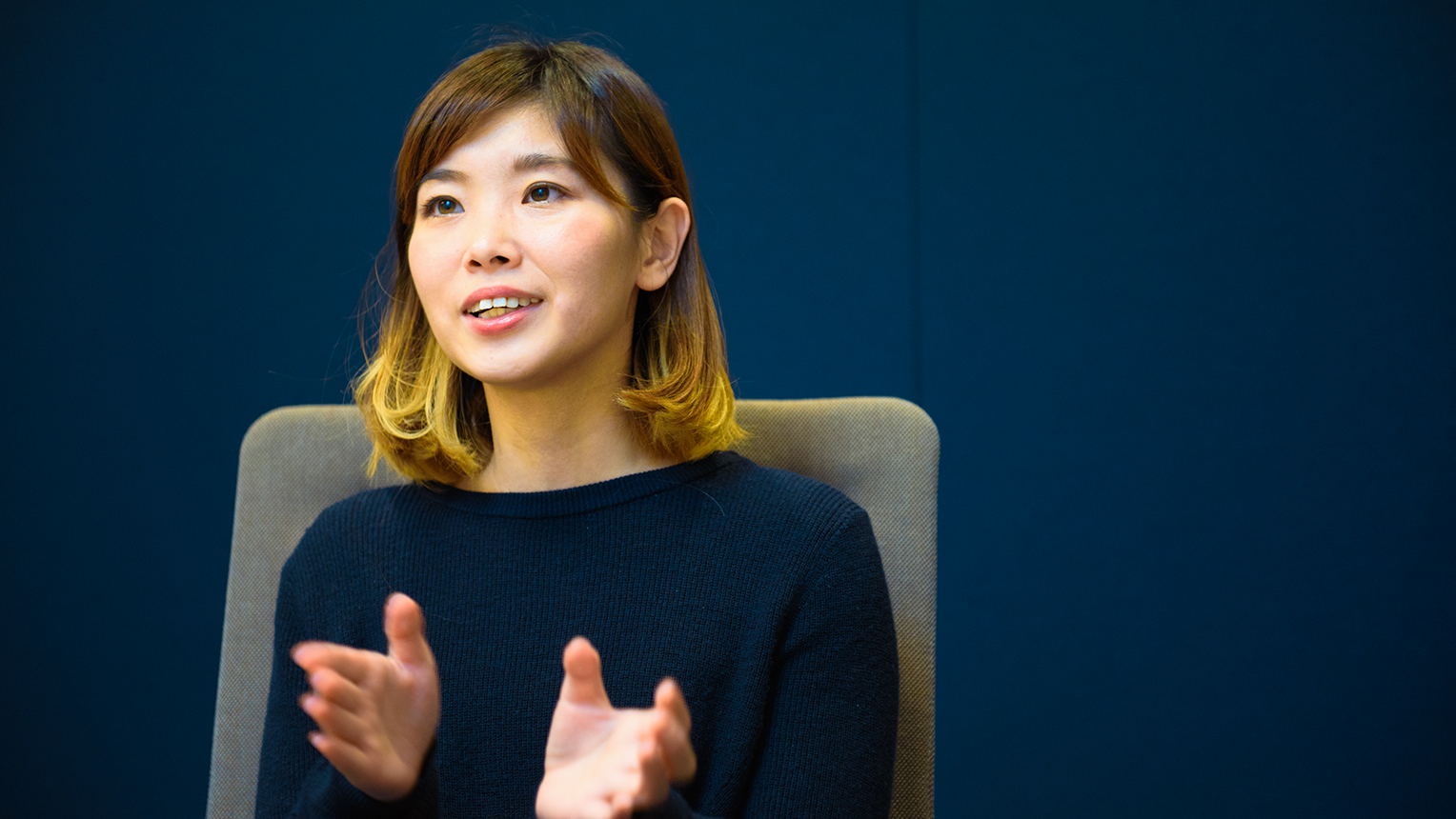
Ms. Tomoko Suzuki
Sekoguchi: Our noren design called for us to cut out a circle in the center of the fabric and add a transparent piece, and our main struggle was how to achieve the transparent piece.
Nakano: It was pretty hard work to figure out how to incorporate transparency into noren without distorting the fabric. Even expert artisans have no experience with removing sections of fabric this way, so we did it ourselves using a hot knife. Then we added the wooden frame and mechanism we had produced into the opening. But hanging it that way would warp the fabric, so we ended up using separate ropes to hang the noren and frame. The nihonbashi β staff members actually gave us that idea, and it’s not an overstatement to say we couldn’t have done it without that. They saved us. I feel like we wouldn’t have made the imaginative jump on our own.
- For the record, were there any pieces that made a major impression on you in this year’s “Meguru Noren Exhibition”?
Takamori: “Musubi Machi” by NO/SE made a strong impression on me. We study 3D printers, so I’m always interested in the shapes and substances in objects around me, so I find it fascinating how they mixed the noren with other materials to create this piece… The rest of the team and I were talking about it.
Obinata: I was obsessing over noren as my creation around the clock, so it inspired me to notice the incredible quality of actual noren on businesses when they would catch my eye as I went out. I think the massive COREDO Muromachi noren are really cool, in particular.
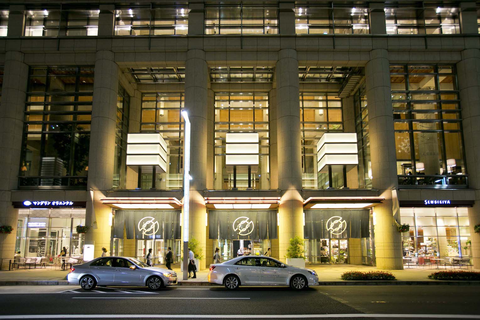
The massive noren hanging in front of the COREDO Muromachi entrance
Nishikawa: Everyone made amazing noren, and I was stunned to see how distinct our visions were on the same theme – Nihonbashi. I was fascinating by the strong presence each designer created, as well as the strong edge each design had. I actually agree with Mr. Obinata, too; I think the massive COREDO Muromachi noren are very impressive with how they let the sunlight through as they flutter in the wind. Having noren on a business changes its atmosphere, you might say, or they have always given businesses a sense of Japanese-ness.
Suzuki: Three pieces inspired me – “Shima-noren” (“striped noren”) by Mr. Naonori Yago, “Mekuru Hana Noren” (“scattering flower noren”) by Ninben Co., and “Lift the Curtain" by Ms. Colliu. Both “Shima-noren” and “Mekuru Hana Noren” synergize with their materials, and they truly achieved everything I wanted to in an artwork, which blows me away. “Lift the Curten” is fascinating with how is shows people of the Edo period opening the curtain when viewed from the back, and modern people emerging from it on the front. It also makes use of noren design features, which was intriguing.
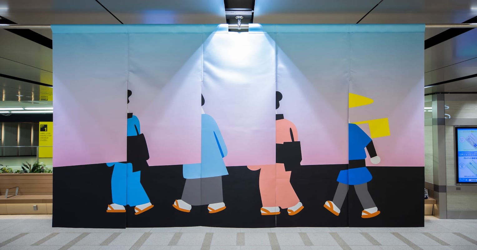
“Lift the Curtain” by Ms. Colliu depicts modern people on the front, and people of the Edo period on the back
Nakano: I was fond of “The Window of KIBO (Actual Size)” by JAXA (the Japan Aerospace Exploration Agency). I think the window in the center instead of a crest is great, combined with the different messages expressed on each side.
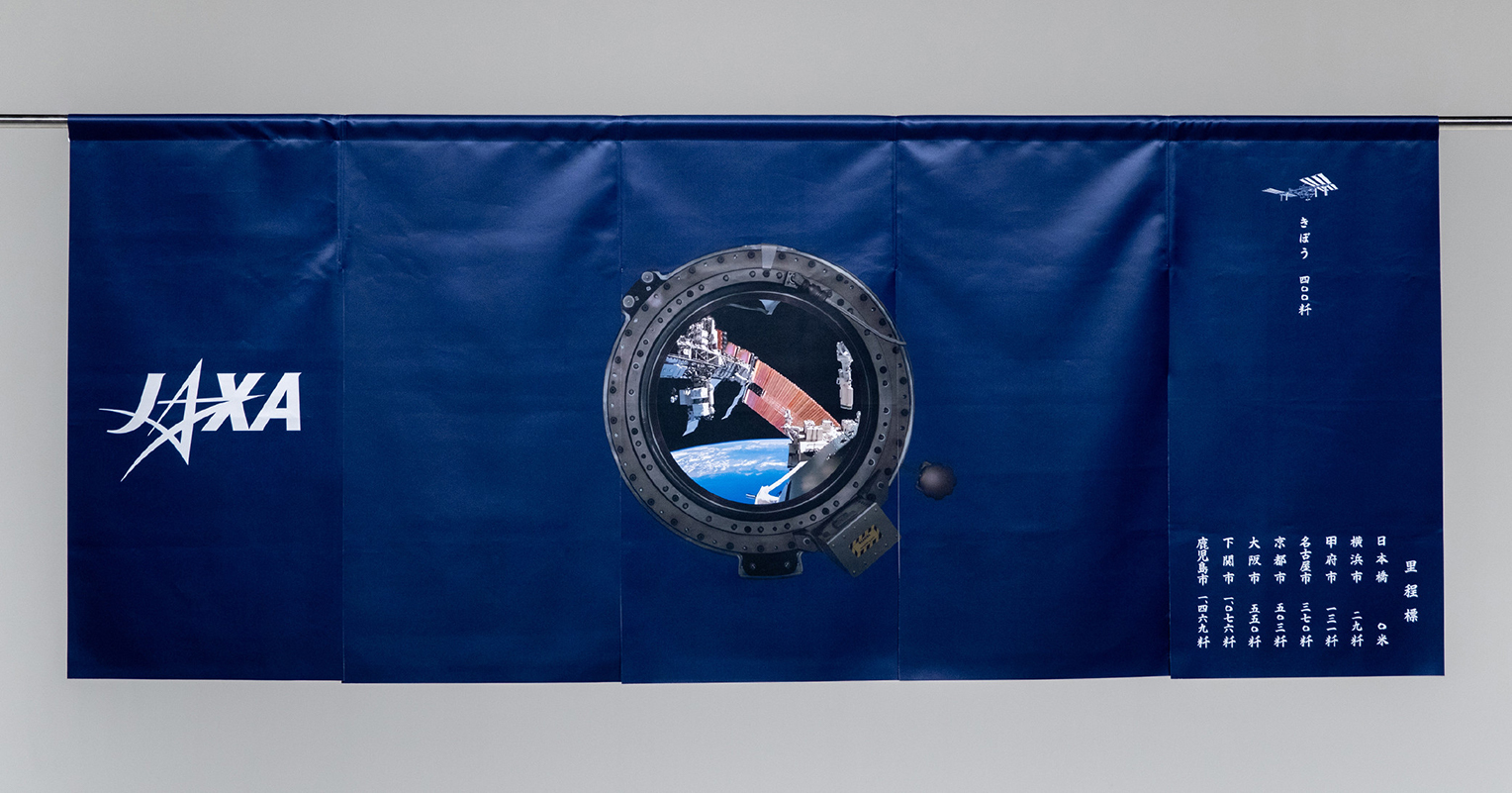
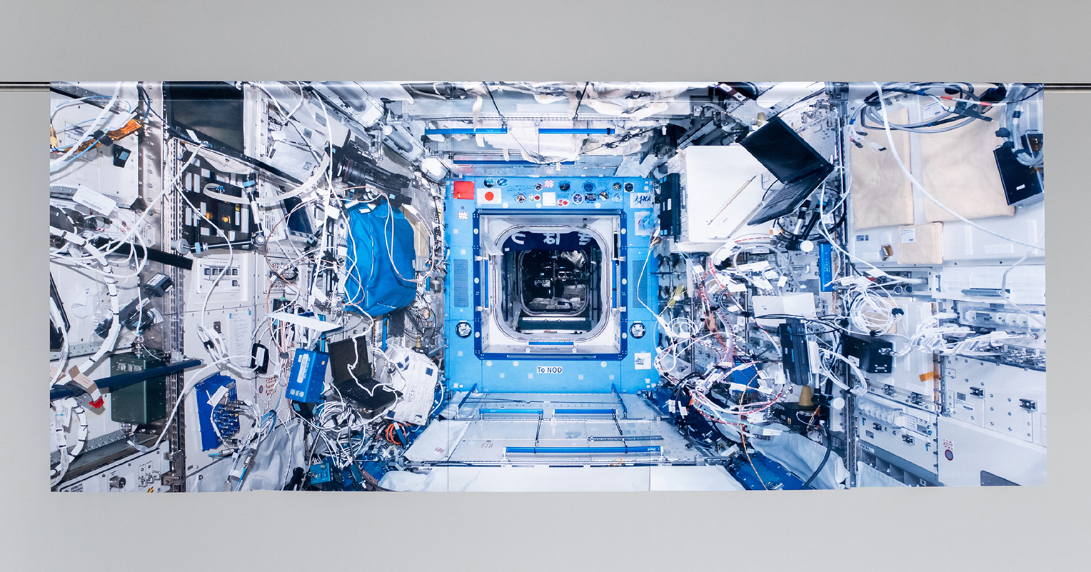
“The Window of KIBO” by JAXA shows the window of the Japanese “KIBO” experimental module on the ISS at actual size on the front, and the interior of “KIBO” on the back
Drawing energy from the possibilities seen and issues faced with nihonbashi β, while moving on to the next challenge.
- Please share how you hope to use your experiences in this exhibit in your future activities as a creator.
Sekoguchi: This was our first time working on an art project together, and I want to use this event as a starting point authentically launching “creative unit NO/SE.” This gave us some common ground with everyone in Nihonbashi, and since I’ve always been interested in urban development, I want to continue attempting designs connected to cities.
Suzuki: Honestly, while I felt “I’m still not there yet” when I saw my noren exhibited alongside all the other creators, it reminded me that want to do better in the future. All of the amazing creations from everyone else gave me a lot of inspiration. This was my first experience handling everything from material selection up through expressive graphics, and I also learned a lot about the process of craftsmanship. I want to use all of the ideas that I built up over this experience in future work and design projects.
Nishikawa: Although I normally do production alone, getting advice from all of the nihonbashi β staff while I worked this time gave me a real sense of the fun part of collaborative work. I hope to do more collaborative work with people with distinct values in the future. I think that would expand my personal dynamism at work, and also increase the scale of artwork I could handle. Also, creating noren in this case gave me a chance to experience the thrill of creating art to decorate a space. Now I want to try creative work without limiting myself, using a variety of environments or larger pieces.
Obinata: Since I normally work in a lab on manufacturing, and ceremonies are on campuses or at academic conferences, this was my first change to exhibit in a public space where numerous people can see and interact with the work. There was a lot of struggle along the way, but it gave me a sense of how broad the possibilities are. I want to create all sorts of things for the world, now. Since 3D printing technologies first draw attention, research has advanced from a “creating forms” perspective, but almost no one is studying them with a focus on “creating color.” I want to continue to work on the challenging of advancing the potential of 3D printing, while also giving form to a variety of ideas and sharing them with the world.
Interview/Text: Yusuke Iguchi
Photography: Daisuke Okamura
The Future of Cities and Creativity – “β Lounge” Volume 2 Public Talk Report
.jpg)
SAKURA FES NIHONBASHI / OFF TO MEET Short Report: Background on Original Souvenir Production.
The Theme is “OFF TO MEET” And They Have a Message for Modern Society.